Federico Viticci

10804 posts on MacStories since April 2009

Federico is the founder and Editor-in-Chief of MacStories, where he writes about Apple with a focus on apps, developers, iPad, and iOS productivity. He founded MacStories in April 2009 and has been writing about Apple since. Federico is also the co-host of AppStories, a weekly podcast exploring the world of apps, Unwind, a fun exploration of media and more, and NPC: Next Portable Console, a show about portable gaming and the handheld revolution.

Apple Launches “Designed for iOS 7” App Store Section

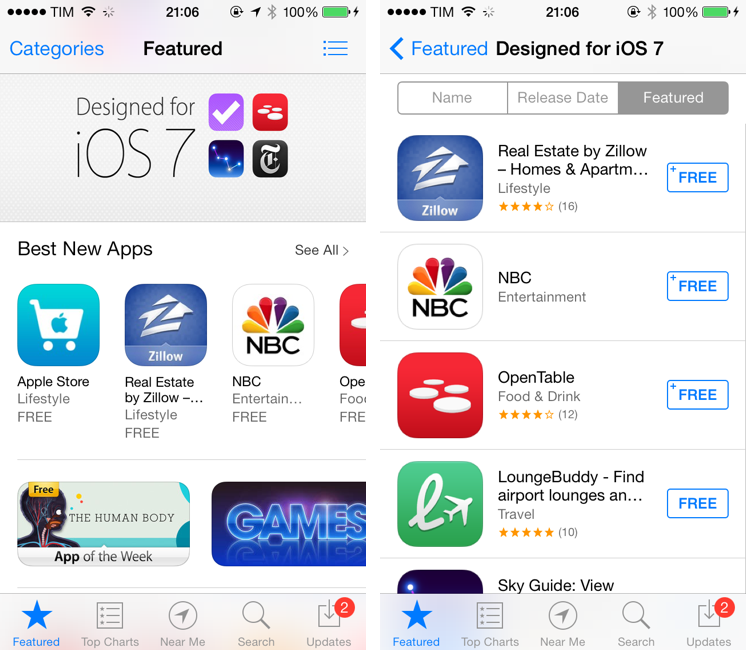
Following the public launch of iOS 7 earlier today, Apple has now launched a new section on the App Store aimed at showcasing apps that have been redesigned and updated to take advantage of iOS 7.

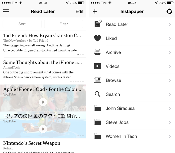
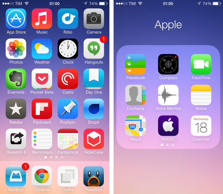
The section, called “Designed for iOS 7” can be accessed by opening the front page of the App Store on any iOS device. At the moment of writing this, the section collects 45 iPhone and iPad apps that have been updated for iOS 7, including big names like Evernote, TED, and OpenTable, as well as apps from independent developers like Twitterrific, Reeder 2, Pocket Casts 4, and Perfect Weather.

Today, Apple is also promoting individual iOS 7 apps on the front page of the App Store with custom banners and links to other iOS 7-related sections, such as Newsstand apps.

Back in July, I wondered how Apple would promote apps made for iOS 7:

Apple isn’t new to custom sections and features for apps that have been enhanced for new system features, OS releases, or new devices. iOS 7, however, will effectively split the App Store in two: apps that were built before iOS 7, and those from developers who care about supporting this major change. This wouldn’t be a problem if every app on the App Store was updated regularly; unfortunately, cleaning the App Store’s back catalogue isn’t a new topic of discussion – today, there are apps on the Store that haven’t been updated in 2 or 3 years (I found apps last updated in 2008) and that will likely remain unchanged with iOS 7. Does Apple want to treat those “classic” apps in the same way that modern iOS 7 apps should be treated?

Apple isn’t new to custom, curated sections on the App Store, and it’ll be interesting to see how they will continue to promote iOS 7 apps over time and organize search results to highlight apps that have been updated in recent months.

You can view the “Designed for iOS 7” section here. Our coverage of iOS 7-ready apps can be found here. Read more


Instapaper 5.0: Sorting and Filtering Options, Tweaked Interface for iOS 7

The first major update since the app was sold by original founder and developer Marco Arment to Betaworks earlier this year, Instapaper 5.0 has been released today on the App Store as a free update for existing owners of the app. Instapaper 5.0 doesn’t add any new major functionality to the app, which is still largely similar to the version 4.0 that was first released two years ago. Betaworks made the app ready for iOS 7, polished the interface, and added some new minor functionalities that, however, nicely complement the reading experience. I’ve been testing Instapaper for the past week on my iPhone 5 and iPad mini running the iOS 7 GM seed. Read more


Pocket Adds Instant Sync, Improved Reading Experience with iOS 7 Update

Pocket for iOS 7

Pocket for iOS 7

When Read It Later relaunched as Pocket last year, I was intrigued by the service’s focus on allowing users to “save everything for later”. In the months that followed, Pocket received a native Mac app, better browser extensions, deeper integration with iOS apps thanks to a new SDK, and started expanding to more devices and OSes, following Nate Weiner’s original strategy to bring Pocket to as many platforms as possible. Today, Pocket is updating its iOS app to take advantage of iOS 7 and ensuring that content is always available on an iPhone or iPad, even if the app isn’t running. The new Pocket is a good example of developers using the new iOS 7 APIs to enhance existing apps. Read more


Living with iOS 7

iOS 7, released today, is a deep reimagination of Apple’s mobile platform: using familiarity and the need for a reset as catalysts, iOS 7 represents Apple’s attempt to make iOS ready for the future. iOS 7 is, effectively, the epitome of a large company that knows it’s time to get rid of cruft and inconsistencies to bring a new order to a platform that has grown exponentially in the past five years. For developers, iOS 7 brings powerful new tools that will allow for a new generation of more flexible, intelligent, and versatile apps. iOS 7 is not perfect: there are rough spots and some wrong assumptions, but it’s not flawed or, as many will argue in the next few weeks, a “mistake”. It would be extremely silly and shortsighted to judge iOS 7 by the look of its application icons or the gradients Apple has decided to use on some graphics. More than any other Apple product, iOS 7 isn’t just defined but how it looks: iOS 7’s new look is devoted to functionality – to how things work.

It’s difficult for me to offer a comprehensive review of iOS 7 today, because I have only been able to test a fraction of the third-party apps I will use on a daily basis with my iPhone and iPad mini. Mirroring the concept of “design is how it works”, I would say that, for me, iOS isn’t just how Apple’s apps work on it – it’s increasingly become about how apps from third-party developers can take advantage of it.

I have been running iOS 7 on my iPhone 5 since Apple released the first beta in June. I later installed the OS on my iPad mini, and have been working with an iOS 7-only setup ever since. As MacStories readers know, I primarily work from my iOS devices, which helped me get a good idea of how iOS 7 will change the way I write, take photos, respond to emails, listen to music and podcasts, and all the other things that I use iOS for.[1] Fortunately, I had the chance to test a good amount of third-party apps that solidified my thoughts on iOS 7 and the way it impacts my digital life and workflow.

It was also hard to get ahold of fellow iOS 7 users in my town. While I imagine that it would be easier to come across a nerd running an iOS 7 beta at a bar in San Francisco, I didn’t have much luck in Viterbo, Italy. I tested new features like AirDrop – which allows you to share files and information locally with other iOS 7 devices – with my iPhone and iPad, and, in the past week, managed to convince my girlfriend to install iOS 7 on her iPhone.

I needed to provide this context: my livelihood directly depends on iOS and how I can work from my iPhone and iPad without having to use my Mac. Therefore, if you’re looking for a list of new features and smaller details of iOS 7 (and there are many), bookmark this article. My “review” of iOS 7 will focus on my thoughts on the update, how it made my iPhone and iPad better devices, and what I believe iOS’ future will be going forward.
Read more


Drafts 3.5 Brings Refined Interface for iOS 7, Action Improvements

Drafts for iOS has singlehandedly reinvented, alongside Editorial, my iOS workflow. With a combination of URL schemes and custom actions, direct Dropbox and Evernote integration for saving text, callbacks, and a fervent community of passionate users pushing the app to its limits, Drafts has become an extremely powerful iOS notepad without losing its basic simplicity. Drafts is the perfect example of an app that is easy to use and approachable but that power users can tweak and enhance if they know where to look.

With the release of iOS 7, developer Greg Pierce has decided to make Drafts 3.5 an iOS 7-only app that includes an updated design and some new features for power users. This will likely be a controversial decision among users who won’t update to iOS 7 right away, but I certainly understand the motivation of wanting to move forward as fast as possible by promptly embracing our iOS 7 future.

Drafts didn’t have much custom UI to begin with, so this new version’s most visible changes are the keyboard, which defaults to the iOS 7 one, and the revised icons and menus that match iOS 7’s new design trends and guidelines. Icons are thinner, the Settings’ cells run from edge to edge, the On/Off switches are new, the status bar blends with the writing area, and there’s a lot more whitespace. After having used Drafts 3.5 for a few months, I would say that, in the transition to iOS 7, it has lost less than Pierce’s other app, Terminology, in terms of identity and personality. Drafts was already spare and clean-looking – iOS 7 just makes it official and takes the app’s whitespace up a notch. Overall, it’s still the same Drafts, now with new icons and an updated keyboard.

The additions to Drafts 3.5 should please power users and those who rely on Drafts as an application launcher more than a note-taking app. Read more


Apple Updates AirPort Utility and Apple Store Apps with iOS 7 Support

Ahead of iOS 7’s public launch, expected later today, Apple has started updating their App Store apps (the ones that don’t come pre-installed on iOS) with support for the new operating system. The first two apps released this morning to get the iOS 7 treatment are AirPort Utility and the Apple Store app.

Both apps have been updated to include the new default iOS 7 UI; based on initial tests, it doesn’t seem like Apple added new major functionality to the apps. AirPort Utility, used to manage and configure AirPort stations directly on iOS, has received an integrated status/bar navigation bar that keeps the app’s existing color scheme. There still is a main screen listing all your active AirPort devices, which you can tap on to enter another view for hardware information and more.

The Apple Store’s update is more substantial from a design standpoint, with Apple including a new app icon and redesigned graphics throughout the app. Apple Store now comes with edge-to-edge sections, translucencies, and thinner tab bar icons that are consistent with Apple’s other iOS 7 apps.

You can find updates to AirPort Utility and Apple Store on the App Store.


Pocket Casts for iOS 7 Review

Pocket Casts 4

Pocket Casts 4

Over the years, I’ve moved my podcast subscriptions to different apps to see which one would fit my listening habits and needs better. I have tried Instacast, Downcast, even Apple’s free Podcasts client with iTunes sync for a while, but never settled on a specific solution for more than six months. The possibility to export a set of subscriptions as OPML to other apps makes it easy to switch, just like it is simple to move RSS feeds from one client to another. But while I have remained loyal to Reeder and Mr. Reader for years now, I’ve never been able to stick with a podcast client for too long. Every time I tried a new app I would say that it was going to be the one for me, but then I encountered an issue, or perhaps a feature was added to a competitor – and I was back exporting my OPML subscription list and relocating to another home.

For the past month, I’ve been testing Pocket Casts 4, developed by the Australian team of Shifty Jelly. Pocket Casts 4 has been approved by Apple, and it will be released on the App Store as soon as Apple will flip the switch for iOS 7 apps on iTunes. Pocket Casts 4 is a Universal app sold at $3.99, and it’s a free upgrade for existing owners of Pocket Casts 3.

While I recognize that I tend to be some kind of an app nomad when it comes to podcast clients, Pocket Casts 4 has some excellent features that work for the way I like to listen to podcasts and organize them. Read more


Amount, A Simple Unit Converter Ready for iOS 7

Amount (developed by Marco Torretta) is a unit converter app for iPhone that takes a unique approach in how it lets you enter numbers and pick a unit to convert. The app was updated yesterday to offer a new layout, and it’s ready for iOS 7 with a status bar that blends with the calculator’s dark display (it’s also still compatible with iOS 6 devices, but without the new status bar design).

The main screen of the app is called Number and it’s a standard calculator that lets you enter an amount to convert. Because it’s a calculator, you can use it to do simple operations, and I like how numbers and clearly separated from other keys through color. My only complaint is that there are no sound effects when pressing keys, which can be confusing if you’re not looking directly at the display but still would like to hear feedback from the app. Read more


AroundMe Gets Redesign For iOS 7

Created by Italian developer Marco Pifferi, AroundMe has long been one of my favorite location-based apps for the iPhone and iPad. In fact, AroundMe is one of the oldest iOS apps I own, as Pifferi always supported the app through the years with free updates and additions that took advantage of Apple’s new OSes and features. With a simple interface and feature set, AroundMe allowed you to easily find nearby places (bars, restaurants, hospitals, hotels, etc) with a rich database and built-in directions for Maps and Google Maps.

AroundMe’s version 7.0, released this week, brings a completely redesigned UI and animations that make the app ready for iOS 7, which is officially coming out on Wednesday. Read more