This Week's Sponsor:

Turbulence Forecast

Know before you go. Get detailed turbulence forecasts for your exact route, now available 5 days in advance.


Posts in reviews

Basil Review

In there’s one thing (among others) that I have noticed while using the iPad extensively over the past five months, is that it makes for an excellent “kitchen screen” while cooking. Whether it’s for browsing recipes or keeping an eye on what the final results should look like, the iPad’s form factor and wide array of apps, coupled with the excellent Safari and Facebook apps, allow for a fantastic experience when browsing recipes, checking out friends’ recommendations, and saving instructions and photos for future usage.

It was with particular interest that I tested Kyle Baxter’s new iPad app, Basil. Available today on the App Store, Basil is a fresh take on “smart recipe books” that lets you to keep your recipes neatly organized in a clean interface that gets out of the way, but it’s also smart enough to facilitate the process of cooking better.

A recipe app should have a clean interface with text on a white background, large buttons you can easily tap, search features, and timers. Basil does this by leveraging the inner strengths of iOS, and it adds its own implementation of bookmarklet/parser to make the process of saving recipes from the web effortless and intuitive. Read more


Instapaper 4.1

In my review of Readability for iOS, I wrote:

I think there are various important points to stress: the Instapaper app has been around for years now, and with the recent 4.0 update it solidified the strong feature set offered by Arment which, quite honestly, is still unsurpassed. Put simply: you can’t do all the things you’re able to do in Instapaper with the new Readability app. So, if you’re really used to Instapaper’s pagination settings, Friends discovery, sharing options and app integrations, you might want to consider staying with Instapaper.

I am one of those users that, for a number of reasons, are glad to stay with Instapaper. When it comes to my reading list, I invested too much time in building a personal archive of articles I enjoyed that I feel uncomfortable switching, after years of usage, to another service. That was the most difficult part of writing my Readability review: to be able to take an objective and balanced look at the app – which, again, I believe is a very good one – while knowing that I would stick with Instapaper. But it’s okay: unlike some people, I don’t see competitors as “enemies”, and healthy competition ultimately leads to more innovation. Omitting the inelegant words of other people that only show a lack of grace when it comes to respecting your competitors, I think Readability and Instapaper can coexist. And as I wrote, I do hope that Readability can figure out a better way to manage its payment platform for publishers. I like and use Instapaper, and in my perfect vision of the software scene everyone would just work hard silently and strive to one-up a competitor, with class.

Last night, Marco Arment released a 4.1 update to Instapaper. You can find it on the App Store, and the app also comes with Retina assets for the new iPad, if you got one yesterday. Perhaps more importantly, at least for me, Instapaper 4.1 adds a series of improvements and design refinements that only make an already fantastic 4.0 version even better. Read more


Scotty 4.0 Is Universal, Transfers Photos to Macs and iOS Devices

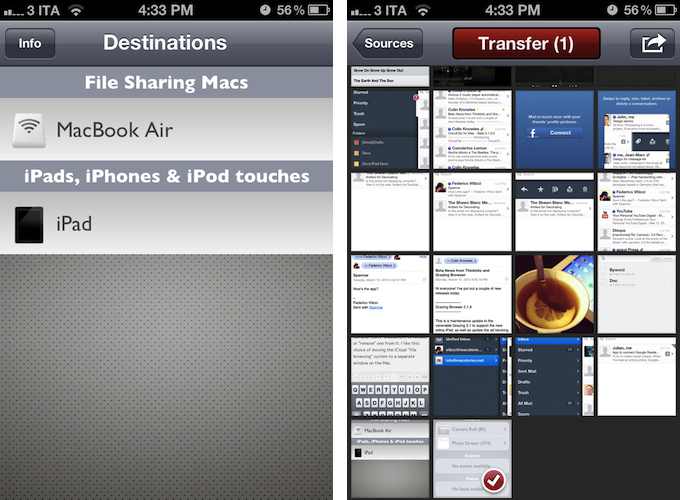
Previously known as PhotoToMac, Scotty is one of my most used apps on the iPhone. And now, thanks to two major updates released in the past weeks, I’ll be able to enjoy Scotty on the iPad as well.

Scotty transfers photos from an iOS device to a computer running OS X using a Mac’s native support for File Sharing. Once active, Scotty will look for a computer on the same WiFi network to initiate a file transfer; the app can pick photos from the Camera Roll, Photo Stream, Events, and Faces, and it’s capable of copying files to subfolders or any other location configured with File Sharing on OS X. The process of transferring files is largely unchanged from my review, only now Scotty has a new user interface design (I like it a lot better) and runs natively on the iPad.

Support for the iPad was introduced a couple of weeks ago and preluded the addition of a (very convenient) new functionality: Scotty can now transfer photos between iOS devices using Bluetooth or WiFi. Once installed on, say, an iPhone and iPad, Scotty will automatically recognize another device when the app is open and running in the foreground. To start a file transfer, you can select an iOS device, pick your source, and wait while Scotty copies the images over WiFi or Bluetooth. What’s really nice is that, whilst Scotty will have to be open during a file transfer, images will be copied directly to the iOS Camera Roll, and transfers to an iOS device pause and resume automatically if a device disappears/reappears from the network.

There is no doubt the introduction of Photo Stream has diminished the need of tools like Scotty for the majority of users. However, I believe there are still some scenarios in which an app like Scotty can become an invaluable utility. For one, if you’re a blogger, you’re going to need Scotty. Especially if you write news and happen to have iOS devices, Photo Stream isn’t the most reliable service to get screenshots inside a post quickly, and Scotty can help in getting images from the iOS Camera Roll directly onto your Mac in seconds. Furthermore, Photo Stream doesn’t work on 3G, while Scotty can transfer images over a local network or WiFi. And last, if you’re considering an entirely iOS-based photo editing workflow thanks to the recent release of iPhoto for iOS, you might want to consider Scotty to get your iPhone 4S photos on your iPad without waiting for Photo Stream.

Scotty isn’t as automatic and “invisible” as Photo Stream, but for this very reason I think it’s worth considering a purchase – it is the best solution I’ve tried so far to copy images from iOS to iOS, and from iOS to Mac. You can get Scotty at $2.99 on the App Store.


Sparrow for iPhone Review

Back in 2006, when Apple was still rumored to be working on a revolutionary mobile phone, many wondered if such device would be able to do core tasks like email and messaging as well as RIM’s BlackBerry. Months later, when the iPhone was officially announced at Macworld, the introduction of the device alone led some people to write that it was “already impacting its new competitors” – namely RIM, and its BlackBerry line of phones that had captured a great portion of corporate America. Yet, those people were right: the numbers are speaking for themselves now, and the many issues behind RIM’s poor management and marketing choices can be traced back to the iPhone’s introduction.

At Macworld 2007, a healthy-looking Steve Jobs said: “This is a day I’ve been looking forward to for two and half years. Every once in a while, a revolutionary product comes along that changes everything. […] Today we’re introducing three revolutionary products of this class.

Today Apple is going to reinvent the phone”.

Looking back at that day now, it’s a shared sentiment among those who have been following Apple for the past years that Steve touched his highest point in presentation style and product-unveiling skills with that keynote. Because while Steve may no longer be with us today, his words still resonate stronger than ever. On that day, Apple did reinvent the phone. And as it turns out, the revolution wasn’t just about multitouch and elegant hardware design.

It was about the software.

Later on during that keynote, Steve arrived at the third section of the presentation and iPhone feature set, which was also described as an “Internet communications device”. The first item in that slide was Rich HTML email – “for the first time, really rich email on a mobile device”, he said. Sure enough, the iPhone’s Mail app was demoed on stage to show off its rich HTML-parsing capabilities, which included inline images, rich text, support for phone numbers and web links, and more. When the iPhone went on sale six months later, on June 29, and debuted online to rave reviews from the press, many praised its email capabilities, among other things.

But then something happened in the following months. As Apple kept adding features to iPhone and refining its core apps including Mail, users and developers began wondering when Apple would allow for third-party apps to be installed on the device. For as much as Apple was adding new functionalities and fixes, there are always niches and sub-markets that Apple can’t address in new software releases – corporate email was one of them, as, admittedly, that were still several things Apple wasn’t adding to its email client to please business users from corporate environments. When Apple did confirm its plans to open up iPhone OS and offer an App Store, users wondered if it would be possible, like it still is on a Mac, to install replacements for the “core apps”, such as the browser, email client, or calendar application. In a somewhat unexpected and much criticized turn of events, Apple made it clear to developers that it would not accept third-party apps duplicating the functionality of build-in iPhone applications.

John Gruber has a good recollection of the events from 2008 – case in point MailWrangler, an email app that was rejected at the time.

I have a theory. It is more, well, emotional than logical. But it’s the only theory I can think of that makes any sense at all and fits the available evidence. The theory is that there is an unpublished rule that Apple — and in this case, where by “Apple” I really mean “Steven P. Jobs” — will not publish third-party apps that compete with or replace any of the four apps in the iPhone’s default “dock”: Phone, Mail, Safari, and iPod.

In the following years, in spite of App Store-related controversies showing up every once in a while, developers more or less “understood” how Apple’s approval process worked, and kept working on apps that would be “safe” for sale within Apple’s rules. Publishing a set of guidelines certainly helped in making things clear for everyone, but new apps that belonged to categories not mentioned in the guidelines would still appear in the App Store, forcing Apple to revise its guidelines or impose new limits. This often happens after new iOS technologies are made available to developers – a recent example is the banning of Notification Center utilities. However, one thing has been clear since MailWrangler’s rejection in 2008: full replacements for Apple’s system apps can’t be developed for the App Store. Developers can use the frameworks behind system features to develop third-party apps: Address Book companions, Calendar utilities, photo editing apps – these are all built using APIs and frameworks available publicly. The same has been true for browsers, which have to use Safari’s rendering engine, and alternative mail clients, which haven’t been exactly popular on the App Store, with the exception of Google’s Gmail app – an app that, however, is based on web views.

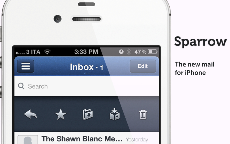
Today marks an important day in the history of the App Store. For the first time, Apple is letting a third-party developer sell a full-featured, custom email client that uses its proprietary email engine to iPhone users. Sparrow, already popular on the Mac and available on the Mac App Store, comes to the iPhone’s App Store today, and it promises to offer a newer, fresh take on email to lure back customers whose only choice since 2007 has been Apple’s Mail.app. Read more


Byword for iOS Review

Byword, the Mac app that I used last summer to write my MacBook Air review, has been updated today to include iCloud syncing on the Mac, and support for a brand new iOS app that briefly went live on Saturday, was pulled, and now is back on the App Store at $2.99.

Byword is a minimal text editor that works with the Markdown format and allows for easy exporting of plain text to a variety of formats including HTML, PDF, and LaTex. Unlike most minimal text editors these days, Byword for Mac has become popular among writers and bloggers (also) thanks to extensive support for keyboard shortcuts, built-in Markdown preview, and integration with Lion’s full-screen mode, auto save, and Versions. We have covered Byword on MacStories before.

The iOS version of Byword runs as a universal app on the iPhone and iPad, and I have been able to test it since its first release last week. Despite some initial issues with iCloud syncing, I was able to activate the functionality, and sync text documents across devices using Apple’s cloud service and Dropbox, which is also natively supported inside the app. Having tried both solutions, I can say that whilst the developers ensured the two syncing services would appear as “invisible” as possible to the user, iCloud seems a little faster at pushing and picking up changes made on another device. On iOS, upon first launch the app will ask you to choose a syncing service between iCloud and Dropbox – alternatively, you can go with none and save documents locally. If you choose iCloud, which I did, the app will show documents stored in the cloud from a sidebar on the iPad, or a dedicated screen on the iPhone. On both devices, you can switch back and forth between the browsing and editing interface with a single swipe on screen – I found this very intuitive and responsive. Syncing between iOS devices through iCloud has been remarkably stable for me in the past few days, allowing me to effortlessly push changes to this very article around in seconds. I also like how Byword for iOS is capable of updating changes “live” inside your document even if it’s already open but being edited on a second device. Read more


Camera+ 3.0 Review

Few iPhone apps have managed to substantially improve on the functionalities offered by Apple in its core system apps. Tap tap tap’s Camera+, a popular alternative to Apple’s Camera app, is one of them, and the 3.0 version released today takes a major leap in turning Camera+ into a more powerful solution to shoot, edit, and share photos online, as well as providing a solid foundation other developers can integrate their apps with.

The thing about Camera+ is that its lead developer and creator, John Casasanta, knows what people want from an iPhone app, and understands the rules behind viral marketing for software sold on the App Store. In spite of a 4-month ban that forced Camera+ out of the App Store due to a functionality the developers shouldn’t have hidden without telling Apple, the app has been an example of modern success in the App Store, granting its developers a renowned position in the top charts with millions of copies sold worldwide. But it’s not just about clever marketing (Casasanta also runs MacHeist, a website dedicated to promoting deals on Mac software that has amassed an incredible amount of followers in the past years). Camera+ is a very well-done app – from the polished user interface to the features it adds on top of Apple’s standard camera-related functionalities, Camera+ has become many users’ go-to camera app thanks to its enhanced view options, filters and effects, and elegant sharing capabilities.

With Camera+ 3.0, a free update for existing users, tap tap tap wants to refine every aspect of the app, whilst opening the door to third-party devs with APIs to offer Camera+’s features into other apps. Read more


OnCue 5.0 Brings Powerful Music Queue Features To iOS

These days, most of my music consumption happens on Rdio. The term “consumption” isn’t there because that’s how providers like to present content: I consume albums and artists that I discover online. However, for as much as I’m completely hooked to paying a monthly fee to get access to a (virtually) unlimited amount of music, there are albums that I still have to keep synced locally through iTunes. Either because Rdio applies some curious restrictions on several artists from Europe or because these artists choose not to make their music available for streaming (ask Coldplay), I have resorted to keeping a portion of my music synced on the devices I own (32 GB iPhone 4S and iPad 2, soon to be new iPad). And when I want to play songs from this “mini library” I sync, I stumble upon the same problem I initially wrote about last year: Apple’s Music app doesn’t let me create queues, and I loathe creating playlists for all possible scenarios my music listening habits may fall into. Just like last year, Dan Pouradi’s OnCue comes to the rescue, this time with a completely re-engineered version that works with iOS 5, and sports a new UI. Read more


Quick Review: Steps

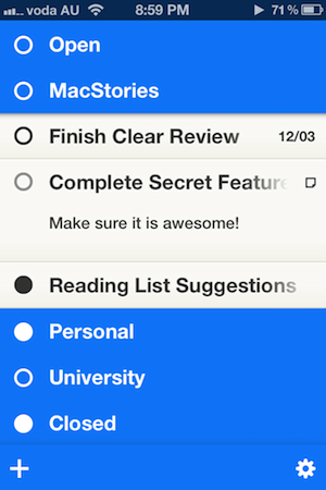
Nearly a month ago, Cody reviewed Clear. It was a new todo app from Realmac Software and Impending, and we called the app “delightful and clever” thanks to its refreshing take on how a todo app could work. Around that time I was let into the beta of another new todo app for the iPhone, and for the past month I’ve been using it intermittently — between giving Clear a go myself, using Things, and using nothing (as I so frequently revert to). That new todo app, Steps, debuted on the App Store last week and it shares many similarities to Clear - particularly in its minimalistic design and strong colour scheme.

Whilst preparing this review, I found myself in a bit of a dilemma. See, I kept constantly and subconsciously comparing Steps with Clear. As I said, they are quite similar because they both target the segment of the todo app market which aims to be super simple and minimalist. I felt as if I wrote this review as a comparison between the two, I would belittle the accomplishments of Steps, because whilst I think it’s a great little app, I also like the “delightfulness” of Clear a lot. But I think because the two apps are so similar in purpose and goal, it would be remiss of me to just ignore the excellence of Clear. So jump the break to see how Steps compares and how the two apps do diverge in some details.

Read more


Reddit Client Alien Blue for iPad Receives Major 2.0 Update

When I’m not writing, reading, or talking to my team, one of the things I like to do online is casually check on Reddit for the latest meme, links to interesting news, or more serious discussion that can only take place thanks to Reddit’s unique nature and community. And when I’m not using my computer, which is “most of the time” these days, I like to do so using Jason Morrisey’s Alien Blue, a Reddit client for iOS that I recently re-reviewed in its newest iPhone version, and that today received a major 2.0 update on the iPad.

Just like the 2.5 update for iPhone, Alien Blue HD 2.0 includes several interface changes to make the Reddit browsing experience more pleasant, as well as various new features that take advantage of the iPad’s larger screen. For instance, Alien Blue HD is already Retina-enabled for the new iPad, with the exception of launch images, which will be updated soon. But the biggest change in this version, new coat of interface paint aside, is the new panel-based navigation that allows you to seamlessly move through Alien Blue’s main sidebar – which lists Reddit sections and subreddits – and posts, comments, and web views. Inspired by Twitter for iPad’s panel-based UX, but much simpler to use, Alien Blue lets you swipe through panels to move around in the interface, or simple pinch on these panels to dismiss them. In fact, the entire app has been tweaked to allow for more gestures, as listed below:

  • Double-tap header for fullscreen
  • Hold-tap on Posts list to show post options
  • (Alternative) 2-finger swipe to show post options
  • 2-finger tap to upvote items
  • 3-finger tap to downvote items
  • 2-finger left swipe over comments to collapse to root
  • Drag Posts list up to load more

I’ve found myself using the double-tap and 2-finger tap gestures a lot, and I think they contribute to making the app faster and easier to use. A visual guide for gestures is available in the Settings screen as well.

There are several improvements and optimizations that found their way in this 2.0 update. The app now supports larger thumbnails, and you can view videos alongside comments in any thread. The post and comment interfaces have been redesigned, alongside the new pull-to-refresh gesture that works similarly to its iPhone counterpart (the subtle animation is pretty amazing). Image links and YouTube videos are now displayed more elegantly, and a new “Optimal” setting for web views enables webpages to scale intelligently to fit Alien Blue’s window. There’s more: you can now delete posts, and links to subreddits open directly within Alien Blue. The app sports Evernote integration to let you save posts in any of your notebooks, and you can check out a submitter’s details right from a post you’re viewing. There are new tags for NSFW posts, and Facebook and Twitter sharing have been fixed. There are dozens of little improvements and fixes in Alien Blue HD 2.0, so I recommend you check out the release notes for the complete list.

More importantly, I like how Alien Blue’s experience is still intact in spite of the interface changes and new navigation schemes. You can still switch to Canvas view to browse images as large thumbnails, and there are several themes to choose from in the Settings. The new UI doesn’t add weight to the app in terms of performance, as Alien Blue still scrolls smoothly and updates fast on the iPad 2.

Alien Blue HD 2.0 offers a rich and intuitive Reddit experience in a native app that comes with many options to interact with Reddit content and links submitted to the site. Even if you don’t spend hours on Reddit every day, the app still offers an incredibly polished experience that I recommend you consider if you’re planning on browsing Reddit from your iPad.

Alien Blue HD 2.0 is available at $3.99 on the App Store.