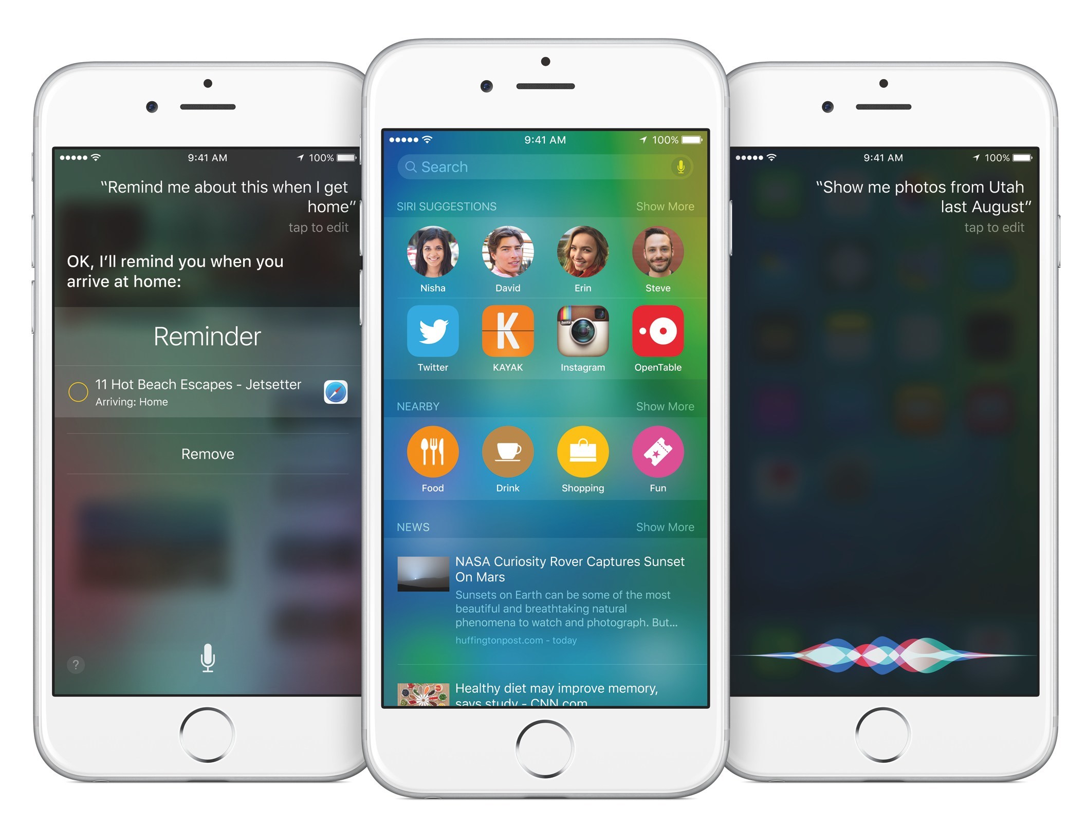
We’re rapidly approaching that time of the year when Apple introduces new iPhones, and BuzzFeed’s John Paczkowski reported last week that the event will be take place on September 9. There will almost certainly be a lot to talk about after the event (Paczkowski says that the event will include a new Apple TV and iPads), but one thing that I’ve been thinking about is what the new iPhone lineup will look like. This was all precipitated by the discussion on last week’s Talk Show with John Gruber and John Moltz.
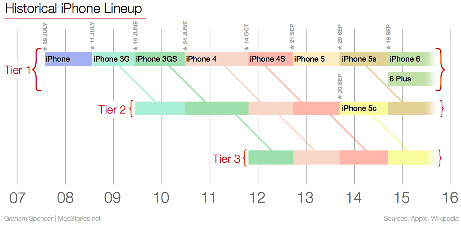
Because my mind was a bit fuzzy on the historical iPhone lineups (particularly the early years), I decided to go back and make a graph to simply and clearly show what Apple has done in the past. The dates I used were based on when each iPhone was available in the US (not the announcement date). Tier 1 represents the newest and most advanced iPhone available at the time. Although there are slight differences between the iPhone 6 and iPhone 6 Plus, they are largely identical (both have an A8 processor with 1 GB RAM, etc) and as a result I’ve characterised them both as Tier 1. Tier 2 represents the next best iPhone available (often the previous year’s Tier 1 model) and Tier 3 is the next best again.