This Week's Sponsor:

Turbulence Forecast

Know before you go. Get detailed turbulence forecasts for your exact route, now available 5 days in advance.


Posts tagged with "app store"

Average App Size Increased By 16% Since March

Average App Size Increased By 16% Since March

MacRumors points to new data by ABI Research, showing that, since March 2012, the average app size has increased by 16%:

The iPad 3’s Retina display and Apple’s more liberal submission policy have caused the file sizes of leading iOS apps to grow substantially, especially in games. The latest data from ABI Research shows that the global average app size across all categories was 23 megabytes in September, 16% more than in March.

On March 1, I wrote:

I see two solutions. Either Apple gets the carriers to agree to larger download sizes, establishing a new “average” that should work for most apps (let’s say 60 MB as Panzarino suggests), or they rebuild the download mechanism completely by allowing devices to “ignore” resources they don’t need. The second solution would be a “cleaner” approach, in that it would address the root of this likely scenario — that is, devices downloading apps containing all kinds of images and resources for Retina and non-Retina displays.

As we know, Apple decided to increase the maximum download size over cellular to 50 MB. This, combined with LTE networking, has allowed developers to be more relaxed in regards to their app sizes, and users to have reasonable download times on 4G (or DC-HSDPA). The solution I proposed earlier this year – a way to identify which assets to download for an app on a specific device – would still require a major rework of iOS.

Due to international pricing, this year I had to get a 16 GB iPhone 5. But I regret my decision. Something we’ve learned in the past two years (since the Retina display was introduced in 2010) is that that app sizes are only going up, and you’re never going to wish you got a device with less capacity. You’ll either be fine, or want more. With the iPhone 5 and Retina + Universal games, I find myself having to keep an eye on my available space, which is something I despise doing.

For the future, I hope 32 GB will become the new 16 GB, and I’m looking forward to 128 GB iPhones and iPads.

Permalink

iTunes and App Store Reminders with Recall

I don’t like some of the changes of the new App Store in iOS 6. That’s not a secret. But there is a single annoyance that goes way back before the iOS 6 days, all the way to when the App Store was relatively new in late 2008 and I got my first iPhone: the lack of a wish list.

I use the Wish List feature of iTunes a lot on my computer. Because I use iTunes mainly for buying apps and checking for updates, I rely on the Wish List to save interesting apps and games to check out later. However, I’ve dropped the occasional song or movie in the Wish List too.

The iTunes Wish List is simple and effective.

Too bad it doesn’t work on iOS devices.

While there have been some rumors on dedicated wish list features coming with an iOS update, in its current state the App Store (and iTunes Store) can’t use your iCloud account to sync items you’ve added to your wish list.

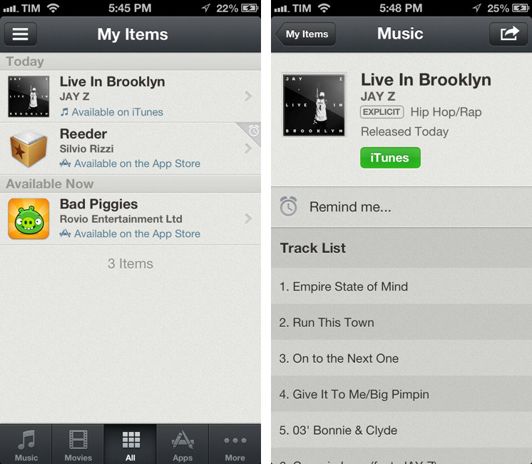
Recall by Overcommitted is not a wish list replacement in the sense that it’ll provide you with a list that syncs across devices. For that, I still use (and recommend) AppShopper, which is just phenomenal when it comes to tracking app updates and price drops with push notifications. Instead, Recall is about “never forgetting iTunes recommendations again”. It provides an alternative interface for the iTunes and App Stores, allowing you to save recommendations and create reminders for them. Read more


iOS 6 Concepts: Multitasking and App Store

iOS 6 Concepts: Multitasking and App Store

The past couple of days has seen a fresh round of new iOS 6 concepts surface online. Specifically, Rene Ritchie at iMore posted a series of mockups showing possible improvements for the current (poor) state of App Store search on the iPhone, while The Verge featured a forum post by member Sentry about multitasking on iOS.

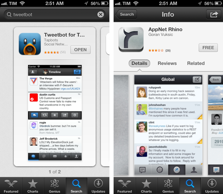
For the App Store, I’ve already largely discussed why I think the new interface represents a step backwards in several areas. Especially on the iPhone, discovery is hampered by a new card-based layout for search results that’s slow and makes terrible use of information desnsity on our device’s screens. Rene offers some interesting solutions:

Taking it one step further, Apple could implement the portrait interface they use for app categories and present a few horizontal list views. The first could present search results filtered by keyword relevance, the second by rating, the third by how many “friends” have the app, the fourth by recency of release, etc. So, for example, a search for “Twitter” could result in the official Twitter for iPhone app showing up first for relevancy, Tweetbot first for friends who have the app, and Flurry for most recent.

Filters are interesting. With iOS 6, not only does Apple have data from Genius and Game Center, they also have direct integration with Facebook and Twitter. I’m not sure this is a path Apple could go down with for such a core feature of the system, but it’d be curious to see, say, how a Facebook-enabled App Store could recommend apps that my friends are liking and using. I’m not sure about the privacy implications, but the appeal of such a functionality could be big for the average user who just wants good app recommendations.

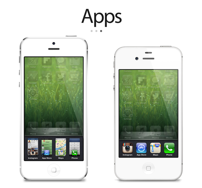
On The Verge, forum member Sentry has an elegant and very Apple-like take on how the multitasking tray could be improved. Practically unchanged since iOS 4, Sentry argues that iOS 6 should make better use of the extra screen space of the iPhone 5 for multitasking. Instead of proposing the usual Mission Control-like UI we’ve seen in dozens of mockups, he says that users are very entrenched into the simplicity of the multitasking tray: it shouldn’t change too much.

In an attempt to offer more functionality and features, they lose the core simplicity of the switcher which made it particularly usable to begin with. Some concepts use the entire screen space to display a grid of app previews, others only double the switcher height to include an extra row of icons. While both offer additional functionality, they actually hinder the flow and ease of app-switching. Whether it’s a full screen grid solution or displaying two rows in the switcher instead of one, both require more from your thumb than Apple’s original solute while tending to be overly brash in appearance as well.

I agree about the app switcher: it’s very easy to use, and, while geeks like us would like to have more options for “real” multitasking, typical iPhone users don’t have any problems with switching apps. I’m still not completely sold on the concept of live app previews for the switcher, but I know (at least I very much hope so) that Apple won’t change this part of the experience unless they come up with something better. An improvement that’s useful, not just different for change’s sake.

Check out the concepts by clicking on the source links above. Also recently: a great concept on how to enhance Spotlight by giving it Siri-like features based on text input.

Permalink

Good App Store Screenshots

Good App Store Screenshots

Speaking of good App Store practices for developers, Jen Gordon published (via Jeremy Olson) a nice overview detailing how users browse the App Store looking for screenshots and icons.

An app with a fantastic interface design will definitely increase sales. However, if all you publish are plain screenshots sans description of features and benefits – you’re missing a HUGE selling opportunity.

In the new iOS 6 App Store, icons and screenshots are more relevant than ever. Particularly with the new “cards” interface for search and genius, the application icon and first screenshot are what users immediately tend to look at, as titles get cut off after 12-15 characters and ratings have a smaller font than iOS 5.

On the other hand, because (on the iPhone) cards are displayed one after the other, developers have more chances to catch a user’s attention with good icons and screenshots. While swiping through search results, beautiful icons get immediately noticed, but the first screenshot has to instantly communicate the main purpose of the app, while showing some elements of its interface. It’s undoubtedly hard to find the right balance between communication and appearances (the coolest part of the UI might not be the most informative), but developers need to keep in mind that just like cards can get an app more visibility, it’s easy to swipe away to the next result.

Permalink

Dissecting The iOS 6 App Store

Dissecting The iOS 6 App Store

Justine Pratt has published (via TUAW) a very thorough overview of the new App Store in iOS 6.

The new AppStore, especially the cards, was really designed for the iPad and the faster processor of the iPhone5. Finally the stores on both devices are common, which should help increase the familiarity when browsing both stores. On older devices, the icons and graphics are slow to load and the cards are slow to scroll on the iPhone. This situation is only temporary, as new devices are released and adopted.

In my iOS 6 review, I took an extensive look at the App Store, its new features, and its most apparent shortcomings; Justine does a much better job at carefully analyzing every single section and change in App Store layout and category organization. I also learned a few tidbits from her overview, such as the new positioning of the “App Support” button next to reviews.

Interestingly, we both came to the conclusion that the new App Store seems to really be optimized for the iPad in terms of layout. In the past few weeks, following the release of iOS 6, I’ve heard quite a few people saying that the opposite was true – that the cards layout was meant for the iPhone first, and eventually brought to the iPad with a larger UI design.

Overall, the App Store still has several visible and deeply annoying bugs that hinder the performance of search, Genius, and Purchased History. Apple still hasn’t fixed many of these, and the improved speed of the iPhone 5 only partially contributes to making the browsing experience slightly better.

As I wrote in my review, there are still some noteworthy additions and changes for developers in the new App Store, so make sure to check out Justine’s article for a detailed analysis.

Permalink

Enforcing Rule 2.25

Apps that display Apps other than your own for purchase or promotion in a manner similar to or confusing with the App Store will be rejected

Earlier today, a number of people noticed a change in the App Store Review Guidelines that took place back on September 12. Specifically, Keith Andrew at PocketGamer noted how the new rule 2.25 could pose serious risks for any app that promotes other apps with direct linking.

The wording is typically vague, but clause 2.25 appears to give Apple carte blanche to put any app that promotes titles from a different developer out of action. At the moment, we understand Apple’s likely prime targets are pure app promotion services, such as (but not necessarily including) FreeAppADay, AppoDay, AppGratis, Daily App Dream and AppShopper, amongst others.

Matthew Panzarino at The Next Web and Darrell Etherington at TechCrunch followed up on the news of the late “discovery” with more details on possible implications and comments from developers of apps that might fall under rule 2.25.

There seems to be a lot of confusion on Twitter in regards to the exact scope of this new rule. In particular, due to some poor sensationalistic headlines that are unfortunately published on a regular basis, some are speculating Apple will start banning all apps that promote other apps or any kind of “aggregator” that collects links to multiple App Store apps. That’s just silly and simply not true. Read more


Drafts 2.0: New Fonts, New Look, A Brand New Kind of Sync, And Now On iPad

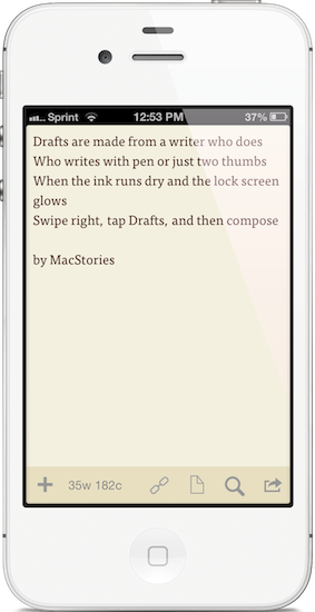
"Drafts are made for a writer who does. Who writes with pen or just two thumbs. When the ink runs dry and the lock screen glows. Swipe right, tap Drafts, and then compose."

“Drafts are made for a writer who does. Who writes with pen or just two thumbs. When the ink runs dry and the lock screen glows. Swipe right, tap Drafts, and then compose.”

I like to think of Drafts as the Field Notes of iOS. It’s inexpensive yet of high quality, unassuming but sharp, highly portable and convenient. While the icon, a simple white chiclet key, doesn’t emphasize Draft’s suave user interface, it is symbolic of the keyboard shortcut for Safari and other browsers, where ‘command + D’ adds the open webpage as a bookmark. The name Drafts itself may curtail ideas of long-form note-taking, although it’s not antagonistic towards writers feeling inspired to write more than a few sentences. Drafts is considerably the everyman’s notebook, unfraught with bindings and covers, instead fitted between two panes of glass in Apple’s iPhones.

Drafts, for those whom haven’t read the original review, is simply a digital notebook for capturing thoughts, lists, and ideas in plain text or Markdown. Those ideas can then be shared with social networks like Twitter or Facebook, your email or calendar, with friends on Messages, to a capturing tool like Evernote, or into a folder on Dropbox. If you’d like, you can use it like Birdhouse for drafting Tweets, or you can use it like Notes for grocery lists and reminders. No matter how you use it, your journal is held together in a simple list, organized by date last accessed, and is quickly searchable.

Read more


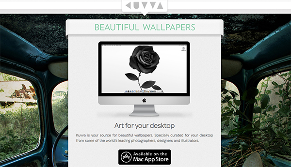
Kuvva — Beautiful Art For Your Desktop. Automated.

Currently, in the San Francisco Museum Of Modern Art, you can visit an exhibition with works of Japanese photographer Naoya Hatekayama. He has a very extensive portfolio of stunning landscapes, buildings, and Tokyo underground photography, which reach very high auction prices. One of his underground photos really caught my eye, and I dreamed of having it as a homescreen wallpaper for my iPad. I desperately tried to find digital copies of his works, regardless of whether I could get them for free or had to spend some money. But usually, professional photographers, including Hatekayama, only show their work to the public through museum exhibitions and printed photo books, not digitally. This way of publishing art has both advantages and disadvantages: on one hand, printing is the only effective way of keeping the copyright handling of your pictures and piracy of digital copies somewhat under control. Yet, it also means that many people interested in photography, especially those who do not live in big cities with renowned museums exhibiting photography, don’t have access to it. And obviously they cannot be used as wallpapers (although this would be for private, non-commercial use).

On the other hand, art which was created digitally is most of the time solely distributed digitally, hence it’s often available as a free download. However, when it comes to wallpapers for both OS X and iOS, I personally prefer photos over digital art. Of course, real pixel lovers need good resources for both kind of background images to ensure their displays are always a pleasure to look at. Websites like InterfaceLift or Poolga may completely satisfy your needs for photographic and digitally crafted backgrounds, but you always need to rely on multiple resources, which means you have to spend a lot time searching, saving, and organizing. Kuvva, founded by @djbradfield and @Nalden and based in Amsterdam, is a new web-based application project that tries to solve this problem by building up an extensive resource of handpicked photographs and digital wallpapers you have fast and easy access to. Read more


Apple Builds Mosaic With Deconstructed iOS Icons for Store Opening

Apple Builds Mosaic With Deconstructed iOS Icons for Store Opening

As noted by iPordelante (via ONE37), Apple has built a unique billboard to announce the future opening of a new retail store in Barcelona, Spain, at Passeig de Gràcia. In pure Gaudí style, Apple has actually built a mosaic off pieces of deconstructed iOS app icons, such as Safari, Photos, and iTunes.

A demonstration of Apple’s typical attention to detail, the mosaic for the upcoming Apple Store also shows how the company cares about the particular aspects and unique traits of a retail location, from marketing to gadgets.

In the past, Apple used iOS icons to build an animated wall at WWDC 2010; this year, they used App Store application icons to create an interactive “app table” for WWDC ‘12 attendees.

Check out more photos here.

Permalink