This Week's Sponsor:

Turbulence Forecast

Know before you go. Get detailed turbulence forecasts for your exact route, now available 5 days in advance.


Posts tagged with "app store"

Thoughts on Nike+ Move for the iPhone

The waveform as shown in motion. It’s mesmerizing.

While not their own, it seems strange that an app Apple showcased on stage in September wouldn’t be available until early November, especially since it’s a major bullet point for one of the iPhone 5s’ key features. Designed exclusively[1] for use with the M7 coprocessor, Nike+ Move is one of the iPhone 5s’ most anticipated apps, expected to set the bar for fitness apps and demonstrate how useful Apple’s new motion technology actually is.

While Nike has stated the app provides an introductory experience into the Nike+ ecosystem, I’m not sure if I’m left wanting more. The app is pretty good, despite being an obvious gateway to other Nike products such as the FuelBand[2].

There’s two things I’ve learned about NikeFuel, the universal system used to measure your activity throughout the day: it’s a much better way to measure activity than step count, and it’s much more adaptable to a wider variety of exercises. NikeFuel doesn’t discriminate against how you move, so long as you get off your butt and get active.

Ultimately, the Nike+ Move app on the iPhone 5s, provided you have one, makes me question wether you need a separate wearable device. My opinion boils down to the M7 coprocessor and how it’s able to determine what you’re doing at any given time.

The problem with wearable fitness devices is that they’re geared towards urbanites, with companies suggesting potential buyers to get fit by stepping out of the office and taking a stroll around the block. They record steps counted, calories burned, and distance climbed, but that’s a rather narrow view into the world of activity and personal fitness[3]. And they’re step counters tied to your wrist, which don’t yet have robust algorithms to differentiate between walking and other activity to be considered reliable pedometers.

Apple’s M7 coprocessor is baked into a device you already have with you. It knows when you’re driving, and it knows when you’re walking vs. running[4]. Being in a phone, it’s also not locked to your body, and it doesn’t (hopefully) end up in the wash. Combined with NikeFuel, you end up with a surprisingly honest fitness device.

Adding to that potency is Game Center support. I don’t have to sign into a separate social network, join a new community, or find my friends. They automatically show up in the Nike+ Move app, and suddenly the idea of gaming my fitness vs. my friends actually works. Not only do I want to get active, I’m motivated to stay active.

Nike+ Move adds a ton of value to the iPhone 5s. It’s free, and for most people, it obviates the need to purchase a separate fitness device[5].

There’s six sections in the Nike+ Move app that break down your activity into various charts and info graphs. At its worst, Nike+ Move is a marketing tool disguised as a fitness app. At its most, it’s the iPhone’s best fitness app solely because the concept is simple: beat your score.

Apple keeps a log of your movement data on the iPhone so that other apps can tap into it at a moment’s notice. This means that you’ll effectively have a good baseline of fitness data to start with when you open a fitness app on the iPhone, and Nike+ Move is certainly no different, which averages the prior week’s total from the get-go.

The app encourages you to get moving, not only to match the prior day’s score, but to go above and beyond. It’ll tell you when you’re behind your average, remind you to “win the hour” by staying continually active for a 5 minute workout, and pit your score against people nearby in addition to Game Center friends to up the ante.

Nike+ Move provides a very similar experience to the Nike+ FuelBand App, lacking only a few features such as move reminders, session recordings (useful for tracking specific workout activity), and sharing successes with the Nike+ community. I’m impressed that the Nike+ Move app offers so much.

The downside is that the app is borderline an advertisement for other Nike+ products. Nike really wants to get people who download in the app to further invest themselves in their community and products, but I really need a solid reason to own a FuelBand considering this app has all the key features in place. I feel a bigger opportunity would be having a shop link in the app menu for directing people to Nike’s store for shoes and apparel[6] so people can gear up in ways that are more beneficial. With the phone having access to location data, there’s a lot you can do there with local and seasonal apparel suggestions.

Fortunately the ads are tucked into menus or hidden in stat info that you don’t have to tap on. In fact, the app is pretty good about just relaying your activity info. There’s no pressure to buy, and I’m sort of interested to see if Nike begins to add advanced features via in-app purchases for people like me who don’t see a need for the hardware component.

The app does require you to sign in via a Nike+ or Facebook login, and I chose the former rather than the latter. The login process feels like an unnecessary step for an otherwise good app, but on the bright side all of your activity data can then be taken to another device if you upgrade to a FuelBand or switch phones down the road.

Once you log in, Nike+ Move requires you to get moving before you can poke around and view your baseline data. A set of jumping jacks with the phone in hand will do the trick.

I don’t know if I need to go through all of the charts and graphs the app offers since they’re all self explanatory. There’s a few different ways Nike+ Move relays your activity, including a central NikeFuel counter, a daily line graph, and a weekly bar graph, but the one that people might raise questions is the location graph.

Nike+ Move asks to keep tabs on your location throughout the day, effectively keeping the location indicator in your status bar on all the time. While the app keeps tabs of your location in the background, I haven’t noticed any real noticeable battery drain (and I’m already running apps like Automatic in the background in addition to other apps that take advantage of geofencing).

These circles get bigger depending on how much you got active, not necessarily outlining the entirety of where you got active.

You can opt out of Nike+ Move’s location features, but they’re perhaps Nike+ Move’s coolest. Basically, the location graph puts big activity bubbles over (very general) areas that you’ve got active in. If you choose to compete with people nearby, you’ll likely end up competing regionally rather than hyper locally. It’s less like a FourSquare check-in and more like a neighborhood scoreboard. Just keep in mind your Game Center name and photo will be public.

I’ve talked a lot about an app that’s free, so at this point you should just download it if you haven’t already. I’m surprised that the app isn’t featured in this week’s Featured top banners on the App Store, but at least it’s found a spot in the enhanced collection.

Nike’s polish on Nike+ Move is remarkable, especially for the price of free. Lots of graphs and activity info is in motion, and Nike’s color palette is bright and captivating. Complaints about the app boil down to login issues, and I have to admit I’ve been logged out of the app at least once (but with no loss in recorded data).

The bigger story here is that the iPhone 5s is now officially a serious fitness device to be contended with. I’ve said before that the M7 in the iPhone 5s is Apple’s testbed for a potential wearable, but now I’m asking if they even need one.

Nike+ Move doesn’t break down nuanced data, calories burned, or supplement data with lifestyle information with nutritional plans. What it does do is encourage people to be just a little bit more active each day, and I think that’s absolutely enough for most people. Athletes who want more can have more, and that’s where the FuelBand, GPS running watches, and other fitness devices like heart rate monitors become compelling. For the rest of us? I’d say we’re set.

Download Nike+ Move from the App Store.


  1. While the App Store’s compatibility information states the app is ready for iPod touches and iPads running iOS 7 as well, Nike’s app description states: “iPhone 5S is required to get motivated with Nike+ Move.” ↩︎
  2. Can we talk about something Nike? On the product page it’s spelled Fuelband. On the press release and store page it’s spelled FuelBand. Standardize the CamelCase yo. ↩︎
  3. Personally, I find fitness programs like Wii Fit and Nike+ Kinect Training much more interesting than wearable technologies. Wearable devices don’t account for where people are, how people are moving, or reliably count steps. For suburbanites, wearables (aka pedometers) are a hard sell because the time to conveniently get active is going to be at a shopping center or around the neighborhood before or after work (large chunks of time are spent commuting). I don’t know about you, but it’s also not so easy to get outside in the cold of Winter. ↩︎
  4. I had to stop using the Jawbone UP because I got frustrated with the fact that it counted steps when I was driving. Plus the band ultimately gets in the way when you want to type at a keyboard, and while its sleeping data was useful, the textured band snags too much on bedding to be comfortable. If you sleep on your side on a box spring mattress, the UP’s morning alarm will loudly vibrate the bed, potentially waking your significant other. ↩︎
  5. I talked about this a little bit when I was invited onto The Menu Bar, but to me, the M7 coprocessor is the iPhone 5s’ most interesting feature. Yes: more so than Touch ID. ↩︎
  6. One of the views reveals how you moved, breaking down running, walking, and other movement statistics. Depending on what stat you tap on, you’ll get a pop-up telling you which product would better track that stat. ↩︎

Fantastical 2 Review

Fantastical 2 for iPhone

Fantastical 2 for iPhone

Last month, I was discussing my schedule for this Fall’s check-ups with my oncologist. During our conversation, she asked me if I had a list of all the appointments and todos that I had saved for the next weeks because she couldn’t find the department’s calendar and she doesn’t save patients’ information in her personal one.

I know that my doctor has an iPhone, and I know that she uses Apple’s Calendar and Reminders apps to manage her own schedule, so I showed her the beta of Fantastical 2 that I had on my iPhone.[1] “You can search for events and reminders that match a keyword or location and get a single list showing all results”. She was intrigued. “For my appointments here, I save them with the hospital’s name, so I can just look for that if I want to see them all at once”. At that point, I’m pretty sure she was sold on the app. “But you can’t buy it yet”, I added with a subtle smirk.

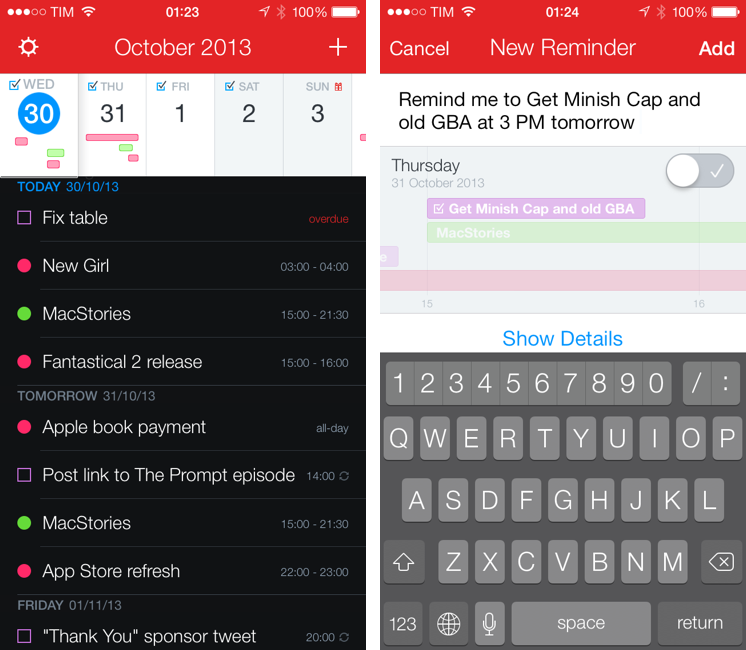
Fantastical 2 for iPhone, released today on the App Store and on sale at $2.99 for a limited time, is one of the best iOS 7 apps I’ve tried so far and the best calendar and reminder client for iPhone, period. It improves upon several aspects of the original app and it introduces powerful new features while sporting a complete redesign that makes the app feel at home on iOS 7 without compromising its identity.

Fantastical 2 is, for my workflow, better than Apple’s built-in apps, and it builds upon the solid foundation of the original Fantastical to offer new functionalities and more flexibility. Read more


Tweetbot 3 Review: Human After All

Tweetbot 3 for iPhone

Tweetbot 3 for iPhone

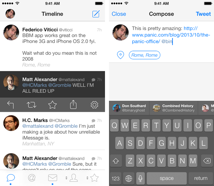
Tweetbot is, by far, the iPhone app that I use the most on a daily basis. It’s not just that I keep Twitter open essentially all day to check for news, talk to friends, or post GIFs: since I got the first beta of the original Tweetbot three years ago, the app has become so ingrained in my workflow that I wouldn’t be able to switch back to any other client that doesn’t have the same capabilities. What started as a moderately advanced take on Twitter clients by Tapbots has evolved with time into a powerful app that spans three platforms and that comes with dozens of unique features and a solid engine that, for me, has no equal. I don’t say it lightly: because of Tweetbot’s feature set, I have been able to reliably communicate with other people (via DM or Mentions), reference tweets for articles, or build complex workflows that have allowed me to be more efficient, faster, and generally happier with Twitter.

That’s why I take major changes to Tweetbot’s overall structure and design, such as Tweetbot 3 for iOS 7, very seriously. Tweetbot 3, released today as a new app sold at $2.99 on the App Store (launch sale), is many things at once: it’s Tapbots’ first foray into the iOS 7 design aesthetic, which marks a radical departure from the small studio’s former visual style; it’s a profound reimagination of Tweetbot’s looks, animations, and sounds, which had gone largely unchanged since 2011; and it’s a confirmation of Tweetbot’s existing feature set with changes aimed at further enhancing the app’s functionality and making room for future additions. It’s iPhone-only, with a new version for iPad coming next.

I have been using Tweetbot 3 every day on my iPhone 5 for the past couple of months. I think that I have a good understanding of the decisions behind the app’s redesign, feature changes, and complete embrace of iOS 7’s visual and hierarchical approach to building interfaces. With version 3.0, Tweetbot, the robotic toy for your Twitter stream, eschews its mechanical roots and graduates to a modern, fluid, and fun assistant that, in the process, is still Tweetbot. I wouldn’t be able to go back to the old Tweetbot now, but I also think that getting used to the new app will take some time. Read more


CameraSync Updated for iOS 7

CameraSync

CameraSync

In my Boxie review yesterday, I mentioned the role of the official Dropbox app on my devices:

Boxie is so feature-rich, I want more from it: there’s no iPad app at this point, and I would love for Tapwings to consider an automatic upload feature for photos that would allow me to completely eschew the official Dropbox app. Right now, the only reason I keep Dropbox on my devices is for the iPad client and automatic background uploads, but, for everything else, I’m doing just fine with Boxie and I enjoy the increased efficiency made possible by the app’s feature set.

I should clarify two points: the Dropbox app is also the easiest way to authenticate with your credentials for third-party Dropbox-enabled apps; and, in a sweet coincidence, CameraSync has been updated today with a new design and bug fixes for iOS 7, which means I have turned off Camera Uploads from the Dropbox app again. Read more


Boxie Review: An Alternative Dropbox Client for Power Users

Boxie for iPhone

Boxie for iPhone

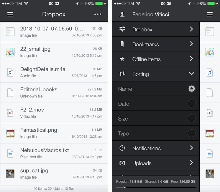
Dropbox is my filesystem. Every file that I need to have available across devices and that doesn’t require the rich text and search capabilities of Evernote goes into my Dropbox account: screenshots that I share with coworkers; PDF copies of my receipts and invoices; articles written in Editorial are stored in Dropbox. Even my photo backup workflow relies on Dropbox as an archival system that’s always in the cloud, readily available and easily shareable. With the Packrat feature, a $39 yearly add-on, I get access to the full history of my deleted files and file revisions, which have saved me on several occasions in the past.

The official Dropbox app for iOS is good, but it’s not great for power users and it hasn’t been substantially enhanced for iOS 7 yet. That’s what Italian developers Matteo Lallone and Gianluca Divisi (together, Tapwings) want to fix with Boxie, a $1.99 third-party Dropbox client for iPhone packed with advanced features and navigation options. I’ve been testing Boxie for the past month, and I think that it’s off to a solid start. Read more


Weather Line Review

Weather Line

Weather Line

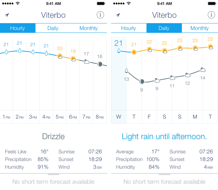
I am not a weather nerd. I don’t commute to work[1] and I don’t need to know the percentage of precipitation and humidity for the next three weeks. I spend most of my days in Viterbo and Rome, where the weather isn’t particularly crazy; I never get to try the fancy weather apps with Dark Sky integration and “radars” because those features don’t work here. You may argue that I’m forced to be a casual user of weather apps; I honestly believe that I don’t need to know everything about the weather to have a good day. I don’t travel much, and therefore I rarely need to plan my trips according to weather conditions. I enjoy simple weather apps like Today, Yahoo Weather, and even Apple’s built-in Weather app for iOS 7 because they display all the data I need without overwhelming me with terminology I don’t understand.

This is why I was curious to try Ryan Jones’ Weather Line when he emailed me a few weeks back. His pitch was simple: “I had this idea for a weather app, and I’m great at making charts”. Sure enough, I remembered Jones’ work on the iPad mini “price umbrella” chart from last year, and he seemed confident enough in his app to convince me to try it. Weather Line is available today at $2.99 on the App Store, it’s iPhone-only, and it is one of the nicest and most unique weather apps I’ve tried lately. Read more


Terminology 3 Review

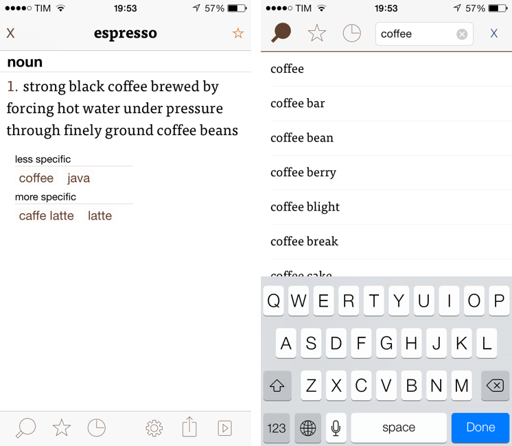
Less popular than Drafts but equally impressive in terms of functionality and inter-app communication, Greg Pierce’s Terminology, a dictionary and thesaurus app for iOS, is relaunching today for iOS 7 with a new Universal app that adds sync, configurable actions, and a redesign that matches iOS’ new general aesthetic. I have been testing Terminology 3 for the past few months, and this new version holds up to expectations by honoring Terminology’s tradition of simplicity and bringing powerful new features.

We first reviewed Terminology in 2010, when it was an iPad-only app that already showed how developer Greg Pierce wanted to focus on words and definitions rather than heavily custom graphics and fancy effects. A few months after the iPad version, Pierce released a standalone iPhone version, called Terminology Ph, that carried all the features of the tablet counterpart onto the smaller screen; a year after version 1.0, Terminology 2.0 was released, refining the user interface and adding new app integrations. Throughout 2011, 2012, and the better part of this year, Pierce maintained Terminology with compatibilty updates but otherwise focused on Drafts, which, as MacStories readers know, has contributed to redefining iOS automation and the idea of a “quick notepad” for iOS.

The new Terminology represents a break from the past, fully embracing iOS 7’s new design philosophy and offering customers an easier purchase experience with a Universal version. As a new app, you will have to buy Terminology again – something that is perfectly acceptable after three years of usage of the same app. Read more


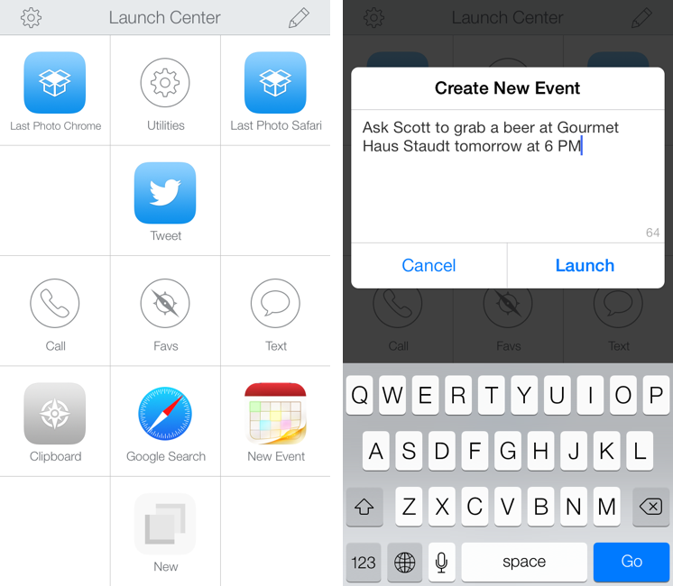
Launch Center Pro 2.0 Review

Launch Center Pro, developed by Contrast (née App Cubby), can be considered the app that spearheaded a small revolution among iOS power users. Initially envisioned as a Notification Center tool, following an Apple rejection in late 2011 the app was released as Launch Center; in the summer of 2012, App Cubby completely reworked the inner workings and design of Launch Center and turned it into Launch Center Pro, allowing users to create custom actions with personalized URL schemes and therefore kicking off a series of months that saw the apperance of several other apps focused on actions, URL schemes, and automated workflows. In looking back at the past year of iOS automation, I think that Launch Center Pro 1.0 was a major turning point in that it proved that many iOS users wanted to create actions and workflows to save time and be more productive.

In March 2013, App Cubby released Launch Center Pro 1.1, which focused on TextExpander integration in URL schemes, Action Composer tweaks, and deeper system integration with clipboard actions for text and more. The app’s library of supported third-party apps kept growing as more developers took the opportunity to address the interest sparked by Launch Center Pro to add URL schemes to their apps. I remember, however, that back then App Cubby’s David Barnard – the same developer behind the recently released and successful weather app Perfect Weather – started telling me about his plans for the future of Launch Center Pro and expanding to other supported services, apps, and devices.

With today’s Launch Center Pro 2.0 for iPhone, a free update for existing customers, Contrast wants to ask: in the era of Drafts actions and Control Center, can Launch Center Pro still have a spot on a user’s Home screen, and possibly in the dock? Read more


Blur 2.0

The new version of Blur, an app to create blurred wallpapers for iOS 7 that I mentioned a while ago, includes a new feature to generate a random wallpaper by tapping a button. What’s nice is that Blur loads random photos from Flickr, displaying a link to the original photo at the bottom of the screen. It’s a cool idea and it can generate interesting wallpapers that you wouldn’t be able to create off your own photos.

Blur is $0.99 on the App Store.

Permalink