This Week's Sponsor:

Turbulence Forecast

Know before you go. Get detailed turbulence forecasts for your exact route, now available 5 days in advance.


Posts tagged with "iOS"

The Case for an iOS Aperture


I’m not usually one for making baseless predictions about what Apple’s going to do next. There are plenty of people who already do that, and I’m generally more interested in their current affairs than in unconfirmed rumors. But there are exceptions to every “usually”, and today I want to try my hand at speculating.

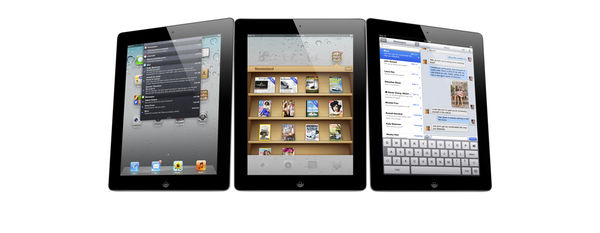
Though we tend to forget about them after the fact, iPads have always debuted with iPad versions of some of Apple’s biggest apps. The original was released alongside iWork, to show that the iPad could do real work from day one (never mind how many people derided it as a consumption device for months). The iPad 2 brought an iPad-optimized version of iMovie and GarageBand, which expanded the boundaries of what everyone thought could be created with a touch screen.

Now Apple is on a photography kick in a big way. Not only have they been relentlessly improving the iPhone’s camera since the 3GS, they have also added important and useful features in iOS 5 in the form of basic photo edits, built-in HDR and composition grids, the ability to organize albums, and Photo Stream, which near everyone agrees is their favorite feature of iCloud.

Given all that, I think that the next big Apple app to make its iOS debut will be Aperture, alongside the iPad 3’s inevitable announcement. Our own Cody Fink has written about the possibility of Aperture for iOS before, but there are a number of reasons why the timing for it makes sense now.

Retina Display
The one thing everyone expects about the iPad 3 is that it will finally get its long-awaited Retina display. It’s also the feature that everyone is most looking forward to (and for good reason, seeing what a huge difference it made when we first saw it on the iPhone 4). Of course this display will be great for reading and writing text, but what better way to really show it off than with photography, where the crispness and clarity of the display will be readily apparent?

A6
Another all-but-certain feature everyone agrees the iPad 3 will have is a quad-core A6, the next evolution of Apple’s A-series mobile processors. Like the A5, this chip will surely include vastly improved CPU and graphics performance over its predecessor, and in addition to games a great way to demonstrate it would be an iOS version of Aperture that shows how fast and fluidly the iPad 3 can manage tons of photos and perform complex image edits.

Photo Stream
Given Apple’s current photography kick the iPad 3 is likely to have better cameras than the iPad 2, but even if they’re not as good as the ones on the 4S —which, given how poor the ones on the 2 are compared to even the iPhone 4, seems likely— the brilliant thing with Photo Stream is that they don’t have to be. With Photo Stream, every photo you take on your 4S, your iPad 3, or even on a DSLR (once it’s been imported into iPhoto or OS X Aperture) would be available on your iOS Aperture library without you having to lift a finger.

iCloud Metadata Sync
We know iCloud is a big part of Apple’s strategy, and is only going to get bigger as time goes on. I can see iCloud playing a big part in Aperture on both iOS and the Mac. Any photo tagged, edited, or organized in one version of Aperture could be automatically mirrored with those same changes on another. Naturally this won’t make sense for current large Aperture libraries, but perhaps there will be a special iCloud section on the Mac version (like how there’s already a section for Photo Stream) specifically for photos that have been edited in this way.

Another Desktop Need Eliminated
iOS 5 may have given us “true” post-PC devices that could finally be used independently of our old-fashioned mice and window-based systems, but many people still need traditional PCs to store and manage digital photo collections. Aperture for iOS (along with iCloud and higher-capacity iPads) could be the next natural step in the iPad’s evolution towards being the only computer that 90% of people need.

Like I said, I don’t usually care to make baseless predictions, and everything here is certainly that. I have no idea if Apple will do any of this or not; for all we know they could be readying iOS versions of Logic and Final Cut Pro instead. But when you consider what the combination of Aperture for iOS with a retina-enabled iPad 3 could do, I think we may very well be seeing this alongside its announcement.


One More Thing: Open photos in any iOS image editor
This is more of a wish than a guess, but just like Aperture on the Mac I would love to see Aperture on iOS have the ability to open any image in any of the great image editing apps that already exist for iOS (with the ability to roundtrip them back into Aperture, of course). I have even less of an idea as to whether Apple will do this than I do my above speculations. Perhaps we will have to wait for a future version of iOS that better lets us share data between apps. But when and whether it happens or not, I think it would be a great way to let Aperture for iOS coexist happily among the many photo apps that iOS users already know and enjoy.




The iOS-ification Of Apple’s Ecosystem

Today’s update to AirPort Utility for Lion reminds me of a topic I was willing to write about but eventually left in my nvALT queue due iOS 5 (review) and iCloud, various app releases, and the usual news from Apple in the past months. The iOS-ification of OS X is, at this point, inevitable, and anyone who doesn’t see it, or tries to neglect, is either software-blind or has some kind of interest in that way of thinking.

I am looking at my Mac’s screen right now, and I can count dozens of iOS-inspired elements now co-existing with “old school” Aqua interfaces and controls. This transition obviously started years ago, and in retrospect it’s hard to dig up the very first example of iOS-ification on the Mac, so let’s just take a general look at the things we have today:

iPhoto (updated in 2010);

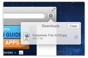
Safari’s popover for Downloads;

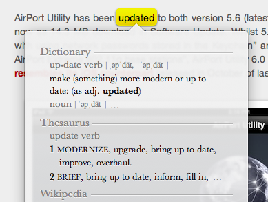
Safari’s tap-to-define;

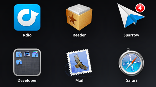
Launchpad;

Linen;

Settings;

Mail;

iCal;

Address Book;

FaceTime (released in 2010);

And now, the new AirPort Utility.

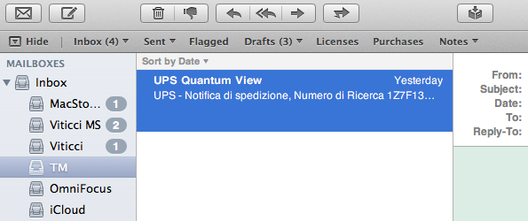
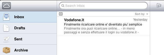
Of course, many great writers have already written about the general concept of graphical resemblance of Lion (our review) to, say, an iPad, noting how several iOS apps and UI schemes have been ported down to the last pixel to OS X. The screenshots above should provide some context.

Today’s (relatively minor) software update reminds me, however, that the iOS-ification goes far beyond simply converting graphics and updating apps from one platform to another. It is actually more a conversion of the entire Apple ecosystem to an iOS-inspired system of graphical elements, user interactions, business models, user experience paradigms, and functionalities. The iOS-ification isn’t simply visual, it’s a fundamental shift of strategy that, ultimately, I believe begins and ends with iCloud – something that I have discussed before.

Sure, many apps look the same across iOS and Lion now. Some features have worked the other way around, finding their way from OS X to iOS, such as Safari Reader and over-the-air software updates. Others weren’t ported – they were released at the same time across two platforms, such as Reading List (which fits in the bigger iCloud plan). From the user experience standpoint, there’s plenty of iOS goodness to go by in Lion: full-screen mode and Auto Save + Resume give users an iOS-like environment for working with apps and never lose data; natural scrolling and gestures have unified the way a user moves content around and interacts with the operating system; the Home user’s Library directory is not visible by default in Lion, eliminating an important piece of filesystem from the default configuration of the OS.

Then there’s the business side of the ecosystem. Both iOS and Mac apps have to be sold through the App Store, with Apple retaining a 30% cut off every transaction (Update: Mac apps can still be sold outside of the Mac App Store. Many have debated, however, that going forward the obvious path is the Mac App Store, with some feature such as iCloud integration being Mac App Store-only). Just like on iOS, Mac developers will soon be forced to implement sandboxing, which limits the access a third-party app has to the filesystem. And, obviously, boxed software is going away, leaving much retail room to Mac and iOS devices showcasing the App Store. Or shelves filled with iOS accessories.

iOS-ification isn’t merely graphical: I believe someday, very soon, almost every aspect of Apple’s operations will be iOS-inspired or iOS-unified: from hardware design to user interfaces and app distribution, from developer guidelines to marketing and the way people “see” Apple these days. Those who got to know Apple in the past five years likely already think of it as “the iPhone company”, and rightfully so for a business largely based on revenue coming from iOS.

There are many questions left unanswered and open to speculation. Will the Mac adopt iOS’ Home screen concept (and shortcomings) in the future? Will the next version of iWork for OS X look something along the lines of this? Will Mac-only applications (and thus Mac-like from a UI standpoint) like Aperture, Final Cut and iBooks Author ever be ported to iOS, triggering an iOS-based rewrite and redesign? We don’t know yet. But soon, maybe?

The complete iOS-ification of the ecosystem will be long and there will still be hardware features and design experimentations that will be tested on the Mac first. We can only assume that Thunderbolt will be made available for iOS devices in the future. Macs are still based on physical keyboards, and even if they (perhaps) don’t want to, Apple’s engineers are forced to test new apps with keyboard shortcuts and a different user interaction. Macs have bigger screens, which can lead to arguable design choices like a comically large Launchpad.

But the seed has been planted, and today’s software release is just another drip of water in a field ready to flourish in iOS-based similarities, like it or not.


The Problem With The iOS Home Screen

I’ve been thinking about the problems I have with iOS’ Home screen concept for years now, but I never fully grasped what was, exactly, that with time made using the Home screen – and thus the whole system of Springboard pages – clunky and annoying. Until it hit me earlier today, and suddenly everything started to make sense.

The iOS Home screen is conceptually broken. Not “broken” as in unusable, unstable or technically flawed. From an engineering standpoint, the iOS Home  screen works. The concept of the Home screen we interact with today is broken because the Home screen wants to be a real, physical, tangible surface while providing access to the gates of the intangible: apps. Apps are data, information, connectivity, presentation, media. Digital content isn’t tangible in the sense that it exists in a physical space, unless you count the atoms and the electrons and the bits that make using an app possible. But that’s a long stretch. The iOS Home screen is based on the concept that app icons are objects on top of it;  this has created a series of issues over the years.

Throughout the release history of iOS, Apple had to compromise and, I believe, implement functionalities the original Home screen wasn’t meant to support. First users wanted third-party apps, Apple waited, but eventually allowed developers to create software to install on an iPhone or iPod touch. Apps are the most important addition to the operating system to date, and they kickstarted the App Store revolution we’re witnessing. In allowing third-party developers to create apps, however, Apple essentially lost control over the display of objects on the Home screen – Apple may be able to check upon the inner workings of an app, but they can’t ban apps based on lack of taste in choosing an icon. And with that, developers were free to choose Home screen icons that don’t necessarily resemble real-life objects, thus breaking the metaphor of manipulating “badges on a table”, as I like to think of it. Have you noticed how almost every built-in, Apple-made iOS app has an icon that resembles a real-life object? The only exception? The App Store and iTunes icons. Which are marketplaces for digital content.

Apple states it clearly in the iOS Human Interface Guidelines:

When virtual objects and actions in an application are metaphors for objects and actions in the real world, users quickly grasp how to use the app. The classic example of a software metaphor is the folder: People put things in folders in the real world, so they immediately understand the idea of putting files into folders on a computer.

Think of the objects and scenes you design as opportunities to communicate with users and to express the essence of your app. Don’t feel that you must strive for scrupulous accuracy. Often, an amplified or enhanced portrayal of something can seem more real, and convey more meaning, than a faithful likeness.

Portray real substances accurately. Icons that represent real objects should also look as though they are made of real materials and have real mass. Realistic icons accurately replicate the characteristics of substances such as fabric, glass, paper, and metal, and convey an object’s weight and feel.

Later, users wanted multitasking and folders. Unsurprisingly, Apple gave them implementations of these features that look like objects, in this case objects with linen. Here’s where the situation gets more complex: folders and the multitasking tray, unlike app icons, actively interact with the Home screen, they don’t just sit on top of it. The way Apple designed them, the multitasking tray resides as linen below the Home screen, and folders are tiny containers with a linen background that expands atop of the Home screen. You can see how the entire concept of Home screen as a surface starts crackling under the design weight of  these features: is the Home screen a surface that has another layer underneath? Another one above as well? What do you mean I have music controls in the multitasking tray, too?

Most recently, iOS users began asking more vigorously for a better notification system, a unified reading environment for magazines, and widgets. Apple gave them Notification Center and Newsstand, but didn’t announce anything widget-related, at least for the Home screen. The Home screen, with iOS 5, got two new additions: a new layer, Notification Center, and a new default icon, Newsstand, which isn’t really an icon but it’s a folder with a different background and shelves.

As I said, I believe choosing the right approach to delivering new functionalities and keeping the original Home screen concept got trickier for Apple over the years. What started as a black background with a few default apps turned into a customizable area of hundreds of app icons with folders and multiple pages with a series of additional layers managed by the overly abused linen texture. But the seed of the broken concept can be seen way back into iPhone OS history: think about Spotlight and Springboard page indicators. What are they – how do they fit into the metaphor of a physical surface with objects on top of it? Surfaces don’t have search boxes and indicators. Notebooks have pages, but you have to flip them and turn them and touch them. Websites have search boxes, but they’re bits and lines of code.

If you follow my theory, you can understand how things start making sense from this perspective. You can’t move multiple app icons at once not because of some technical limitation, but because, I believe, in the original Home screen vision inspired by physics apps were meant as a single entity to manipulate, one at a time. On a table, you can’t “select” multiple buttons and pretend they’re all going to move as you touch only one. That doesn’t make any sense in real life. I could expand this concept to the entire skeuomorphism Vs. interface design, but I’ll leave that for another time. My concern right now is the Home screen, the first thing you see when you unlock a device, when you close an app, the place where you manage your apps, your content. There’s a lot of weirdness and inconsistencies going on in some Apple apps and interfaces, but the Home screen is the prime example of a user interface meant for 2007 which was subsequently patched and refined and patched again to accomodate new functionalities introduced in iOS (the same happened with the Home button). You could argue that some proposed features, such as widgets, haven’t been implemented yet because of technical constraints. It’s fair argument, and I’ll take it. Yet I think that, even if complex from an implementation standpoint, it’s the concept itself that makes widgets difficult with the current Home screen.

The problem Apple needs to overcome is that the Home screen tries to be a real object while providing access to the gates of the digital world. To reinvent it, Apple needs to tear apart the whole concept and rebuild it from the ground up.


Five Ways to Improve Gmail for iOS

Five Ways to Improve Gmail for iOS

Great analysis by Ken Yarmosh:

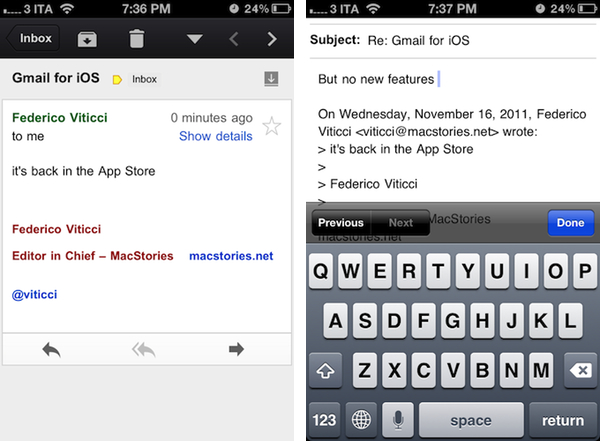
A native Gmail app on iOS had been anxiously awaited for years but when Gmail for iOS launched back in November 2011, it do so to much berating. The main complaint against the app is that it is basically an iOS wrapper around the standard mobile web app. Personally, I found the criticisms overall harsh but it does need to be improved. In no particular order, here are five ways to do that.

I agree on all the points, and I’ll add that Google might consider picking the team that created the Search app for iPad to improve Gmail for iOS. Google Search for iPad is a great app: fast, stable, responsive, innovative – that’s Google at its best, making a native app that is not cumbersome or underpowered. Gmail, on the other hand, feels like an attempt to “get the job done”: take a web view, throw some native wrapper on top of it, call it a Gmail app. Done. Gmail for iOS disappoints, but I’m still hoping Google is preparing something good for it. If that’s the case, please, Google, follow Ken’s suggestions.

On the other hand though, I can’t stop thinking about Sparrow for iPhone. That’s one of my most anticipated apps of 2012.

Permalink