Ryan Christoffel

992 posts on MacStories since November 2016

Ryan is an editor for MacStories and co-hosts the [Adapt](https://www.relay.fm/adapt) podcast on Relay FM. He most commonly works and plays on his iPad Pro and bears no regrets about moving on from the Mac. He and his wife live in New York City.

iOS and iPadOS 14 Users Can Now Set Google Chrome as the Default Browser

Apple is hosting its first fall event in a matter of days, and a public release for all the company’s latest OS updates is expected to follow not long after. However, today anyone using the beta versions of those updates can benefit from a new feature ahead of time: setting Google Chrome as the default browser on iPhone and iPad.

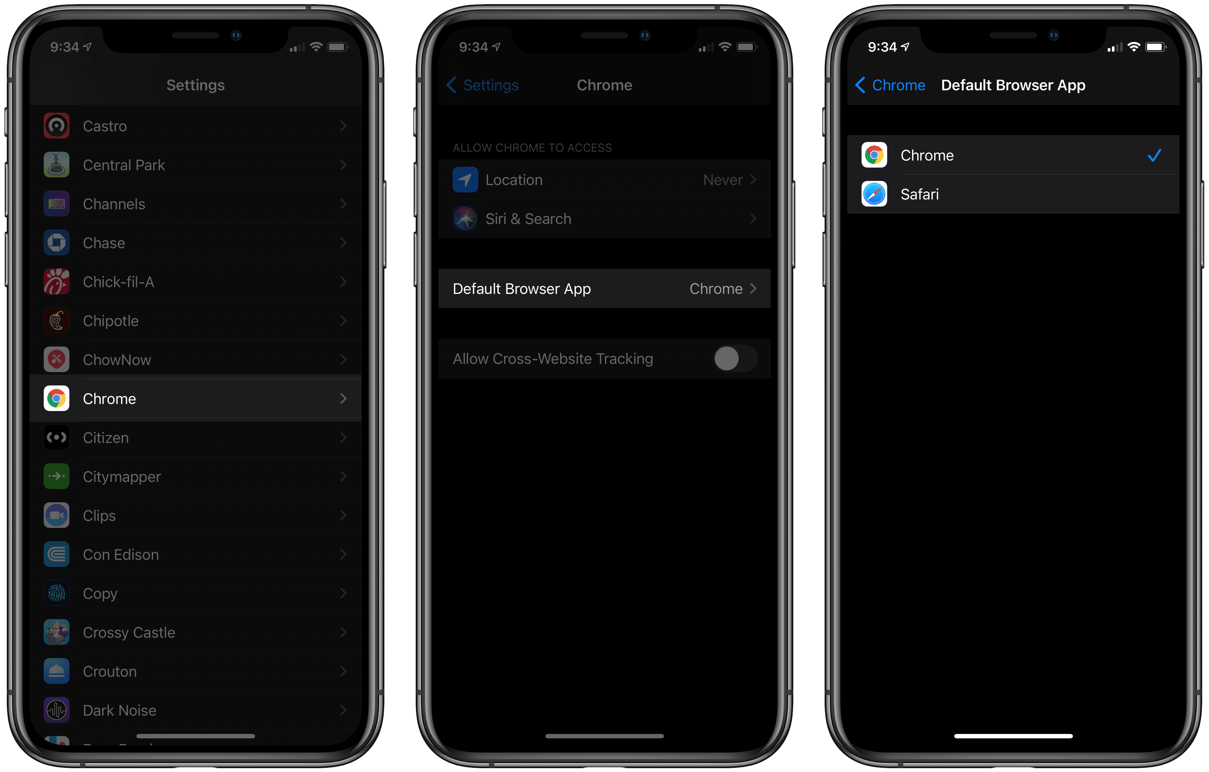
iOS and iPadOS 14 both include the ability to set a third-party browser or email app as the system default, replacing Safari and Mail. Up until now, however, beta users couldn’t yet try the feature because it’s usually not possible for third-party apps to support new OS features until after the beta cycle is complete. That’s not the case with Chrome, though, which as of its latest update can now be configured as the default iOS and iPadOS browser. You have to be running the iOS or iPadOS 14 beta for this to work, but if you are, all you have to do is visit Settings ⇾ Chrome ⇾ Default Browser App to make the change.

Once Chrome is set as your default, any link you tap systemwide will open in Chrome rather than Safari. It’s that simple. Whether you’re opening a link in an app like Messages or even from inside Siri results, the OS will always launch links directly in Chrome. The one point of friction that remains is apps that use Safari View Controller as an in-app browser rather than sending you to a separate app when you tap a link. Slack, for example, behaves this way. Fortunately, all you have to do is hit the Safari-inspired icon inside Safari View Controller that sits next to the share icon and the page will open in Chrome.

Now that Chrome supports this new iOS and iPadOS 14 feature, we may start seeing other browser apps and even email clients debut updated versions that can be set as defaults. I wouldn’t be surprised to see Gmail follow Chrome’s lead before long.


My Widget and Home Screen Setup on iOS 14

Despite WWDC being a few weeks late this year, all signs point to Apple’s fall OS updates still launching to the public at about their normal time. And if my TestFlight catalog is any indication, that means a flood of third-party widgets for iOS and iPadOS 14 will soon become available. Developers are taking all...


Focused Work Review: Staying on Task Amidst Growing Distractions

Working from home isn’t for everyone. Many of us have been challenged by the loss of structure that an office or other public workspace provides. Not only that, but homes often provide far more distractions than a dedicated workspace. As a result, I expect that more people than ever need aids to help them do focused, productive work.

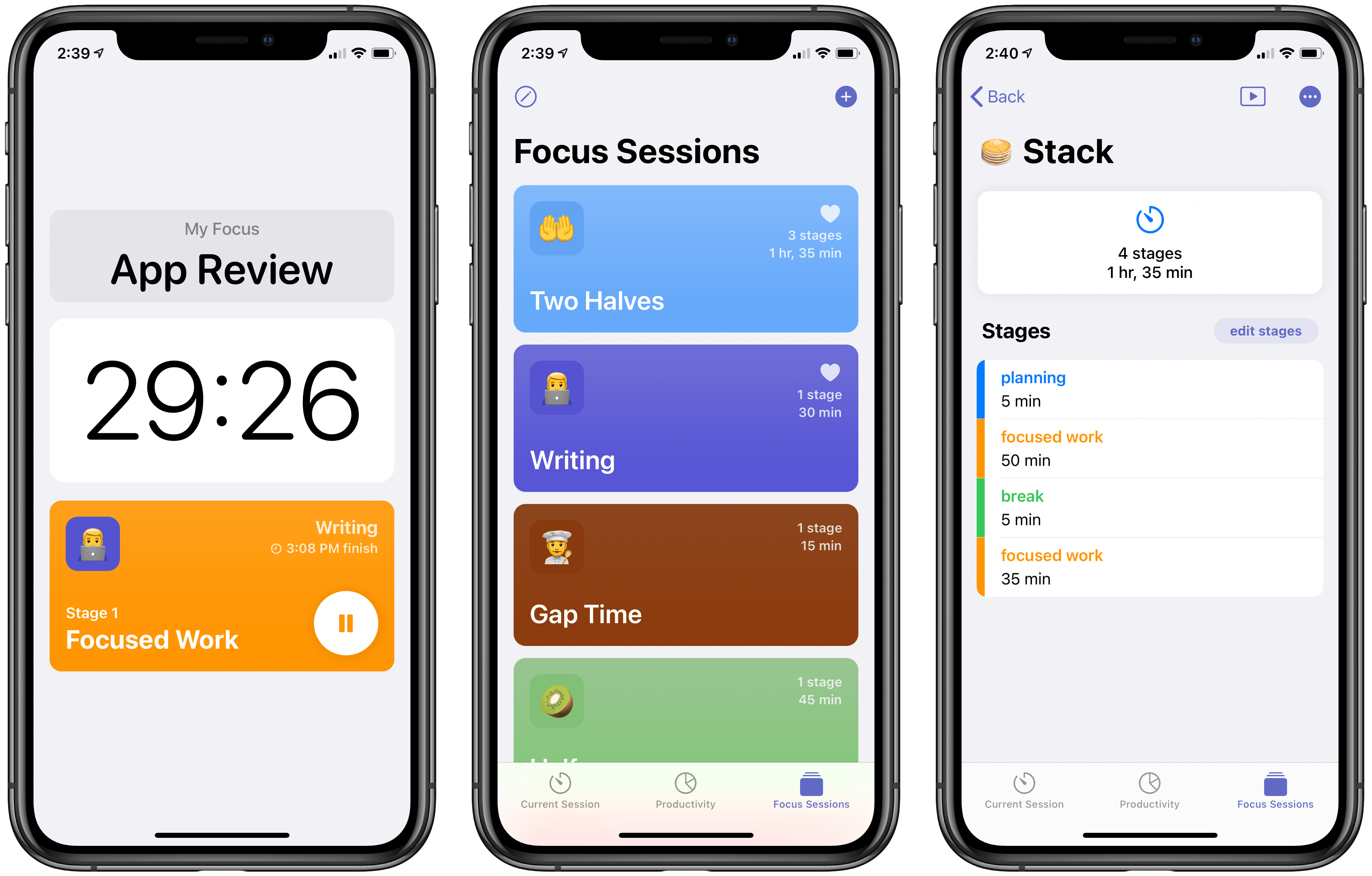
A new app from developer Michael Tigas aims to help. Focused Work is a simple, but valuable utility for creating timed focus sessions of productivity. While this may sound like merely a Pomodoro timer app, what I appreciate about Focused Work is that while it can be used with the Pomodoro Technique, it’s much more flexible than that because it enables creating any timers or sequence of timers that will best meet your own needs and fit with the way you work.

Read more


Note Linking in Bear Expands to Include Section Linking

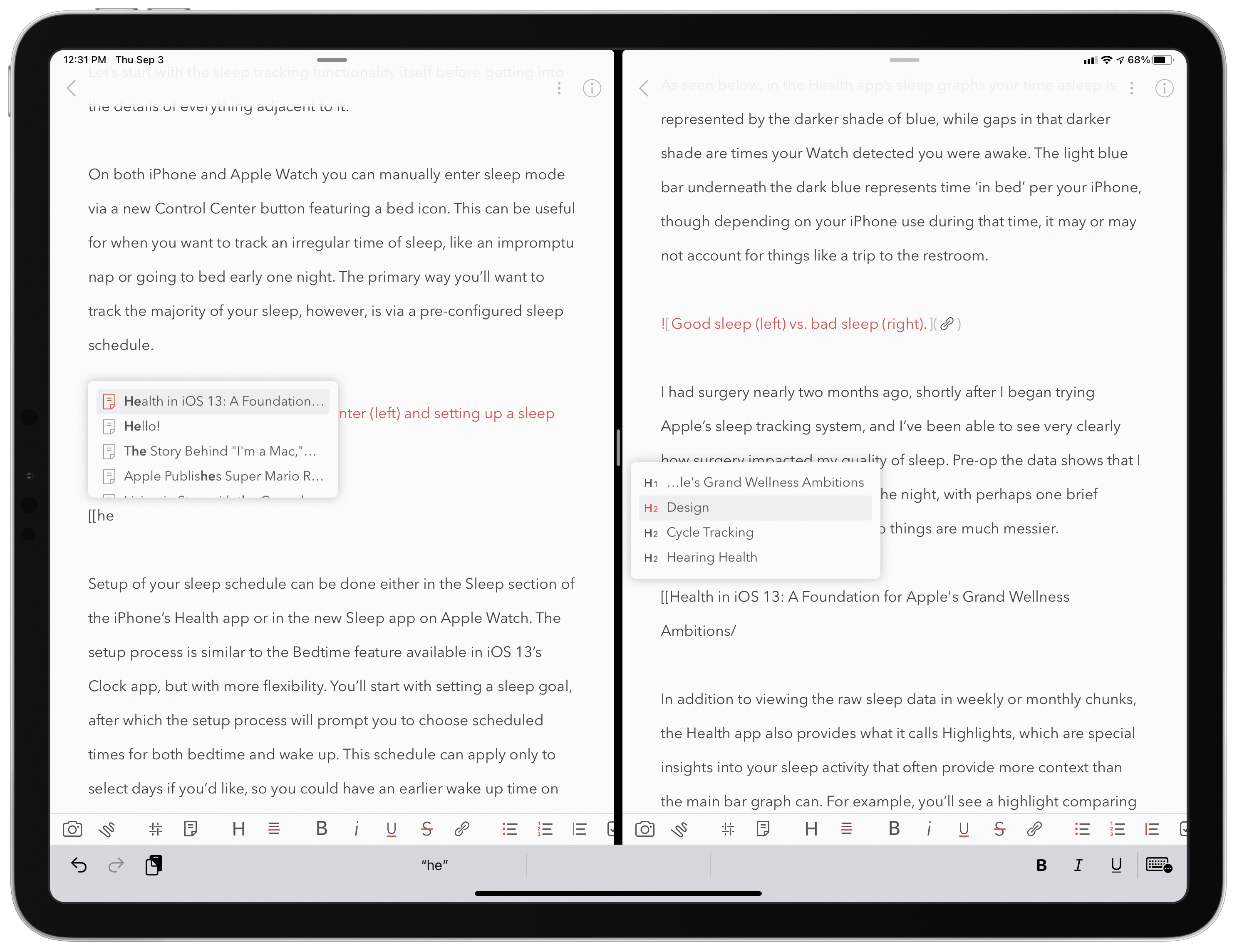
Creating a note link (left) and section link (right).

Creating a note link (left) and section link (right).

One of my favorite features in Bear has always been the ability to link to different notes inside one another. Putting the name of a note inside double brackets, like [[Club 5th Anniversary]], is a clever way to connect and quickly access related notes. I wish every note-taking app offered a similar feature.

The great thing about creating a note link is that you don’t need to remember the titles of the notes you want to link to. Just type the two opening brackets, then a couple characters that are part of a note’s title, and Bear presents a dynamic autocomplete list of suggested notes that best match what you’ve typed. While using a connected hardware keyboard, you can cycle through the suggestions using just the arrow keys and hit Return to select the right one – Bear will then create the link for you by inserting the note’s full title into double brackets. Once a link’s been created, you can tap or click it to quickly open that other note.

Bear has made note linking even better in its latest update, though, by expanding it to enable linking to specific sections of another note, which works by tying into the note’s headers. Every header can now be linked to individually, opening a variety of new possibilities – creating a table of contents is the most obvious option, but there’s so much more that can be done with direct section links.

This expanded functionality for links is worth mentioning because of the valuable utility it provides, but also because of how well it’s been implemented. Building on the existing system of typing two opening brackets then part of a note’s title, all you have to do to link a note section is then type a single forward slash / after you have an autocomplete suggestion highlighted – that note’s headers will all display so you can select the right one from there. If you’re using a hardware keyboard especially, the whole process is so fast and simple. It feels especially nice on iPad, where apps often drop the ball with keyboard support when navigating popup menus. In Bear everything just works the way you’d expect. Thanks to strong keyboard support and an intuitive UI for note and heading suggestions, creating links takes just a couple seconds.


External Keyboards, iPadOS 14, and Obscuring Tab Bars

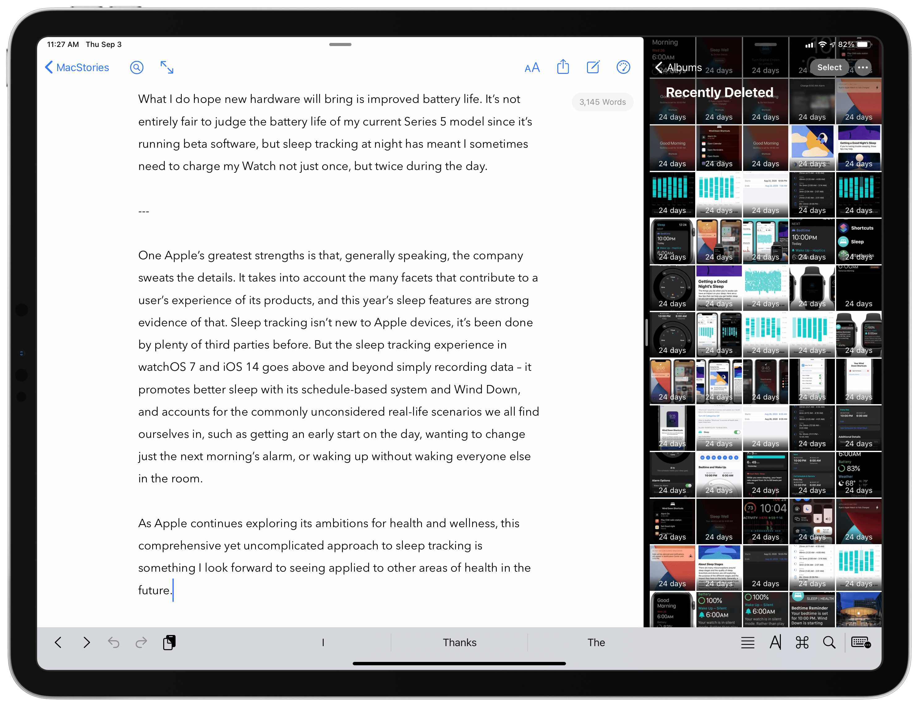
iPadOS 14 apps use sidebars, but only in certain size classes, so tab bars still get hidden behind the keyboard row.

iPadOS 14 apps use sidebars, but only in certain size classes, so tab bars still get hidden behind the keyboard row.

I love using the iPad as my primary computer, but a long-standing frustration I’ve had involves the keyboard row that lines the bottom of the screen when an external keyboard is attached. I like the row itself, as it usually offers valuable utility such as in Apple Notes, where a text formatting menu is available in the keyboard row. The problem is that iPadOS doesn’t adapt apps’ UI to account for the keyboard row, rather it simply hides the bottom portion of an app – which in many cases means hiding the app’s tab bar or other important controls.

This is mainly an issue when using Split View or Slide Over, not full-screen apps. But most of my iPad use does involve Split View and Slide Over, and I can’t count the number of times I’ve had to manually hide the keyboard row so I could access an app’s tab bar. This is a regular occurrence when writing articles, for example, as I’ll keep Ulysses and Photos in Split View, and the keyboard row that appears when working in Ulysses obscures Photos’ tab bar so I can’t switch tabs in Photos without manually hiding the keyboard row. The row also hides the share icon when viewing a photo, which is what I press many times when writing an article so I can run shortcuts via the share sheet. So as a workaround I have to manually hide the row, a short-lived fix because it then reappears after typing a single keystroke in Ulysses.

In iPadOS 14, Apple is halfway solving this problem. Because apps are being encouraged to switch from a tab bar-based design to one that involves a sidebar, there are fewer occasions when tab bars will be visible. In the iPadOS 14 beta, if I have Ulysses and Photos in a 50/50 Split View, there’s no longer a tab bar for the keyboard row to obscure, because Photos uses a sidebar instead where I can easily navigate to the view I need.

Unfortunately, this is only a partial solution because iPadOS 14 apps still revert to using a tab bar in a compact size class (i.e. when they’re an iPhone-like size). So all Slide Over apps retain tab bars for navigation as before, meaning those important tabs will be hidden any time you’re also working in an app that uses text and thus presents a keyboard row. The same is true for Split View when an app is the smaller app in your multitasking setup. If the app you’re writing in is the larger app in your Split View, the smaller app will have its tab bar obscured by a keyboard row. This is especially problematic for writers, who live in a text editor all day, but it also applies to anyone working in a note-taking app, messaging app, or anything else involving text. iPadOS 14 improves things via sidebars in certain situations, but in many multitasking contexts the years-old problem remains.

But there’s a happy ending of sorts, at least for me. My inspiration for writing about this issue was the discovery of a feature in Ulysses that fixes the problem for me. The app’s View Options inside its Settings panel contains a toggle that has been there for quite a while, I simply never thought to activate it: Hide Shortcut Bar. What this does is perpetually hide the keyboard row whenever a hardware keyboard is attached to your iPad. No keyboard row means no hiding tab bars in other apps while I write.

Ulysses does place some important shortcuts in the keyboard row, but most if not all of them can be triggered via keyboard shortcuts instead, making the keyboard row unnecessary (for my uses at least).

After making this discovery, I dug around in a few other apps’ settings to see how common this feature is. iA Writer offers it, as does Drafts, and possibly many other apps I haven’t tried. It seems more common in text editors than note-taking apps. It’s a shame that the whole keyboard row needs to be hidden just to account for an iPadOS design flaw, but I’m thankful that third-party developers have stepped in to address the issue themselves.

Ulysses is the app I multitask in most frequently, so the ability to keep its keyboard row hidden forever has truly made my day. I tried explaining to my wife why I got so happy all of a sudden, and she didn’t really get it. I don’t blame her.


Apple Releases iOS 13.7, Bringing COVID-19 Exposure Notifications Express to the Public

For the first time that I can ever recall, Apple is releasing a point update to iOS just a week after the update’s first beta debuted. iOS 13.7 is rolling out now to iPhone users, bringing the COVID-19 Exposure Notifications system to users without the need to download a separate third-party app. This version of the system is being dubbed Exposure Notifications Express. Per an Apple-Google quote provided to The Verge:

As the next step in our work with public health authorities on Exposure Notifications, we are making it easier and faster for them to use the Exposure Notifications System without the need for them to build and maintain an app. Exposure Notifications Express provides another option for public health authorities to supplement their existing contact tracing operations with technology without compromising on the project’s core tenets of user privacy and security.

After installing the update, from Settings ⇾ Exposure Notifications users can either opt-in to the new system, which was developed in a partnership between Apple and Google, or sign up to be notified when the system becomes available in their region. Currently, even though a separate app download isn’t necessary anymore, Apple is still only activating its system in areas where public health authorities are explicitly on board and have the processes in place to utilize data gathered from iPhones and Android devices for the sake of contact tracing. This means availability still doesn’t extend to all iPhone users, but it will hopefully expand quicker than when a separate app download was required. In the US, Exposure Notifications Express will launch in Maryland, Nevada, Virginia, and Washington D.C. with more states expected to be supported throughout the remainder of the year.


Fall Hardware Wishes

Pumpkin Spice Everything season is in full swing, and with the past six months having felt like a black hole, it all seems too soon to me. Regardless, fall is my favorite time of year so I welcome its swift approach! Especially the new batch of Apple products it will hopefully bring. So on...


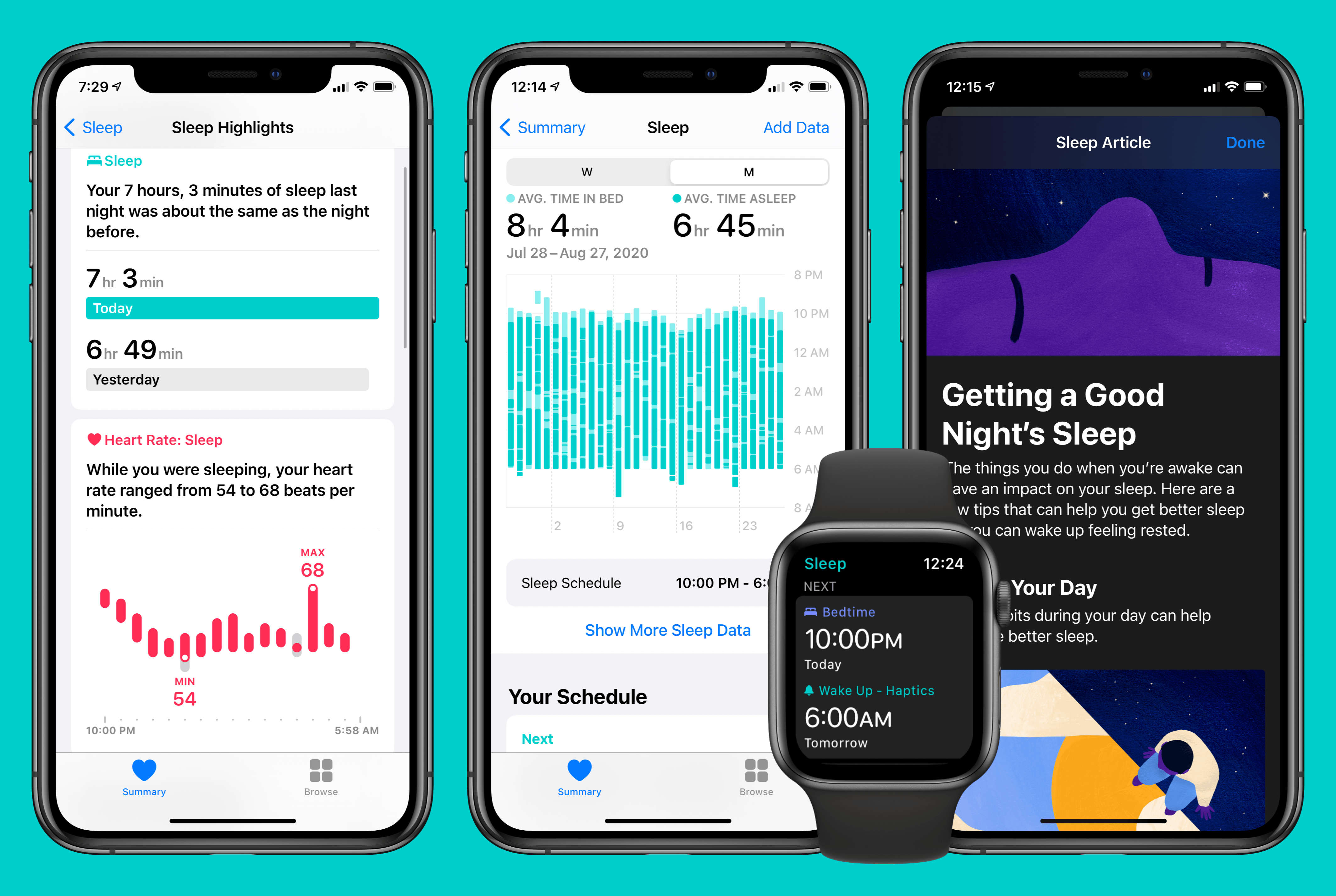
Sleep Tracking in watchOS 7 and iOS 14: Elevated by a User Experience-Driven Design

Sleep tracking has always seemed like a natural addition to the Apple Watch, and for years all signs have indicated Apple had it in its plans. In 2017 the company acquired Beddit, which specialized in sleep-tracking hardware and software. Perhaps one motivation for that move was the fact that paid sleep-tracking apps regularly occupied the App Store’s top charts. Apple has also progressively exhibited strong interest in areas of health, making sleep a no-brainer. So the technology for sleep tracking had been acquired, customer demand was clearly there, and it fit within the broader health ambitions of the company.

Yet until this year, Apple’s sleep-related software enhancements have been limited to…improved alarm options on iPhone. This fall that’s changing, as watchOS 7 and iOS 14 will together introduce a true sleep tracking system.

I’ve been using the new sleep-related features of Apple’s forthcoming OS versions for two full months now, and in true Apple fashion, they’re in some ways more comprehensive and elegant than third-party solutions, and in other ways they’re underpowered compared to what third parties provide, ensuring that they won’t be the best fit for all users, but their simplicity will make them a solid solution for most people.

Read more