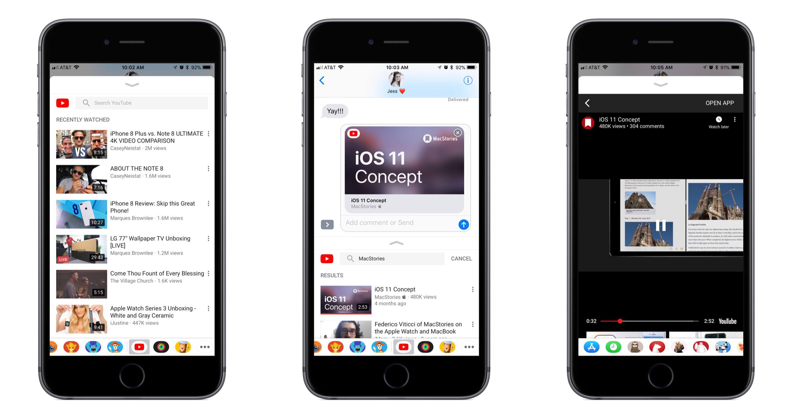
Following just a few days behind Pixelmator for Mac, which recently received support for HEIF and editing files stored in Apple Photos, Pixelmator for iOS was updated today with the aforementioned HEIF support – Apple’s new file format for images in iOS 11 – as well as drag and drop support on iPad.
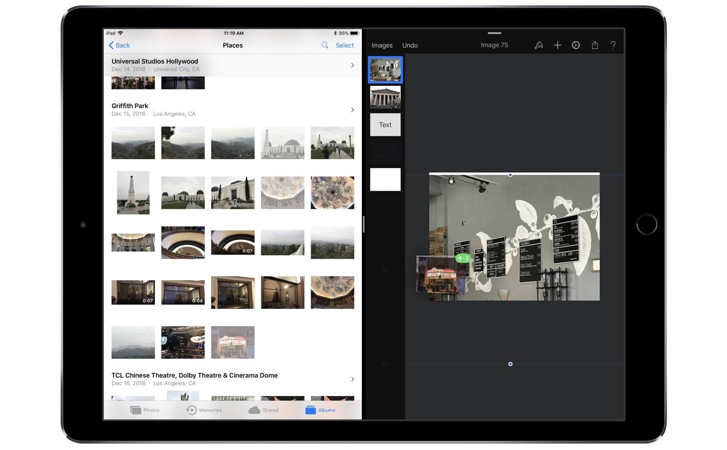
Drag and drop enables, as you might expect, moving images and graphics out of or into Pixelmator. Dropping images into a work in progress will import them all as new layers. Depending on the size and number of images you’re dropping, there may be a brief delay before they appear in your working document, but overall this action works well. When it comes to dragging content out of Pixelmator, you’ll need to do it with a single layer at a time – once you’ve lifted a layer, you can’t use drag and drop to pick up any additional layers. In a document containing many different layers, this can be fairly limiting, but there is a type of workaround: you can merge layers together in the sidebar to then drag the newly merged layer out of the app as a single image. Unfortunately, this only solves the problem if you want both layers permanently combined into one when dropping them elsewhere.
This layer merge technique is the only way I’ve discovered to drag a final image, containing multiple layers, out of Pixelmator and into another app – if you don’t want to first merge all layers together, you’ll have to use a more traditional data transfer technique like the share sheet. I would have liked to see drag and drop enabled within Pixelmator’s main image browser for moving a completed image out of the app, or for importing photos into the app to edit later. Currently, long-pressing an item from the image browser simply engages rearrange mode.
One nice side effect of drag and drop support is that when dealing with layers that don’t fit inside your canvas – such as an image you’ve dragged in that’s larger than the canvas itself – previously it was difficult to easily determine how large the full layer was. But now, grabbing the layer and watching it lift from the screen will provide a view of the full image, regardless of canvas size. Once you start dragging the layer away, it will shrink into a smaller drag preview, but until that move is engaged, the lifted image will be shown in full.
Despite its limitations, drag and drop support in Pixelmator is definitely great to have; before today I have tried several times to drag images into the app only to remember I couldn’t do that yet. Perhaps when the upcoming Pixelmator Pro arrives on the iPad, it will include a richer implementation of drag and drop. Until then, I’m grateful to have one less app limiting my iPad drag and drop experience.