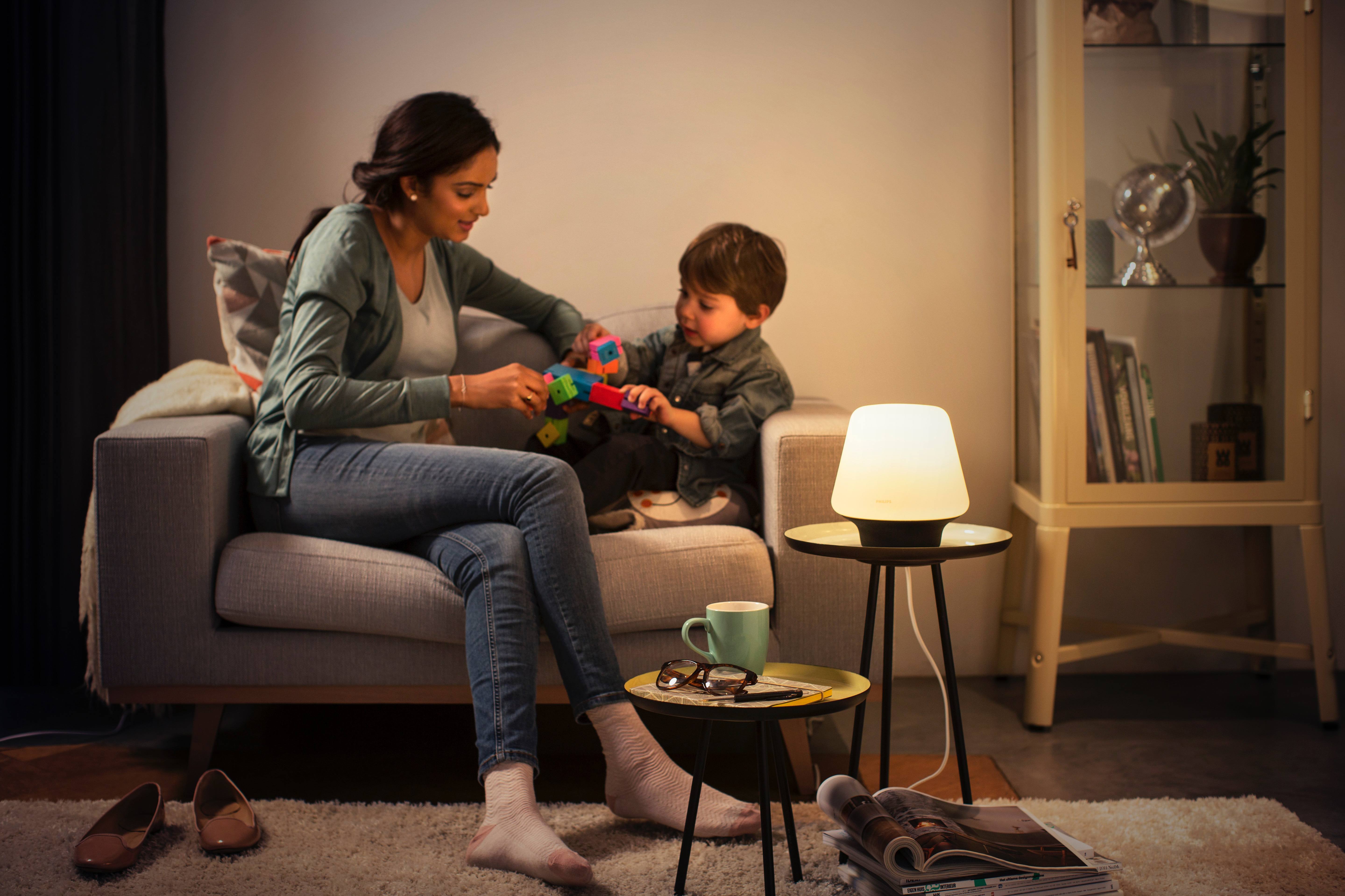
Ryan Christoffel

991 posts on MacStories since November 2016

Ryan is an editor for MacStories and co-hosts the [Adapt](https://www.relay.fm/adapt) podcast on Relay FM. He most commonly works and plays on his iPad Pro and bears no regrets about moving on from the Mac. He and his wife live in New York City.

Shazam Launches Redesigned, Simplified iOS App

Shazam for iOS has introduced an update that makes app navigation more simple and streamlined. Gone are the traditional navigation tabs at the bottom of the screen; they have been replaced by a paginated layout where a swipe left or right is used to switch screens.

Launching Shazam lands you on the Home page, which is devoted almost entirely to the Shazam button. Tapping it will cause the app to start listening to what’s playing; one change to the Home page is that you now activate Auto Shazam with a long-press on the Shazam button. Auto Shazam allows the app to continue listening to what’s playing even after the app closes.

The top of the Home page indicates that there are three pages in total to navigate through. To the left of Home is My Shazam, to the right is Discover1, and swiping back and forth is the primary way to get where you want to go. This type of layout resembles that of apps like Snapchat, only Shazam pulls it off in a less confusing manner. Not only do you always see three navigation dots at the top of the screen to indicate your current place within the app, but the Home page also contains icons that show which pages are placed on the left and right – Snapchat could benefit from similar aids, for new users at least.

My Shazam hasn’t changed much from before, but in an effort to consolidate the total number of pages in the app, Discover now includes the contents formerly found in Trending as well. A Chart Update card is included with your daily mix, plus you’ll find a button at the top and bottom of your 10 daily updates that takes you straight to Trending.

I appreciate what Shazam has done to try simplifying its app, both in the number of pages to navigate through, and in adopting the swiping gesture to handle that navigation with ease. Not every app would benefit from such a streamlined interface, but it works well here.


  1. Unfortunately Discover has not yet made it to the iPad, so Trending stands in its place on that device. 


Rejected Apple Intern Applicant Reimagines the Music App

Jason Yuan, writing for Medium’s Startup Grind:

Earlier this year I applied and interviewed for a graphic design internship at Apple Music (an opportunity of a lifetime), and was turned down with a very kind letter stating that although they liked my work, they wanted to see more growth and training.

At first, I was frustrated — Northwestern University doesn’t offer any sort of undergraduate graphic design program, so whatever growth they were looking for would have to be self taught…

…but as soon as I came to this realization, I became inspired to embark on what became a a three-month long journey to the holy grail — the iOS app that Apple Music deserves.

We don’t often link to concept pieces, but Yuan’s work is well worth a look. Besides the clean, elegant visual updates found here, one of the most interesting segments in the piece concerns a proposed new music discovery method called ‘My Sampler.’ The idea is that users can sample short clips of songs and either swipe down to add a song to their library or swipe up if they don’t like it. Yuan does a great job of showing how this type of gamification through gestures could be a welcome addition to the iOS Music app.

Permalink

Apple Announces Date and Time of Its WWDC Keynote Event

Following the announcement in February of WWDC’s dates and location for this year, Apple today has notified members of the press that the conference will kick off with a keynote event, as has become tradition. Jordan Kahn writes for 9to5Mac:

The keynote is scheduled for 10AM PT on June 5, the first day of the conference, and will likely play host to new product unveilings as well as our first previews of Apple’s operating systems, iOS, macOS, watchOS, and tvOS, as well as new developer tools to go with them.

June 5 is coming up quickly, and our team will be present in San Jose to witness Apple’s announcements firsthand. We’ll provide all coverage from the keynote, as well as the conference as a whole, on our site here.

Permalink

Snapchat Adds Magic Eraser, Emoji Brush, Limitless Snaps, and More

In an update released today, Snapchat has added a slew of new tools to enhance the creation and sharing of Snaps.

The Magic Eraser is a tool for removing unwanted objects from a picture. You can use it by tapping the scissors icon, then the stars icon. The tool works very much like the Repair Tool found in Pixelmator, the powerful photo editing app. Simply tap and drag on the part of the image you’d like to ‘erase,’ and after a couple seconds of work Snapchat will remove the object. When it works properly, what’s left in the absent object’s place will blend in nicely with the rest of the photo. As with all tools like this, the reliability can vary depending on the particular photo and object.

A second new tool is the Emoji Brush, which lets you draw with emoji on an image like you might draw with a standard colored brush. Tap the brush icon, then the heart emoji, to pull up the emoji picker. Currently only a select few emoji are available to choose from, including the heart, fire, star, flower, and a few others. If you tap and hold on the bottom of the emoji lineup, it will expand to temporarily reveal a variety of colored heart options.

Additional changes in the app include the new Loop tool, which lets you set a Snap to loop until your friend taps forward to the next Snap. This pairs nicely with the new option to remove a time limit from your Snap, so friends can view it as long as they’d like before moving on. Once the Snap is closed though, it will still delete as usual.