Federico Viticci

10804 posts on MacStories since April 2009

Federico is the founder and Editor-in-Chief of MacStories, where he writes about Apple with a focus on apps, developers, iPad, and iOS productivity. He founded MacStories in April 2009 and has been writing about Apple since. Federico is also the co-host of AppStories, a weekly podcast exploring the world of apps, Unwind, a fun exploration of media and more, and NPC: Next Portable Console, a show about portable gaming and the handheld revolution.

Dropbox Releases Completely Redesigned iOS App

Dropbox has today launched a major new version of its iOS app, featuring a new UI design, new upload features, and an updated photo experience.

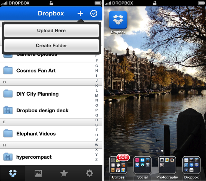
As detailed in a blog post by the company, the new Dropbox aims at simplifying the user interface with “flattened out” colors, simpler lines, and less visual complexity. For instance, the new tab bar of the app doesn’t come with text labels, using only icons to indicate folders, Photos, Favorites, and Settings. In a way, the Dropbox redesign is somewhat reminiscent of the latest Rdio update for iOS, also focused on flat colors and an overall simplification of graphical elements.

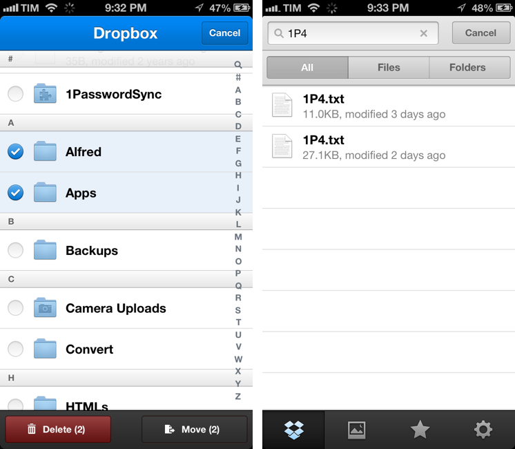
The new Dropbox changes the upload system as well. In the previous version, there was an Uploads section to upload items from the iOS Camera Roll to a specific folder; users needed to specify the folder before starting the upload process. In Dropbox 2.0, every folder – including the main Dropbox one – has got a “+” button in the upper toolbar with two options: “Upload Here” and “Create New Folder”. I look forward to trying this feature in particular as I use the Dropbox app to upload photos on a daily basis to different folders; I don’t know whether an upload button dependent on the folder you’re currently viewing will eventually make me save taps, or require more navigation around folders.

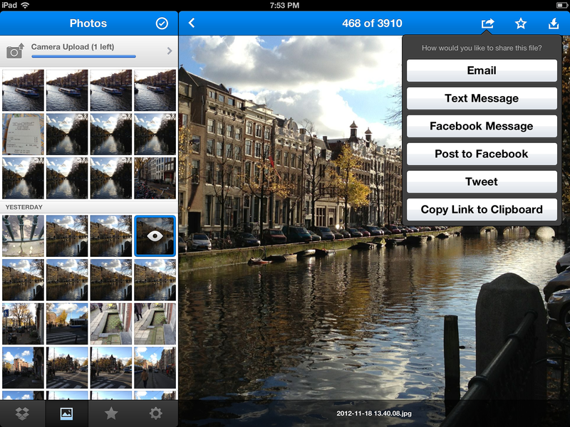
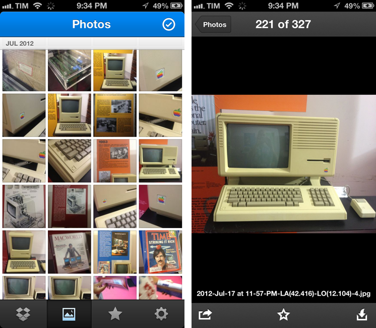
Photos are also part of my Dropbox workflow, and the new app introduces a new browsing experience for them. According to Dropbox “all of your photos” including those you have “uploaded from other devices” will be available in the new Photos tab. This view comes with a grid interface to browse photos from newest to oldest. Interestingly, sharing options for photos now include separate entries for “Post on Facebook” and “Facebook Message”. The Photos view retains the Camera Uploads functionality of the previous version (though personally I use CameraSync for this, a third-party app that offers more settings for Dropbox photo uploads).

The new Dropbox app is available on the App Store.

Update: Based on my first tests, it appears only photos uploaded with the app’s Camera Uploads feature are recognized in the Photos tab; it doesn’t seem like the app is recognizing photos I uploaded with third-party apps like CameraSync. Too, like in the previous version of the app, you can’t star folders.

More screenshots below.


“This Won’t Happen On iOS”

“This Won’t Happen On iOS”

I found myself nodding in agreement with Jason Snell’s latest piece for Macworld:

That’s why I’m optimistic that the dismissal of Forstall to tend his garden might be just the shake-up that iOS needs. In the operating system’s nearly six years of existence, Apple hasn’t really rethought any of iOS’s major features. We’ve seen the continual addition of new features, but very little has disappeared to be replaced by something utterly new. iOS is pretty good, but that stasis is odd, and perhaps even a little self-delusional on Apple’s part: Nothing is inviolably perfect, especially on the first try.

For me, there are two sides to this argument. I have been advocating iOS, and especially the iPad, as a platform capable of doing tasks previously exclusive to “real computers”. At the same time, I’ve also been trying to focus on how “regular people” could benefit from using apps that we thought were only “for geeks”. Maybe not Pythonista or another scripting app, but definitely – just to name two examples – apps like 1Password or Launch Center Pro.

And yet, the single reply I get the most every day is that “this won’t happen on iOS”. Some people seem to think that just because Apple was successful in reinventing the mobile OS five years ago, then they’ll have to stick to that model forever. That they’ll have to keep the Mail app as it is, that they’ll avoid considering more “power user features”, and that trying to make technology work for everyone – from grandparents to nerds – is wrong.

I disagree with the notion that the philosophy of iOS is set in stone. If there’s anything great about software, is that it can be changed. Sometimes it’s a huge undertaking, but it can happen.

I’m not saying change is always good – because I don’t know. But like Jason says, being static and complacent isn’t good either: the market is changing, people change their habits and needs. Eventually, change is not only good, but necessary.

And if Apple didn’t believe this too, we’d all be using a stylus today.

Permalink

iTunes 11 Navigation

iTunes 11 Navigation

Disclaimer: I am not a “heavy” iTunes user, but since version 11 came out – out of curiosity – I have tried to use it more.

I think Lukas Mathis is spot-on with his comments on iTunes 11’s new navigation. Mainly, the different ways to change “views” and “sections”:

To reiterate: if I’m in the store section, I don’t click on «Music» to go to my music, I click on «Library». But if I’m in my music section, I click on «Music» (which is on the opposite side of the screen from the previously-clicked «Library» button) to go to my movies.

I may not use iTunes as my default media manager for music and movies, but I do use it every day to check for app updates and buy new apps. Therefore, I am constantly switching between the “Apps” view of the Library and the “My App Updates” section of the iTunes Store (which, by the way, still hasn’t been updated to a new look). In the Library, the dropdown menu to switch views (Music, Movies, etc) is on the left; when I check for updates and I’m given the updates page, to go back I have to work with a different dropdown on the right. Maybe I’m too old for this stuff, but this breaks my muscle memory. Even worse, if I am in Apps, I check for updates, and click Library in the My App Updates page, I am not brought back to Apps – the Music view opens instead. This is incredibly confusing, and it still happens in iTunes 10.0.1.

I recommend reading Lukas’ post for a reasonable take on iTunes 11’s complicated navigation scheme and menu layout. Personally, I have gone back to showing the sidebar because it just makes more sense to me.

Permalink

Televised

Televised

I don’t watch American TV shows as soon as they’re aired, mainly because, being based in Italy, I don’t have access to legal TV subscription. However, I do like to “stay in the loop” with news and episode dates so I can later download everything in iTunes. Televised is a new iPhone app developed by Robocat that wants to provide a way to easily catch up on “status updates” for TV shows you’re interested in.

Televised takes a very visual approach. TV shows are presented as posters of the current season and the entire app features a custom design by Michael Flarup that is a mix between the dark style of Plex and a remote. In fact, you can tap on the hamburger button in the top left to open a section with buttons for Settings, Help, and “Add Shows”. Unlike most iOS apps, this section doesn’t open from a side, but from the top, with an animated light reminiscent of a TV remote. The design is very particular, but I found it to be slightly confusing coming from apps such as Facebook or Rdio (and really, just about any other app these days), which use a standard side-panel navigation. However, considering Televised’s highly custom approach to navigation, sounds, and modal views, I think the alternative take fits with the rest of the app.

The core element of Televised are the show preview thumbnails. You can tap on one to bring up a modal “card” that comes in the foreground with a nice 3D animation. Each card contains information about a show’s upcoming episode with summary, background photo, airing date, and three buttons at the bottom. These buttons let you share an episode, turn on notifications (which I haven’t been able to test), and “View on IMDB”. Televised uses data from TheTVDB, but if you have the IMDB app installed it’ll try to display a selected episode’s information on the service. I say “try” because – I don’t know if this is related to Televised or IMDB itself – in my tests I haven’t always been redirected to an episode’s proper page.

Televised focuses more on the “upcoming” aspect of TV shows rather than providing a fully searchable archive of a show’s episodes. There are some nice touches (the static effect as background for modal cards is one of them) and some aspects I can’t comment on (such as the future reliability of notifications), and the app does undoubtedly look good on the Retina display. I recommend checking out Televised on the official website, where there’s also a promo video.

Permalink

PDF Expert 4.4 With PDF Converter Integration

PDF Expert 4.4 With PDF Converter Integration

PDF Expert by Readdle is my preferred PDF reader app for iPad. It comes with a polished UI, various annotation tools, and, more importantly, Dropbox sync. The latest update to PDF Expert for iPad, version 4.4, features integration with Readdle’s other PDF app, PDF Converter. As Readdle describes it:

Anyone who has already installed Readdle’s PDF Converter on the iPad can easily convert any files into PDFs from within PDF Expert. Once you send a document to convert in PDF (action button -> convert to PDF), it instantly converts to PDF and is saved back in PDF Expert for annotation. So far, users that have .doc, .pages, .ppt now can convert these file in PDFs and annotate them in PDF Expert.

I have tried the feature with .rtf files (which I often receive), and it works as advertised. Essentially, it works with a URL scheme that from PDF Expert can forward a document to PDF Converter (if installed); this is done through a “Convert to PDF” menu available in the upper toolbar of the document viewer. Once pressed, PDF Expert will send the document to PDF Converter, which will convert it and automatically send it back. I have asked Readdle whether this kind of integration was achieved using x-callback-url, but they told me they’re using their own implementation called RDIntegration.

I personally run my own remote PDF converter through Dropbox, but the option in PDF Expert works nicely and it’s entirely automated, so check it out if you’ve been looking for something like this on iOS and Readdle’s apps.

Permalink

Tweetbot 1.1 For Mac

Tweetbot 1.1 For Mac

An update to Tweetbot for Mac – my go-to Twitter client – was released today on the App Store. Tweetbot 1.1 doesn’t bring major new features, but it’s got a fair amount of bug fixes and minor improvements that I like.

For Mountain Lion users, there’s an “All Notifications” option in the Settings to, literally, receive all notifications for your stream. This means you’ll see every tweet from every user you follow show up in Notification Center as soon as they tweet. I can’t use this because I follow too many people (I would get a notification every few seconds), but it can be useful for timelines following less users. What I really like is the option to show a Visual Sync Marker (like on iOS) and to globally invoke the app/new tweet window with a hotkey.

Last, there are many other fixes and improvements such as new keyboard shortcuts, better “pin to top” for non-streaming columns, and better compatibility with Moom. Tweetbot continues to be my favorite Twitter client on the Mac and it’s available at $19.99 on the Mac App Store.

Permalink

Apple Posts “Best Of App Store 2012” Lists

In today’s weekly refresh of the App Store, Apple posted a list called “Best of 2012”, highlighting the apps they “loved the most” this year. Day One, a journaling apps we reviewed on MacStories several times, wins as “Mac App of the Year”; “Deus Ex: Human Revolution” wins as “Game of the Year”. The Mac section is also viewable on the web here. On the iOS side, Paper for iPad and Action Movie FX win as Apps of the Year; Rayman Jungle Run and The Room win as Games of the Year for iPhone and iPad, respectively.

Over the past year, the Mac App Store was packed with impressive new apps and games. Some were dazzling debuts, while others were existing apps updated to leverage new features in OS X Mountain Lion or to take advantage of the Retina display of the new MacBook Pro. Browse the apps and games we loved most in 2012.

The list is organized in Runners-Up, Best Apps of 2012, and Best Games of 2012. Below, the full list, recompiled from the Mac App Store, iPhone App Store, and iPad App Store. My personal congratulations to the Day One team, an app that has completely changed the way I archive my memories on iOS and OS X.

Other notable winners in iTunes categories include:

Read more


Open Google Maps Directions With Siri or Launch Center Pro

Here’s a fun experiment to launch the Google Maps app via URL scheme directly into a new Directions view.

As I detailed this morning, the new Google Maps app for iPhone lets you launch specific views and modes using a URL scheme. You don’t need to be a developer to use the URL scheme; this means you’ll be able to launch the Google Maps app from Safari, Launch Center Pro, or any other launcher using the base comgooglemaps:// URL.

Google’s URL has a scheme for directions with addresses and transportation parameters. It lets you specific a starting address with the saddr parameter, and a destination address with daddr.

Further, you can instruct the URL to open a specific directionsmode, such as driving or transit.

With these parameters, it becomes possible to set up a nice automated workflow to launch directions using Siri or Launch Center Pro. Read more


Google Maps SDK For iOS And URL Scheme

Google Maps SDK For iOS And URL Scheme

Alongside the launch of its official Maps app for iPhone, Google has also released a developer SDK to let third-party apps embed Google Maps directly. As detailed by Andrew Foster at the Google Geo Developers blog, the SDK – which requires signing up for API access – will allow developers to integrate Google Maps with their own apps, displaying embedded 2D or 3D Maps views with markers and info windows. The blog post also confirms that the SDK will work on the iPad; Google has confirmed to The New York Times that a native iPad version of Maps is indeed coming.

The SDK features vector-based maps that load quickly, allowing users to easily navigate 2D and 3D views, rotating and tilting the map with simple gestures inside your app. Developers can also change the Google maps view to include information such as traffic conditions, and control camera positions in 3D.

In the SDK documentation, Google says that the appearance of Maps embedded through the SDK is the same of the Google Maps apps, and that the SDK “exposes many of the same features”.

However, the SDK isn’t the only way for developers to integrate with Google Maps. Using a URL scheme, developers can point to the Google Maps app and launch it from their app into a specific view or map object. Documentation for the URL scheme is available here. Developers can link to Google Maps with specific views, modes (standard or Street View), set zoom levels, and pass directions with the URL scheme.

It’ll be interesting to see how and when Google Maps-compatible apps such as AroundMe or WhereTo will support the new Google Maps SDK. The addition of a URL scheme shouldn’t be underestimated either, as it’ll enable regular users to launch the app using tools like Launch Center Pro.

Permalink