Federico Viticci

10804 posts on MacStories since April 2009

Federico is the founder and Editor-in-Chief of MacStories, where he writes about Apple with a focus on apps, developers, iPad, and iOS productivity. He founded MacStories in April 2009 and has been writing about Apple since. Federico is also the co-host of AppStories, a weekly podcast exploring the world of apps, Unwind, a fun exploration of media and more, and NPC: Next Portable Console, a show about portable gaming and the handheld revolution.

IMDb 3.0 for iPad

IMDb 3.0 for iPad

I’m a fan of the major update to the IMDb app for iOS released today. Hitting version 3.0, IMDb (which, for those who don’t know, is owned by Amazon) sports a completely refreshed user interface for the iPad, taking advantage of the larger screen to provide better access to a variety of sections, charts, and options for your account.

The “Home screen” of the app is now accessible  by swiping to the right (or tapping the IMDb logo) to bring up a panel on the left; this panel contains your lists and recommendations (if you’re signed in) as well as links to Featured movies and TV shows, “Coming Soon” (either to theaters or DVD/Blu-Ray), Latest (news, birthdays, etc) and Popular. There’s a lot to browse through thanks to these links collected under your account’s information. The main view itself is interesting too: at the top, there’s a Coverflow-like carousel of featured entries that, however, are actually composed of two distinct items. As you swipe, a movie will be presented with a poster (to go to the IDMb page for the item) and a trailer thumbnail, which you can tap on to start playing a trailer right away. The entire app is full of mini widgets/sections that you can swipe through to access other pages or view more content. The interface has been polished to offer a simple dark background that makes movie posters really “pop”.

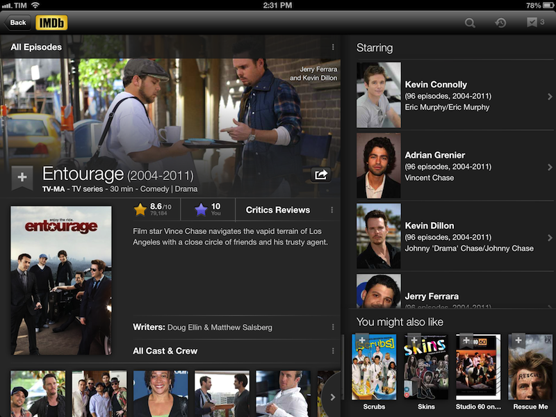
For me, the best feature is improved support for Watchlist and the reorganized movie pages. Every item now has a “+” button to quickly add it to your Watchlist, which can be opened in a “top shelf” by tapping on the same button in the upper toolbar; the shelf also features an arrow button on the side to go straight to the dedicated Watchlist page (this button is used elsewhere in the app). History (every item you’ve recently viewed through the app) is available in the same section at the top. The new item pages are essentially composed of three main areas: movie information (poster, reviews, trailer, photos, and more) on the left, Cast on the right, and “You might also like” recommendations at the bottom right.

Both the iPhone and iPad app now use native iOS 6 Facebook sharing and include TV episode details in Filmographies. IMDb 3.0 is available on the App Store.

Permalink

Evernote Launches Food 2.0 With Major Redesign, iPad Version, And More

Last year, Evernote launched Food, an iPhone app to save photos and details of your favorite meals, which would then be synced to your Evernote account. Today, Evernote is launching Food 2.0, a major revamp that includes a native iPad app and a completely rebuilt experience focused on exploration, saving recipes, and browsing restaurants available in a specific area.

I have been able to quickly play around with a final version of Food 2.0, and I came away quite impressed by the effort put into this relaunch. I never got into Evernote Food, mainly because my girlfriend and I tend to save our recipes in dedicated apps, bookmark others we want to check out or simply keep a note with links to them, and because we use other services for restaurant reviews and recommendations. Being able to save a photo of a final meal – either made by us or someone else – didn’t hold much appeal against dedicated solutions. Evernote Food 2.0 wants to address exactly this issue by collecting in a single app, Evernote-style, recipes you can explore and “clip” (i.e. save in your Evernote account), while offering standalone views for restaurants and the meals you have already saved (and will continue saving) in Evernote Food.

The iPad app starts with a gorgeous horizontal wall of photos for Explore, My Cookbook, Restaurants, and My Meals. You can swipe to the right to reveal a napkin with the Evernote logo on the left, and tap on a section to view an “unfolding” animation open a specific section. I noticed that the speed of the animation took an extra second upon the first launch of the app on my iPad 3, but then went back to normal as I kept using the app. On the iPhone, the app uses the same vertical layout for sections seen in Evernote 5.0. Read more


MacStories Interviews: Gus Mueller

In our ongoing series of interviews with developers and creators in the Apple community, I had the chance to talk with Gus Mueller, founder and programmer at Flying Meat. You may know Gus because it makes two of the finest Mac apps – Acorn, an image editor, and VoodooPad, a note-taking and wiki app. Gus tweets as @ccgus.

The interview below was conducted between May 5 and December 15, 2012.

Federico Viticci: Hey Gus! Could you introduce yourself to the readers who haven’t heard about you or haven’t tried any of your apps before?

Gus Mueller: Hello!

I’m Gus Mueller, and I’m the founder/programmer for Flying Meat Inc, which makes software for the Mac. These days my most known application is Acorn “The image editor for humans”, but before that I was mostly known for my desktop wiki VoodooPad. I also have a couple of other minor projects – JSTalk, FMDB, and a handful of open source libraries that are popular. Read more


Skitch For Mac Updated with FTP, Custom Styles, More Sharing Options

I like Skitch. However, after the move to Evernote and the release of a new Mac app, Skitch didn’t exactly go through a “smooth” transition. Namely, features were removed, and existing Skitch users weren’t thrilled with the new Evernote-only nature of the software. Last month, Evernote published a blog post detailing how, after receiving lots of feedback from their users, they decided removing functionalities people had become dependent upon was a bad move. For the past few weeks, I have been testing the 2.0.3 update to Skitch for Mac, which brings back many of the features that made the original Skitch one of my favorite Mac apps.

A feature that I’ve been using on a daily basis is FTP support. In Skitch 1.0, you could take a screenshot, quickly annotate it, and send it off to your own server via FTP. I share a lot of screenshots, and I like the combination of an easy-to-use image annotation app with my own server and my own URLs. FTP integration was the right balance between Skitch’s annotations (which I prefer to Apple’s ones in Preview) and the power of putting images on a server that’s only mine. Skitch 2.0.3 adds a new FTP/sFTP option in the Sharing tab of the Preferences, allowing you to configure multiple FTP accounts. The configuration is similar to other FTP clients for Mac (you’ll find the usual Base URL, port, and directory settings) and it took me a minute to set up with my credentials.

Once configured, you’ll be able to send images from Skitch directly to your FTP server. Unfortunately, there’s no option to assign keyboard shortcuts to a specific FTP account, so you’ll have to click on Share > FTP or right-click an image to upload via FTP. Personally, I’ve set up a Keyboard Maestro macro that uses AppleScript GUI scripting to let me share via FTP easily with just a keystroke.

An updated sharing menu is available both from the menu bar and the Skitch image editor. From the latter, an arrow in the upper right corner reveals a dropdown menu with options for email, Messages, Twitter, Facebook, and iPhoto. You can also set a picture as desktop background, or set the kind of link that you want to generate from Skitch. More ways to share Skitch links now include direct image URL, HTML code, HTML thumbnails, and forum code. In addition to more sharing options, the new Skitch comes with an Auto Copy feature as well, allowing you to automatically place a link to a Skitch image (shared publicly) in the clipboard.

Aside from various improvements and bug fixes, other features I like include timed screenshots and custom styles. In the tools palette of the editor, you can now set a custom color for your annotations, choose between preset sizes from the same color swatch, or define your own size by manually adjusting the blue dots of the marquee around text and shapes. For me, this alone is a welcome improvement that is still easy to use and doesn’t add complexity to the editing interface of Skitch. I don’t use this functionality with Skitch, but version 2.0.3 introduces timed screenshots, letting you perfectly time areas to capture with a countdown timer.

I’m looking forward to more updates from the Evernote team on Skitch. After a series of initial missteps – possibly dictated by a need to release the app – it’s good to see features coming back, sometimes in different forms, to Skitch, which remains my favorite app for screenshot annotations on the Mac. Skitch 2.0.3 is available today on Evernote’s website.


Apple Releases iOS 6.0.2

Apple just released iOS 6.0.2. The software update is now available in iTunes. According to Apple, the update includes “improvements and bug fixes”, including a fix for a bug that ”could impact Wi-Fi”. At the moment of writing this, iOS 6.0.2 is only showing up in iTunes, as Apple’s own software update tool for iOS is returning an error.

iOS 6.0.2 is available only for the iPhone 5 and iPad mini.


Letterpress 1.2 Brings HTML5 Replay Feature

Letterpress 1.2 Brings HTML5 Replay Feature

Loren Brichter’s Letterpress is my favorite iOS game. It’s no surprise that the game has been adopted so quickly and listed by Apple as a runner-up for Game of the Year on the “Best of App Store” list for 2012. Letterpress is fun, clever, and incredibly addictive. As I detailed in my original review (and as Loren himself explained in our interview), Letterpress has also a strong strategic component that, again unsurprisingly, has already been largely discussed.

Today’s Letterpress update brings a new feature that may appear as “minor” at first sight. While Letterpress got a quick “rematch” functionality in version 1.1, the 1.2 update released today brings “replay” – a way to literally replay a match word-by-word in an HTML5-powered webpage you can share with friends.

I asked Brichter about the technical details of Replay, because – try it for yourself here from a Mac or iOS device – I had to know how he managed to archive a match’s list of words and play it back with an interactive slider. In version 1.2, the app creates a JSON version of the history of the game, which is then “replayed” via JavaScript and HTML in the browser. The Replay webpages support touch controls (you can move the slider with a mouse on a computer) and the letter tiles “wiggle” just like they do in the app if you touch a word in the list. You can also simply tap the board (click on a computer) to advance one step at a time. It’s a simple feature that’s been executed extremely well.

There are two aspects to consider about Replay. From a strategic standpoint, it can be useful to analyze an opponent’s previously shared links for possible patterns and/or past mistakes. But I also wanted to ask Brichter about the technological component of Replay; he told me that, with this technology in place, he could now consider other neat visualizations for Letterpress games: for instance, he mentioned charts for scores and word lengths as possible implementations of the Replay webpage, which simply requires server-side updates. Brichter is also thinking about documenting the data format to allow other developers to build analysis tools for Letterpress. It may be “just a game”, but Brichter has several ideas to turn Letterpress into more than just a Game Center-enabled game.

Letterpress 1.2 is available on the App Store. It also brings an updated dictionary and funny release notes.

Permalink

iPad in Real Life: Erik Hess, F-5N Tiger II Pilot

I believe people aren’t using iPads only as devices to “watch videos” or “catch up on reading”. Perhaps many people are; but there are some individuals who, thanks to the power and portability of the iPad, have managed to fit the device into their workflows and personal lives in ways that most of us wouldn’t expect. I think these stories deserve to be told. And they need to be told by the people who experience them first-hand.

For the first installment of a (non-regular) “iPad in Real Life” series, I asked Erik Hess to show me how the iPad has improved his flying experience in the cockpit.

Erik Hess spent 13 years as a pilot in the US Navy flying F–14B Tomcats and F/A–18E/F Super Hornets from aircraft carriers. He’s now a full-time designer and partner at high90 and continues to fly the F–5N Tiger II as an adversary pilot in the US Navy Reserve. He posts occasionally at his blog The Mindful Bit and you can find him on Twitter.

I asked Erik to share his experience in using the iPad as a flight-aiding tool in the cockpit. The result is a detailed account written by Erik himself covering a wide range of aspects from software used and replacing paper charts to portability and the importance of the Retina display. Perfect for what I was looking for, I left Erik’s thoughts mostly untouched because I believe, for this series, I should let these voices speak for themselves. Aside from minor editing, I chose to offer Erik’s own story, rather than my summary of it.

Read more


Sponsor: Check the Weather

My thanks to Cross Forward Consulting for sponsoring MacStories this week.

Check the Weather is a fast, accurate, and beautiful weather app for iOS. It’s universal, so with a single download you’ll get native iPhone and iPad versions. Check the Weather is powered by accurate and powerful weather data (including hazardous weather alerts from the National Weather Service and Dark Sky integration in the U.S.); the app is localized in seven different languages and presents all the basic weather data in a simple and elegant interface.

I use Check the Weather on my iPad on a daily basis because it provides a beautiful overview of my day (I use the app with the Avenir Next font), as well as upcoming days with good-looking weather icons and high/low temperature values.

Find out more about Check the Weather here.


Slow Feeds 2.0 Does “Fever for Google Reader”

Slow Feeds 2.0 Does “Fever for Google Reader”

I have been testing Slow Feeds 2.0, a major update to Slow Feeds released today that adds new features and an iPad version. For those who don’t know Slow Feeds, it’s a neat concept: the app analyzes your Google Reader account, and puts “slow feeds” – articles from blogs that don’t post 20 articles per day – in a separate section. From my old review:

Slow Feeds won’t replace your daily RSS app (it doesn’t want to), yet at the same time, I believe it really has a chance of becoming an app many will use alongside their RSS client on a daily basis. Slow Feeds’ core concept is so clever, and so naturally implemented, I am now wondering why, in retrospective, others didn’t come up with it first.

Slow Feeds 2.0 is a solid update. The developer is extremely clear about his main source of inspiration for the new Hot Links section: Shaun Inman’s Fever. Hot Links doesn’t look at “slow” or “high volume” blogs, it simply collects links that are the most discussed and “linked-to” in your account. Just like Fever, only for Google Reader (and with less features: there are no “kindlings” or “sparks”). It is a natural evolution of what Slow Feeds already did; now the app comes with four different browsing options: Slow Feeds, High Volume, Hot Links, and Starred. With just one app, I can catch up on the different kind of RSS feeds I want to receive every day. I only have two minor complaints right now: there’s no way to hide the sidebar/middle panel in landscape mode, so the web view for a Hot Link is too small for most websites (the app uses panels in portrait mode); second, the sites that are linking to a Hot Link should be listed in the app (Sunstroke gets this right for Fever).

Slow Feeds 2.0 also has an Images view that extracts every image from the articles in your feeds, and displays them as a large “photo wall” on screen. Unfortunately, the feature doesn’t have much utility for mea right now, as I don’t want to browse a beautiful wall of app screenshots (a common topic among the blogs I subscribe to). Ideally, Slow Feeds could let me pick a “Photography” folder from my Google Reader – and in that case the Images view would come in handy.

Make sure to read more about Slow Feeds’ original concept in my review of version 1.o. Slow Feeds 2.0 is a great update the makes the app more useful for my reading workflow, and I’m looking forward to future improvements.

Permalink