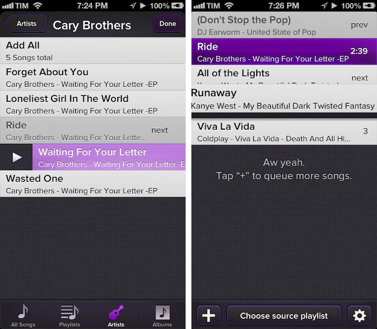
Party Monster is a Universal iOS app to queue songs in a temporary playlist, perfect for parties, dinners with friends, or, generally, every time you want to listen to specific songs in a specific order. As you may know, I’m a passionate Rdio user, and local music with iTunes doesn’t really fit with my listening habits. I wouldn’t mention Party Monster, however, if it weren’t for its approach and attention to detail that made it stand out for me. Read more
Reverse Engineering Penultimate→
Reverse Engineering Penultimate

Fascinating analysis by Alex Caithness of CCL-Forensics about Penultimate (thanks, Clark), a digital note-taking app that was acquired by Evernote earlier this year. Penultimate allows users to draw on screen, simulating virtual ink with smooth lines and curves drawn upon a notebook-like background. That’s what CCL-Forensics tried to reverse-engineer.
Opening one of the “page” files we find another “NSKeyedArchiver” property list. After unravelling the structure of the file we find a top-level object containing further metadata (including a “blankDate” which appears to match the “created” timestamp reported in the “notebookList” and the dimensions of the note) along with a list of “layers”. Each of the “layer” objects (again represented by dictionaries) have keys for the layer’s colour (more on that later) the layer’s dimensions and a list of “layerRects” – sections of the layer where the user has drawn their notes; and that’s where we finally find the image itself.
Sort of.
The description of how Alex got around understanding how Penultimate stores information inside its library is highly technical, but easy to follow with screenshots and Alex’s clear explanation. Essentially, Alex ended up using Python and XML to retrieve the user’s drawings, stored as coordinates – not as “images of the ink”, as one would initially assume.
If anything, it’s a great reminder that our data can usually be retrieved in a variety of ways using forensic tools (and intuition).
Disable Auto-Correct In Tweetbot for Mac→
Disable Auto-Correct In Tweetbot for Mac
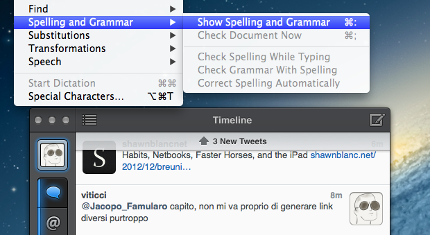
I write in English, but I live in Italy. Some of my Twitter followers are Italian, too, and I like to talk to them in my native language. In the past weeks, I noticed an annoying bug: Tweetbot for Mac, my Twitter client of choice, couldn’t disable auto-correct (Edit > Spelling and Grammar > Correct Spelling Automatically) permanently. The option is there, but it appears it “doesn’t stick” after you enable it to send a tweet without auto-correct. This led to an increasing number of misspelled Italian tweets with English words mixed in (as per my Mac’s system language).
Fortunately, I’ve found the solution here. With a simple Terminal command, you can override Tweetbot’s default setting and disable auto-correct (but not spell checking) automatically.
This is exactly what I was looking for, so make sure to hit the source link to check out the full command.
Pages For iOS and Change Tracking→
Pages For iOS and Change Tracking
Yesterday, Apple released an update for iWork on iOS that added, among changes to Numbers and Keynote, support for change tracking in Pages. I’m not a frequent user of this particular feature, but it could have come in handy when we edited my Mountain Lion review earlier this year. However, last night I noted how the way Apple implemented Change Tracking on iOS felt outdated and convoluted.
Jeff Richardson does use Pages on a regular basis and posted his thoughts on the new version (via David Sparks):
Track changes support has long been the Holy Grail for many litigators using an iPad or iPhone. For the most part, I really like the way that Apple implemented this feature in the latest version of Pages. I wish that the update included a better way to review each edit, but for the most part I suspect that I’ll just scroll through a document and look at the redline edits in the context of the document as a whole so this omission is not critical for me. The lack of support for Comments will sometimes be a problem (depending upon how often you work with people who use that feature), but as long as you know about it and have an app like Documents to Go, Office2 or Quickoffice Pro, you can work around the Comments omission when it becomes an issue.
I can see how lack of Comments and Review mode can be an issue for some users. Mostly though, I believe that the interaction of Change Tracking needs to be redesigned entirely. On Pages for Mac, you can simply click on a change to review it and accept it from a sidebar on the left; in fact, if you click on the blue boxes in the sidebar you can see the blue line connecting the change to the actual text being highlighted in real time. It’s a subtle visual hint, but it’s there.
I’m not sure why Apple decided to go with this simpler interface rather than cooking up a completely new one, but I have a couple of theories. My first thought is that text rendering and manipulation on iOS still doesn’t allow for fairly complex on-screen drawings such as the aforementioned blue lines; a second reason may be scrolling performances, especially on older devices (Pages still supports the iPhone 3GS). But I think that, overall, Apple decided to use this approach because is consistent with the current iOS text selection and because a major new version of iWork for iOS (possibly requiring iOS 6 or later, not iOS 5.1) could be on track for next year.
Apple has long touted iOS devices as heralds of the post-PC era, but iWork has been far behind its desktop counterpart (originally launched in 2009) for months. I expect iWork 2.0 for iOS to level the field in every area.
Improving The iOS Keyboard→
Improving The iOS Keyboard
Chris Bowler, writing about possible improvements for the iOS keyboard:
The negative with writing on the iPad is typing. It’s a bit of a mixed bag experience — the iOS autocorrection is (at times) brilliant and I can fly along with confidence, knowing the OS is going to correct my typos. But when mistakes are made and are either not autocorrected, or autocorrected incorrectly, then the iPad becomes a less comfortable environment.
Remember when, ahead of the original iPad’s announcement in January 2010, rumors tended to focus on what the “tablet keyboard” would be like? Here are a few examples. In spite of the iPhone having shown that Apple simply wanted a regular keyboard’s appearance translated to multitouch, several people wondered whether Apple should do something different for the bigger screen. The answer was that they simply designed a “full-screen” keyboard.
As Chris notes, over the years third-party developers have extended the iOS keyboard with additional bars. Look at Writing Kit, Pythonista, Textastic, and iA Writer for examples of these modifications.
I think the discussion on the iOS keyboard often mixes writing with editing. Personally, I believe the iOS keyboard is great for writing, because it’s just a normal keyboard, but iOS text selection is in serious need of an update, because it feels outdated. I’m not sure the average user cares about better text selection, but for the sake of the argument, I will say that a better solution should be explored.
If you read those old pre-2010 posts on the “iSlate keyboard”, you’ll notice a common thread: that Apple must build something revolutionary for text entry. I recall some people guessed a split keyboard could be a possible implementation, and, in fact, that one came true in 2011. But what about text selection? I don’t think keeping on adding bars above the keyboard is feasible. Especially on the landscape iPad, a single bar alone sensibly diminishes the space available for writing – space being one of the most commonly cited advantages of the iPad against 16:9 and 16:10 tablets. On the iPhone 5, it’s an acceptable solution thanks to the taller screen, but, then again, the bar is too narrow to be a meaningful improvement.
Rather, I would say entirely new ideas for text selection and manipulation are the future. It’s the reason everyone got excited for the Hooper Selection: once you saw it, it just made perfect sense. Too, I wouldn’t completely forget about features that Apple put on the shelf, as they tend to come back.
So here’s my hope for the future of iOS for writing: the same keyboard, but also new, fresh ideas for text selection and editing.
YouTube for iOS Gets iPhone 5 and AirPlay Support, iPad Version
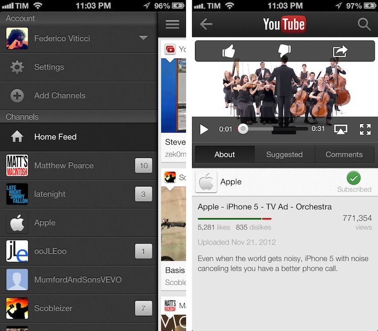
Following a major update to Gmail for iOS, Google has today also released a new version of its YouTube app, which includes AirPlay and iPhone 5 support, as well as an iPad version that makes the app Universal.
One of the new features is the Guide of channels that you can access by tapping on the YouTube logo in the title bar; tap it, and you’ll go back to the app’s main sidebar, listing your account’s options and Channels. On the iPhone 5, YouTube is now optimized for the taller screen – a glaring omission that has annoyed several iPhone 5 users since the device’s release. Among other improvements – including clickable links in video descriptions and ability to add or remove a video from your playlists – a notable addition is AirPlay support: you can now natively stream videos to any AirPlay-compatible device such as the Apple TV or a Mac running Reflection (which is what I tested).
The iPad version of the app is rather obvious, but still welcome: it packs a sidebar on the left side, and main content on the right side of the screen. When you tap on a video, the right portion becomes the main view hiding the sidebar and displaying suggested videos on the right. Interestingly, you can’t browse and watch videos at the same time, as the sidebar will always be hidden after you click a video’s thumbnail.
For everything else, both the updated iPhone app and iPad version share the same features that I covered in my original review of the app, and today’s changes are definitely improvements worth checking out – it’s especially good to see Google supporting AirPlay right after the 1.0 release. Both on the iPhone and iPad, Google offers a feature in the Settings to open links in Chrome, also available for both platforms on the App Store.
The updated YouTube app is available on the App Store. More screenshots of the iPad app are available below. Read more
Evernote Business and Related Notes→
Evernote Business and Related Notes

Today Evernote officially introduced Evernote Business, its new platform that comes with dedicated features for teams and organizations to get the most out of Evernote. Announced earlier this year, Evernote Business builds on the existing foundation of Evernote for regular customers, but it adds more storage, an admin console, Business Notebooks, and the Business Library, a way for members of a team to get direct access to a collection of notebooks.
The Business Library is a collection of selected Business Notebooks that are accessible to the entire organization. At Evernote, our Business Library includes everything from important HR documents to design assets to product schedules to media mentions. All employees have the ability to publish some of their Business Notebooks into the Business Library. Administrators have full control over the Business Library, and can further elevate notebooks into a Recommended set that they feel are particularly valuable to employees.
With Business, Evernote has updated its platform for the new type of accounts that, however, can still merge Personal Notebooks (which are private) with Business Notebooks, which are shared with members of an organization. There’s an admin FAQ and user FAQ available, and the Evernote native and web apps have been updated for compatibility with Evernote Business. The service starts at $10 per user per month, and for now it is available in seven countries. More details (including a video with CEO Phil Libin) are available on Evernote’s blog post.
As I tweeted this morning, however, a big change for me is the addition of Related Notes for both business and normal Premium accounts. As Evernote explains:
This is where things start getting magical. In the latest version of Evernote for Mac (coming soon to other platforms), as you type a new note or view an existing one, Related Notes will appear at the bottom of the note area. The more you type, the more contextually relevant the notes will become.
Essentially, Related Notes is a section that lives underneath the note panel showing up to three related notes. In my opinion, it is a great way to rediscover notes that you may have forgotten about. That has certainly been a problem with the way I use Evernote, because I tend to clip a lot of material from the web, and it often gets lost unless I access it on a regular basis. From what I’ve seen so far, Related Notes works surprisingly well in capturing existing notes about the same subject; I’d be interested in knowing what kind of algorithm Evernote is using here – whether they simply look at keywords or also consider location, tags, time stamps, and other metadata.
Related Notes are available in Evernote 5.0.2, released today for non-Mac App Store users.
iTunes 11 Interface Innovations→
iTunes 11 Interface Innovations
I don’t use iTunes as my default media player on a daily basis. However, since the release of iTunes 11, mainly out of curiosity and to see my wish granted, I’ve forced myself to listen to some music and do some movie watching with it. I was considering a separate article, but Adam C. Engst perfectly summed up the issues I find myself having with iTunes 11:
In the end, it’s good to see Apple trying to extend interface concepts with all these new approaches in iTunes 11 and some, like the use of color and the new approach to application typography are welcome. But there’s a distinct lack of consistency and attention to discoverability that renders the single-window model and multifarious button menus less successful than they might be. I cringe at the thought of trying to help someone use iTunes 11 over the phone — it will be nearly impossible to describe the screen successfully and to walk someone through different actions if you can’t do so in person.
Overall, I believe iTunes 11 is an improvement. I like the expanded album view, the new Store’s consistency with iOS, the device popovers, and the MiniPlayer. But at the same time, as a non-power user of iTunes 11, I found it to be extremely complicated and confusing in other areas: the Done button to dismiss the device window, the separation of sections, views, devices, and Store buttons across the entire window, and the non-native sharing of the iTunes Store. And yes, even other inconsistencies such as the inability to go back to Apps view, the lack of visual hints for songs added to UpNext using the “+” button in the popovers, and the standalone Downloads window that should have probably worked like Safari’s.
It’s not that I don’t like iTunes 11: in fact, I do – overall. It’s that, even from my perspective, there’s a surprising lack of minutiae in the design of iTunes 11.
Slogger and Day One Memories
Slogger is a fantastic script created by Brett Terpstra. With a bit of manual setup, Slogger can run on your Mac and, on a daily basis, pull entries from various Internet sources – such as Twitter and RSS – and put them into Day One automatically. It is a way to fill Day One with social updates for stuff that you write elsewhere. Brett is awesome, he’s working on new stuff for Slogger, and you should definitely check it out (and consider a donation) if you’re interested in its functionality.
I, however, have turned Slogger off a couple of weeks ago and removed the entries it created. This happened soon after the release of Day One with tags and search, which made me realize “automated logging” is not for me. Slogger was a placebo, not a medicine to let me write more. Somewhat intrigued by its scriptability and automation, I fell short of my own promise:
In twenty years, I’m not sure I’ll be able to remember the songs I like today, or the faces of people that I care about now. I don’t even know if I’ll be around in twenty years. But I do know that I want to do everything I can to make sure I can get there with my own memories. We are what we know. And I want to remember.
It took a while for me to realize I wasn’t fixing the right problem. Instead of making an effort to document memories I care about, I was passively watching another Internet pipe feeding a digital archive of my life with tweets, liked items, starred posts, and everything in between. Brett is awesome, but Slogger is not for me. At least not with the current version of Day One, because there’s no way to meaningfully separate “social entries” from “actually-written-by-me entries”. My wish is for Slogger to eventually mature into a standalone app for “social archiving”, separate from Day One.
I want my thoughts – not my stupid Twitter jokes – to be read by someone who, for some reason, will care about the life I had. There are several aspects of my digital life that I like to improve, but I won’t automate my memories.
Day One is a personal experience, and as such, I want it to be mine.