Federico Viticci

10804 posts on MacStories since April 2009

Federico is the founder and Editor-in-Chief of MacStories, where he writes about Apple with a focus on apps, developers, iPad, and iOS productivity. He founded MacStories in April 2009 and has been writing about Apple since. Federico is also the co-host of AppStories, a weekly podcast exploring the world of apps, Unwind, a fun exploration of media and more, and NPC: Next Portable Console, a show about portable gaming and the handheld revolution.

Masto-Redirect, a Mastodon Shortcut to Redirect Profiles and Posts to Your Own Instance

Using Masto-Redirect in Safari.

Using Masto-Redirect in Safari.

Like many others over the past month, I’ve been thinking deeply about my experience with Twitter and whether I want to align my social media usage with the kind of platform Twitter is rapidly becoming. It’s a complex discussion (if my readers are still on Twitter, am I doing them a disservice by not using Twitter?), but in the meantime, I’ve decided to learn more about Mastodon. And in doing so, I came across an aspect of the service that I wanted to improve with a shortcut.

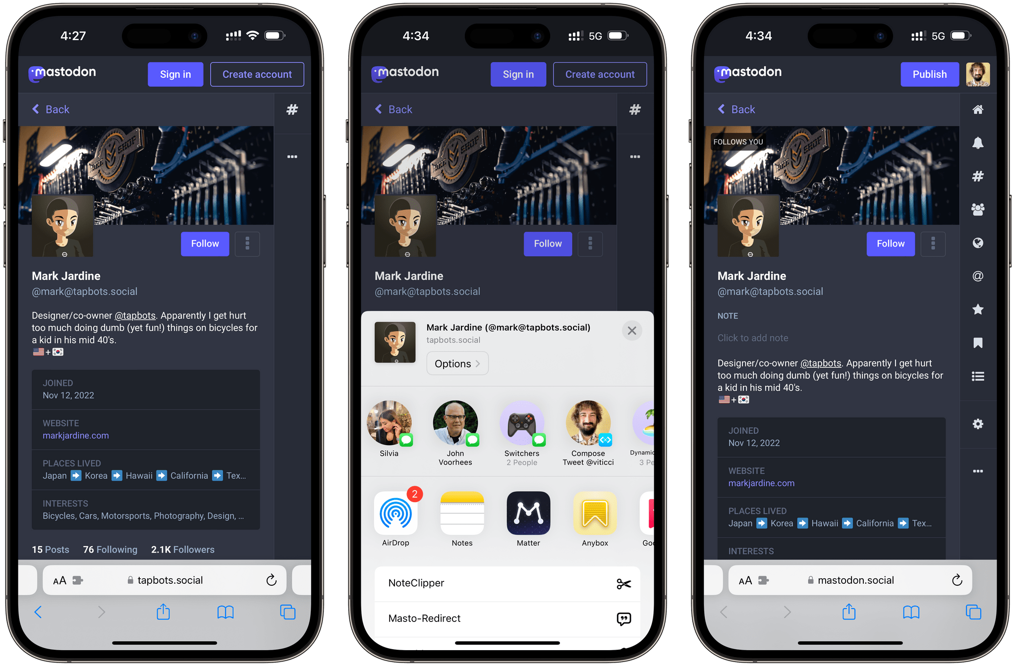
I created an account on Mastodon.social all the way back in 2018, and you can find me as @viticci there as well. I don’t want to turn this post into a guide to Mastodon (you can find an excellent one here), but, long story short, Mastodon is a decentralized service that is based on a federated network of instances. Essentially, there isn’t a single “Mastodon website” like, say, twitter.com; instead, there can be multiple Mastodon instances across different domains (hence why it’s “decentralized”) but, thanks to an underlying API, you can follow and be followed by people regardless of the instance they’re on. I can be on Mastodon.social, and you can be on Journa.host or Mastodon.online (different instances of Mastodon), but we can still communicate with one another via the protocol Mastodon uses. It’s like living in different countries but speaking the same language. You can read more about this here.

Read more


Nerding Out for the Holidays (Part 2)

AppStories+ Deeper into the world of apps

AppStories Episode 307 - Nerding Out for the Holidays (Part 2)

0:00
34:39

AppStories+ Deeper into the world of apps

This week, Federico and John conclude their two-part series on their nerdy holiday projects with home automation, RSS, WiFi, and other plans.

Read more


Apple’s Taken the Joy out of its Books App with iOS 16

I enjoyed this article by Mitchell Clark, writing for The Verge, about the removal of the classic page-turn animation from the redesigned Books app in iOS 16:

Apple Books has been my main reading app for years for one very specific reason: its page-turning animation is far and away the best in the business. Unfortunately, that went away with iOS 16 and has been replaced by a new animation that makes it feel like you’re moving cards through a deck instead of leafing through a digitized version of paper. And despite the fact that I’ve been trying to get used to the change since I got onto the beta in July, I still feel like Apple’s destroyed one of the last ways that my phone brought joy into my life.

I forgot to mention this in the Books section of my iOS 16 review. The Books app received a major redesign this year, and I’ve heard from quite a few people over the past few months about why, for serious readers like them, the new UI layout of the Books app is a regression from iOS 15. All that aside, however, I don’t understand why the page-turn animation – a fun, whimsical aspect of the Books UI that felt uniquely Apple – had to be taken away.

I agree with Mitchell on this: the page-turn animation should come back – if anything, as an optional setting.

Permalink

Nerding Out for the Holidays (Part 1)

AppStories+ Deeper into the world of apps

AppStories Episode 306 - Nerding Out for the Holidays (Part 1)

0:00
36:12

AppStories+ Deeper into the world of apps

This week, Federico and John share the nerdy holiday season projects they’ve lined up in part 1 of a two-part series.

Read more


‘Command-K Bars’ as a Modern Interface Pattern

Maggie Appleton (via Michael Tsai) has written about one of the UI trends I’ve seen pop up more and more lately, and which we mentioned on AppStories several times over the past year: the so-called ‘Command-K’ bars inside apps.

Command bars are command-line bars that pop up in the middle of the screen when you hit a certain keyboard shortcut.They’re also known as ‘command palettes’, ‘command launchers’, or ‘omniboxes’ Traditionally CMD + K, hence the moniker “Command K bars.” But CMD + E and CMD + / have also been strong shortcut contenders.

[…]

They don’t even have to remember its exact name. Fuzzy search can help them find it by simply typing in similar names or related keywords. For example, if I type “make” into a command bar, it’s likely to show me any actions related to creating new items. Even if “make” isn’t part of the action name.

[…]

These bars also do double duty as universal search bars. You’re not only searching through the available actions in an app. You can also search through content like documents, file names, and tasks.

You’ve probably seen these command bars in apps like Obsidian, Craft, Todoist, Arc, Cron, Notion, and lots of others. (On Apple platforms, Things did something similar all the way back in 2018 with a feature called ‘Type Travel’.) It feels like every modern productivity app – especially on desktop – has its own flavor of this interface element nowadays. In a way, this visual trend reminds me of pull-to-refresh before it was standardized by Apple and became a native iOS UI component.

I’m intrigued by Command-K bars as a feature that speeds up keyboard-driven interactions on iPad and Mac while at the same time serving as a search box for an app’s own commands. Think of the typical Command-K bar as a mix of Spotlight, the macOS menu bar, and iPadOS’ keyboard shortcut menu, but as an element that can be invoked from anywhere in an app and dismissed with just a keystroke. As the examples in Maggie’s article show, Command-K bars can be genuinely useful to surface hidden commands and allow power users to save time when using complex apps.

There are plenty of cases where Apple’s apps could benefit from this kind of in-app search makeover. Here’s Notes, for instance, when you activate the ‘Note List Search’ command:

Search inside Notes.

Search inside Notes.

And here’s the rather complex list of keyboard shortcuts supported by Safari:

Keyboard shortcuts in Safari for iPad.

Keyboard shortcuts in Safari for iPad.

I said this on AppStories and I’ll say it again: I think Apple should consider an in-app version of Spotlight that replicates the functionality of Command-K bars and is optimized for keyboard usage on iPadOS and macOS. Modern productivity software is clearly moving in this direction on desktop and the web; I’d like to see Apple apps offer faster keyboard navigation and command discoverability too.

Permalink

A Close-Up Look at Anybox and Spring

AppStories+ Deeper into the world of apps

AppStories Episode 305 - A Close-Up Look at Anybox and Spring

0:00
39:22

AppStories+ Deeper into the world of apps

This week, Federico and John dig into two excellent apps they’ve been enjoying recently: Anybox, a bookmark and file organizer, and Spring, a third-party Twitter client.

Read more


Apple Frames 3.0: Completely Rewritten, Support for iPhone 14 Pro and Dynamic Island, New Devices, Multiple Display Resolutions, and More

Apple Frames 3.0.

Apple Frames 3.0.

Today, I’m pleased to announce the release of version 3.0 of Apple Frames, my shortcut to put screenshots taken on various Apple devices inside physical frames for iPhone, iPad, Mac, and Apple Watch.

Apple Frames 3.0 is a major update that involved a complete re-architecture of the shortcut to improve its performance and reliability on all Apple platforms. For Apple Frames 3.0, I entirely rebuilt its underlying file structure to move away from base64 and embrace Files/Finder to store assets. As a result, Apple Frames 3.0 is faster, easier to debug, and – hopefully – easier to maintain going forward.

But Apple Frames 3.0 goes beyond a new technical foundation. This update to the shortcut introduces full compatibility with the iPhone 14 Pro and 14 Pro Max with Dynamic Island, Apple Watch Ultra, and the M2 MacBook Air. And that’s not all: Apple Frames 3.0 also brings full support for resolution scaling on all iPad models that offer the ‘More Space’ display mode in iPadOS 16. And in the process, I also added support for ‘Default’ and ‘More Space’ options on the Apple Silicon-based MacBook Airs, MacBook Pros, and iMac. All of this, as always, in a native shortcut designed for high performance that uses Apple’s official device images and requires no manual configuration whatsoever.

Apple Frames 3.0 is the biggest, most versatile version of Apple Frames to date, and I’m proud of the results. Let’s dive in.

Read more


Calendars, Communications, and More Revisited

AppStories+ Deeper into the world of apps

AppStories Episode 304 - Calendars, Communications, and More Revisited

0:00
43:17

AppStories+ Deeper into the world of apps

This week, Federico and John pick up where they left off in episode 300 by revisiting episode 200 about calendar apps, communications, home assistants, and Federico’s first surprise of 2021.

Read more