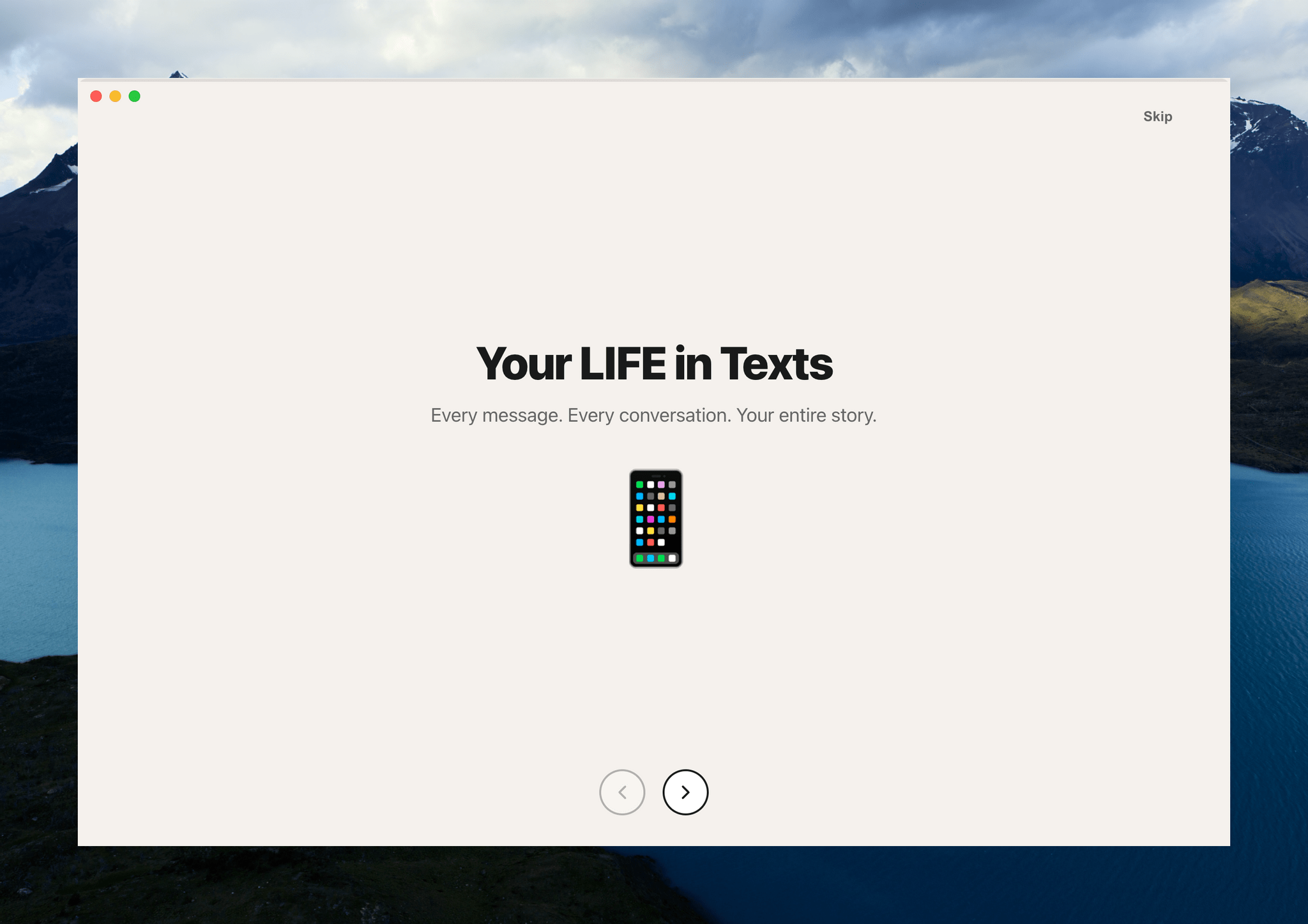
Text messages are a chronicle of our lives. But by the same token, those conversations remain locked away in Messages. The app’s search has improved with macOS Tahoe, which I appreciate, but finding past snippets of a chat log doesn’t allow you to understand the full arc of conversations across your entire family and friend group.
That’s where Remess by Fahmi Omer comes in. It’s a Mac app that accesses your Messages and Contacts databases locally to paint a picture of your life in text messages.
To run Remess, which is an open source project that you can inspect on GitHub, you need to run a Terminal command that bypasses Apple’s Gatekeeper protection and give it both full disk access and access to your contacts. The developer says the app only accesses your information locally, but there’s an element of trust there that’s worth considering before you take the plunge. That said, if you go for it like I did, Remess is a lot of fun.
Let’s take a look.
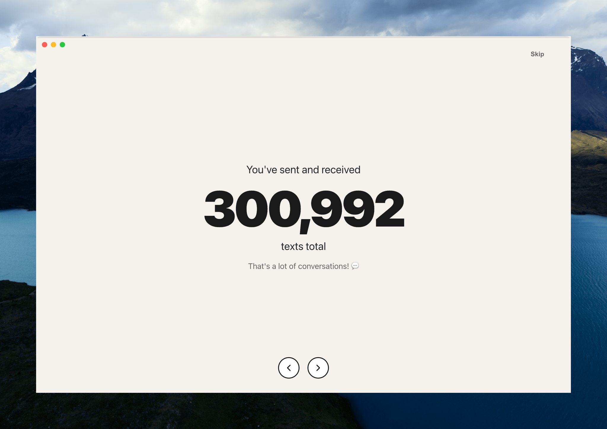
The app starts out very high level with the total number of messages sent and received:
Then, it digs into the details. This is what writing at MacStories for nearly a decade looks like:
From all-time numbers, Remess digs into what a typical day of texting looks like for you:

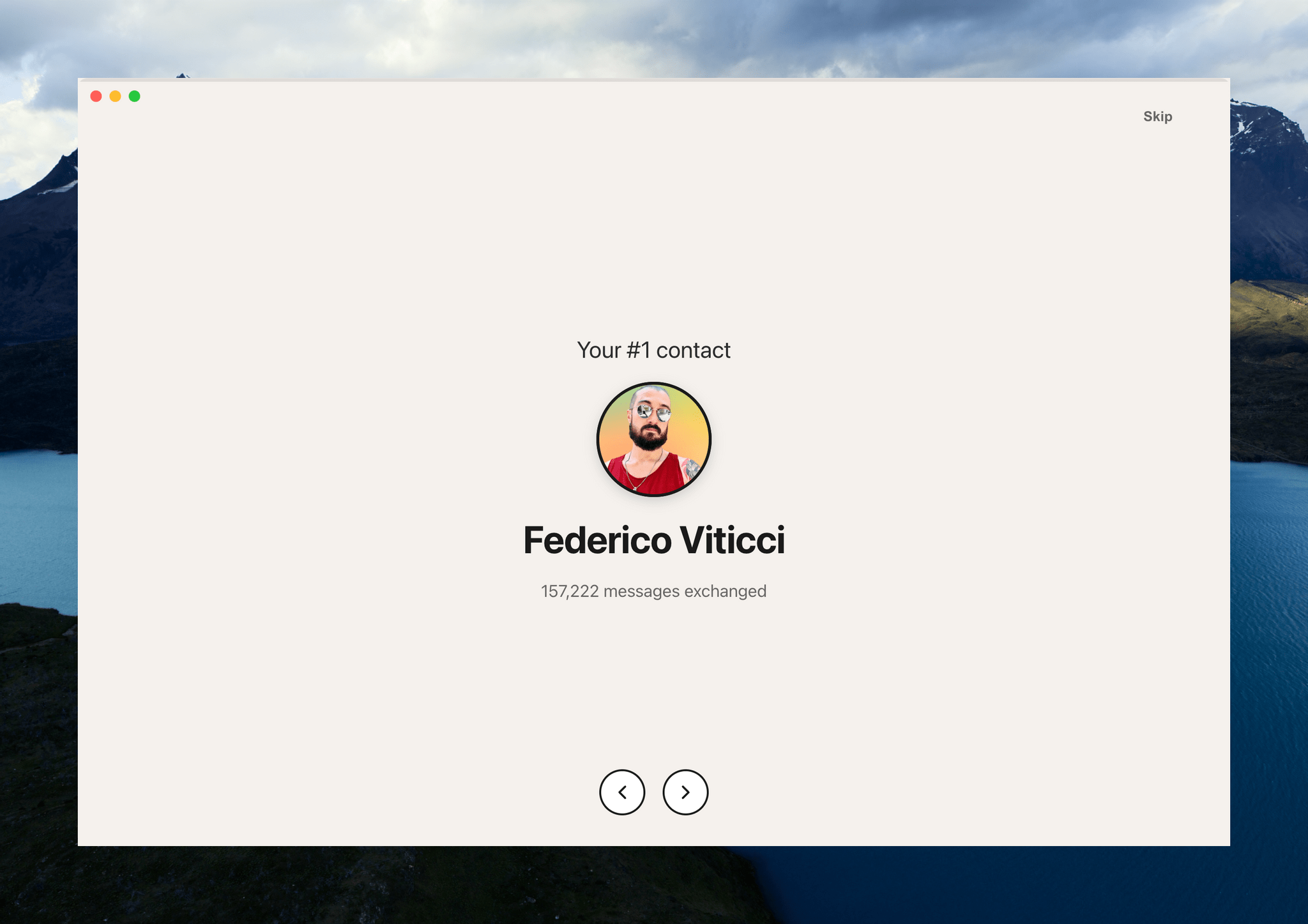
The app also calculates the year you sent the most messages and how many people you’ve exchanged texts. After this brief tour of your life in texts, Remess lands on a dashboard with additional data, a graph of your texting totals, a word cloud of most frequently-used words, and a ranking of your contacts and groups ranked by texting totals.
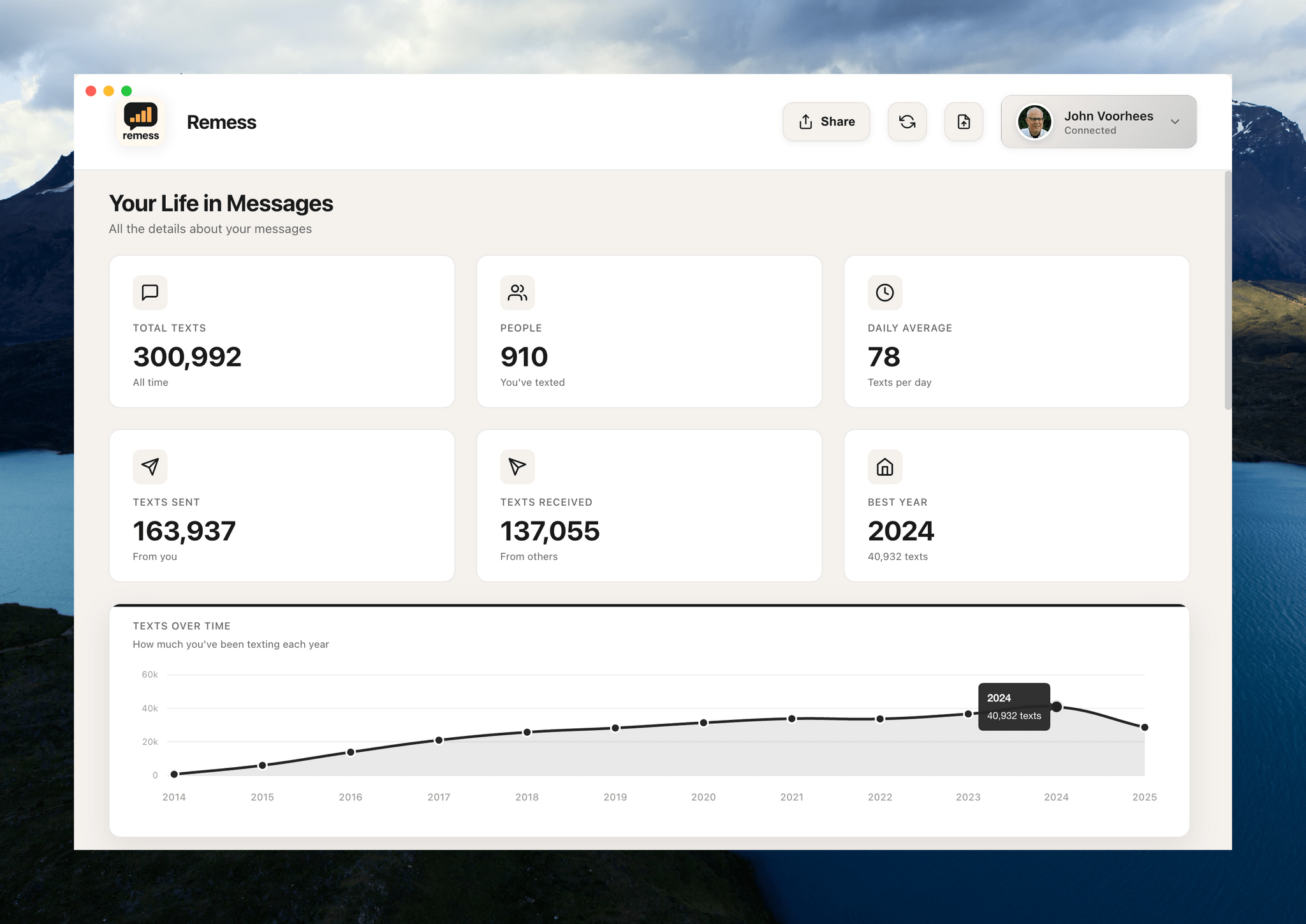
You can filter texting totals by year, too, which is an interesting way to spot patterns in your messaging habits.
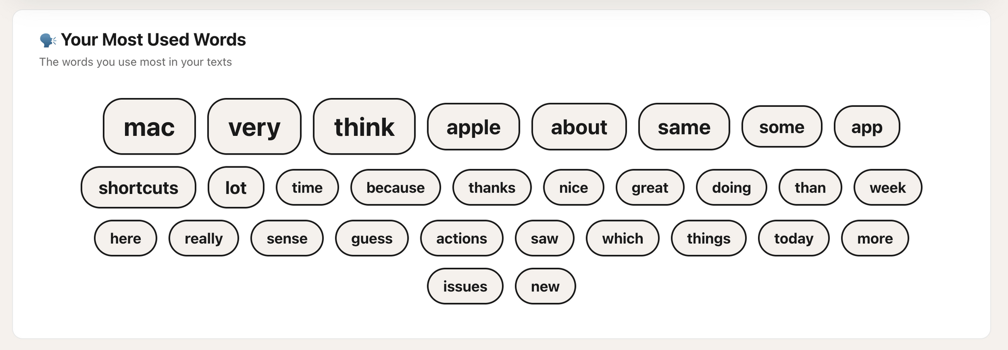
The word cloud should probably filter out common words, but the rest is about what you’d expect from me: Mac, app, shortcuts.
I’m not sure I learned anything about my texting habits from Remess that I didn’t already have a sense of based on my day-to-day messaging. Still, it’s interesting and fun to see the magnitude of the number of texts and the way they’ve accumulated over time.
Remess is available as a free download directly from its developer.