With the introduction of the App Store, mobile gaming took off, quickly becoming the number one driver of revenue for the store. By the time Apple Arcade was released, more than a decade later, mobile games were dominated by free-to-play titles supported with ads or In-App-Purchases, virtual toll booths designed to interrupt the fun until the player paid with their time or money to continue.
This week, in an interview with CNET’s Shelby Brown, Matt Fischer, Apple’s vice president of the App Store, explained that Apple Arcade was created to eliminate those toll booths:
…many users are also looking for game experiences they can enjoy without interruptions, [and] without having to pay up-front for each title. So we saw an opportunity to bring an exceptional set of games together for players who want unlimited access to an evolving catalog of great games, all for a low monthly price, all without in-game ads or in-app purchases.
That perspective fits well with Eddy Cue’s comments to BuzzFeed in 2015 about gaming on the Apple TV, four years before Apple Arcade launched:
When we first announced the iPhone, we didn’t tout it as a gaming device. But games became a huge part of iPhone, because it turns out that a lot more people than just hardcore gamers love games. We expanded the market. I think the vast majority of people around the world probably aren’t looking to buy an Xbox or PlayStation. But that doesn’t mean they don’t enjoy playing games. I think Apple TV expands the gaming market to those people.
Those two quotes are about as good an explanation of Apple’s approach to Arcade as any I’ve seen. The $4.99 per month subscription is designed to appeal to people who like videogames but aren’t likely to play console or desktop games and who would rather pay a monthly fee than be interrupted by ads or In-App Purchases.
That’s not to say that Arcade isn’t testing new ideas, though. A good example is Dead Cells, a big hit before it debuted on the App Store in 2019. Dead Cells has always been a paid-up-front title, with paid DLC that was released periodically in the years that followed. Now, it, too, is available on Apple Arcade as Dead Cells+, a version that collects the original game and all DLC for subscribers.
Apple has also expanded its Arcade catalog with App Store Greats and Timeless Classics, which, unlike Arcade Originals, don’t always support the Mac or Apple TV. According to Fischer:
Over time, something we heard consistently from players was that they wanted more casual titles, along with many of the richer Arcade Originals in the catalog. So we saw another great opportunity to offer our subscribers a collection of classic games along with award-winning titles from the App Store, but with all the benefits that players love about the service. In April 2021, we introduced two new categories of games, App Store Greats and Timeless Classics, to expand the catalog.
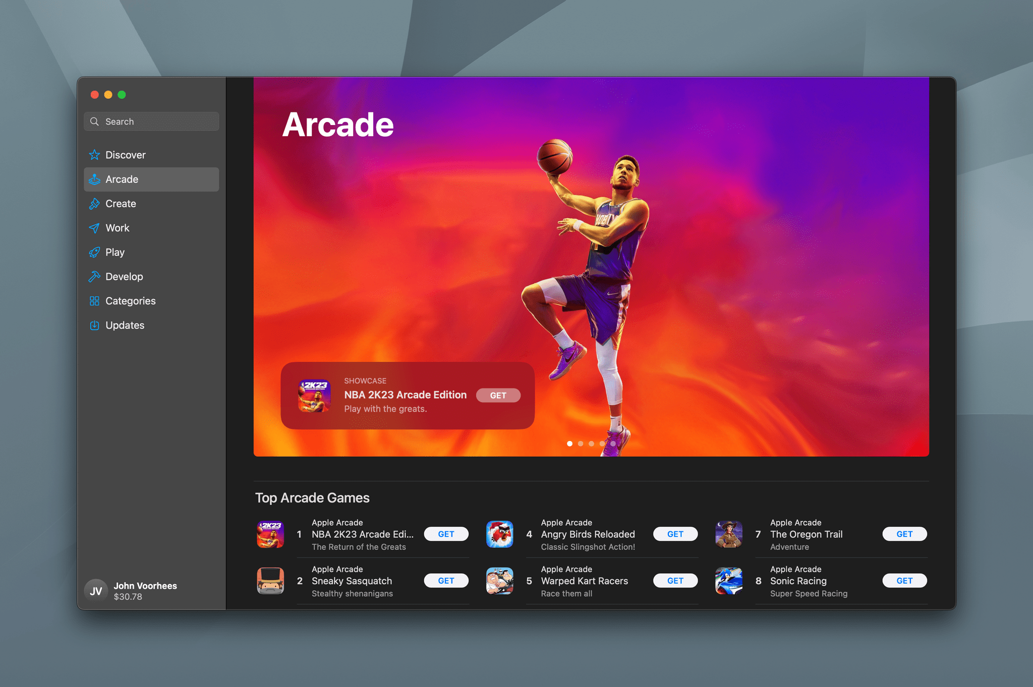
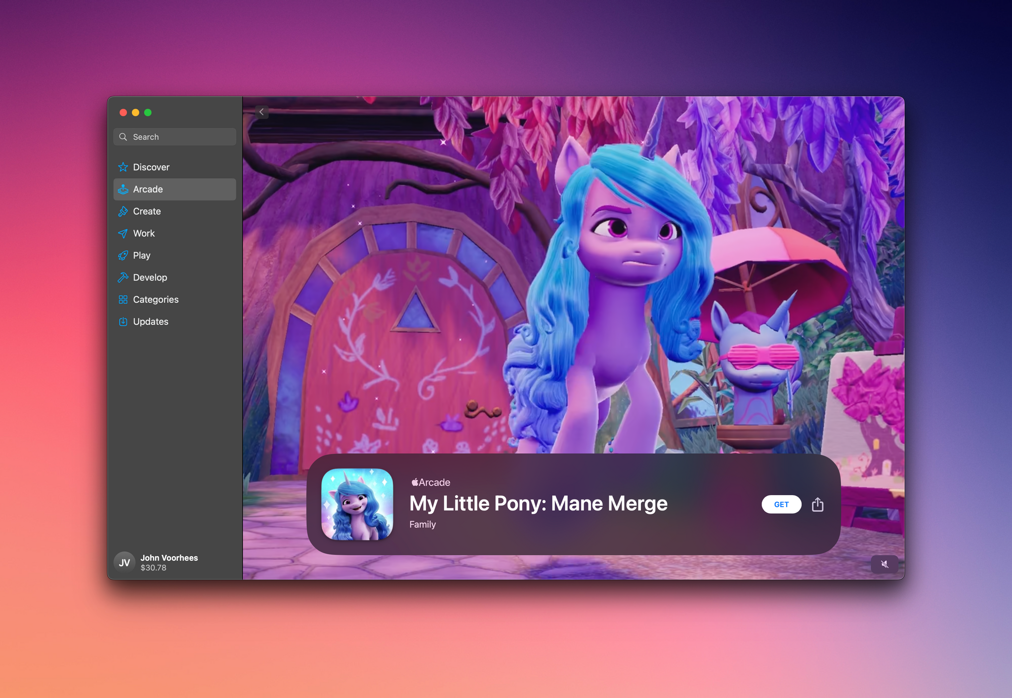
Those titles, along with Originals and others, have grown Apple Arcade into a much more diverse and interesting service than it was when it debuted in 2019. However, games that were previously only available on consoles and desktop computers are increasingly coming to handheld devices like the Steam Deck. Arcade has some titles that rival console releases, but the selection is limited. With more competitors’ devices handling everything from casual games to console and desktop releases, both locally and via game streaming services, I won’t be surprised if competitors start chipping away at the position Apple has carved out for itself in the videogame industry. How Apple reacts will be one of the stories worth keeping an eye on in 2023.