Putting together my annual list of Must-Have iOS Apps is an exercise in analyzing the trends of the year and considering which ones had the biggest impact on how I use my iPhone and iPad. Two years ago, it was web services and open APIs; last year, I focused on collaboration with the MacStories team and making my workflow consistent across devices; this year, there isn’t a single overarching theme behind this list, but rather a collection of trends and changes that I’ve observed over the course of 2018.
First and foremost is the switch to a subscription-based business model by some of my favorite apps. As we noted in our look at the modern economics of the App Store earlier this year, it is becoming increasingly challenging for indie developers – the ones who make the apps we tend to use and cover most frequently on MacStories – to find a balance between reaching new customers with paid app updates and supporting an app over the span of multiple years for existing users who already paid once.
A subscription seems like an obvious solution: new customers can try an app for free and later decide to subscribe; longtime users of an app get to support their favorite app over a longer period of time; developers are more incentivized to keep making an app better thanks to the financial security provided by an ongoing revenue stream. Recurring subscriptions for all apps launched two years ago just before WWDC, and it feels like we’ve only now reached a point where more and more developers are willing to experiment with them. This major shift in app pricing wasn’t always met favorably by longtime users of existing apps, which has resulted in developers testing different approaches such as optional subscriptions, bundles containing subscriptions and In-App Purchases, or even multiple ways to unlock the same features. In looking at the apps included in this list, I was surprised by how many now include some form of recurring subscription; I think this transition will only become more prominent in 2019.
The second trend I noticed in my usage of third-party apps is a strong preference for those that fully embrace modern iOS technologies. From Siri shortcuts (by far, the most important iOS developer framework of 2018) to Files integration and support for external keyboards on iPad, I tend to prioritize apps that eschew proprietary functionalities and adopt native APIs such as iCloud, the Files document browser, or Reminders. With iOS growing more powerful and complex each year, I think it’s only natural that I’ve stuck with apps that shy away from Apple-provided solutions as little as possible; those frameworks are always going to be more integrated with the rest of the system than any alternative a developer can come up with, and I seek that level of integration because I enjoy the comfort of an ecosystem where all the pieces work well together.
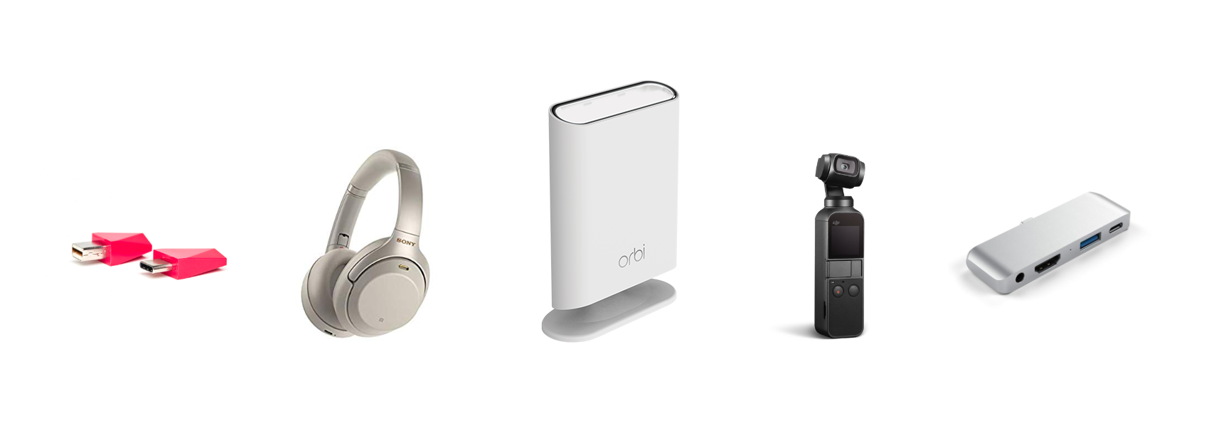
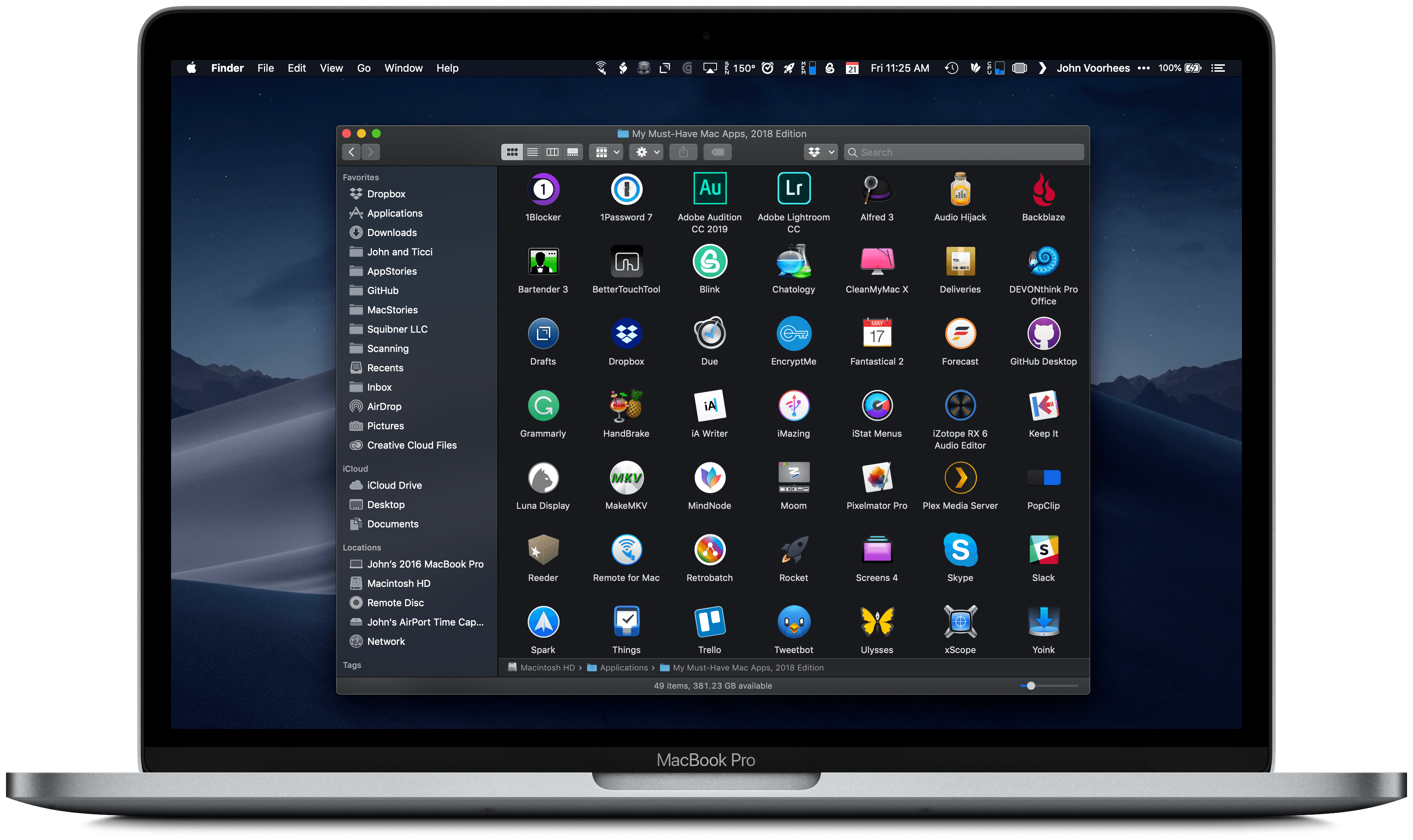
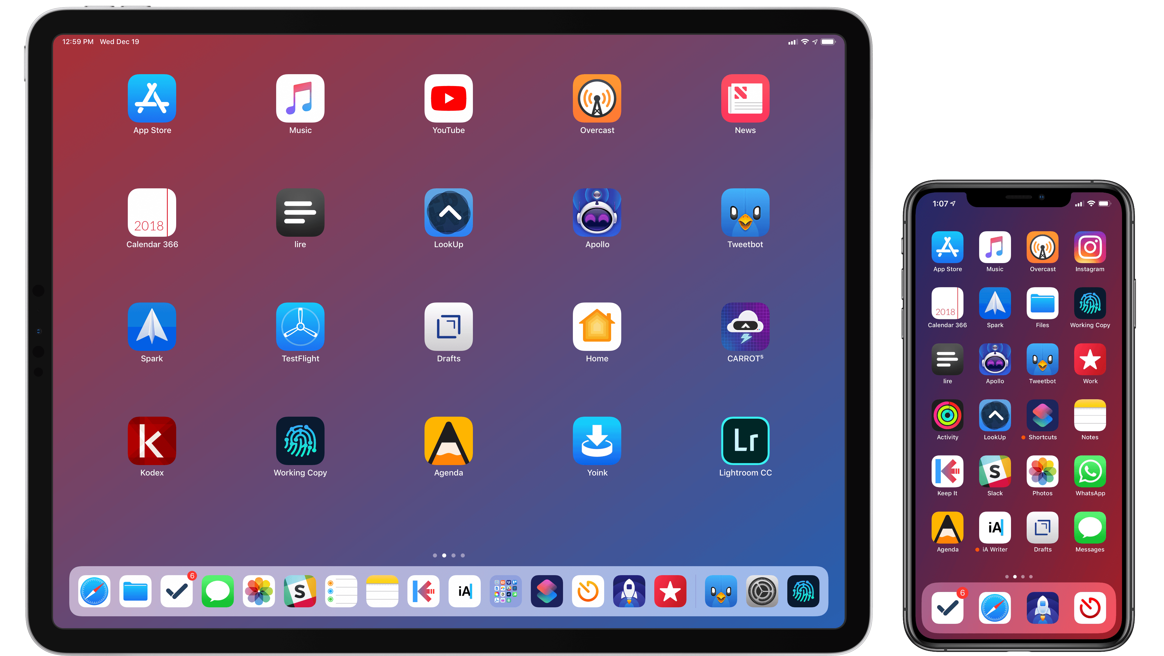
Lastly, I’ve noticed some overall changes in the kinds of apps I consider my must-haves for iPhone and iPad. In the “pro” app department, the Photography and Development lists have grown to include apps such as Lightroom, Scriptable, Darkroom, and Halide – all new entries this year. One of my goals with the new iPad Pro is to use it as a workstation for editing photos and programming my own little additions to iOS; I felt like my increased usage of these apps warranted some changes in the annual picks. You will also find more apps designed to interact with macOS as a result of my purchase of a Mac mini (which I’m using as a home server for various tasks) and different utility apps as some of the old ones have been replaced by Shortcuts. An app that, by the way, I can no longer include in this roundup due to my self-imposed rule of not featuring Apple apps because they’re kind of obvious choices for an iOS user (this also applies to Shazam, officially acquired by Apple this year).
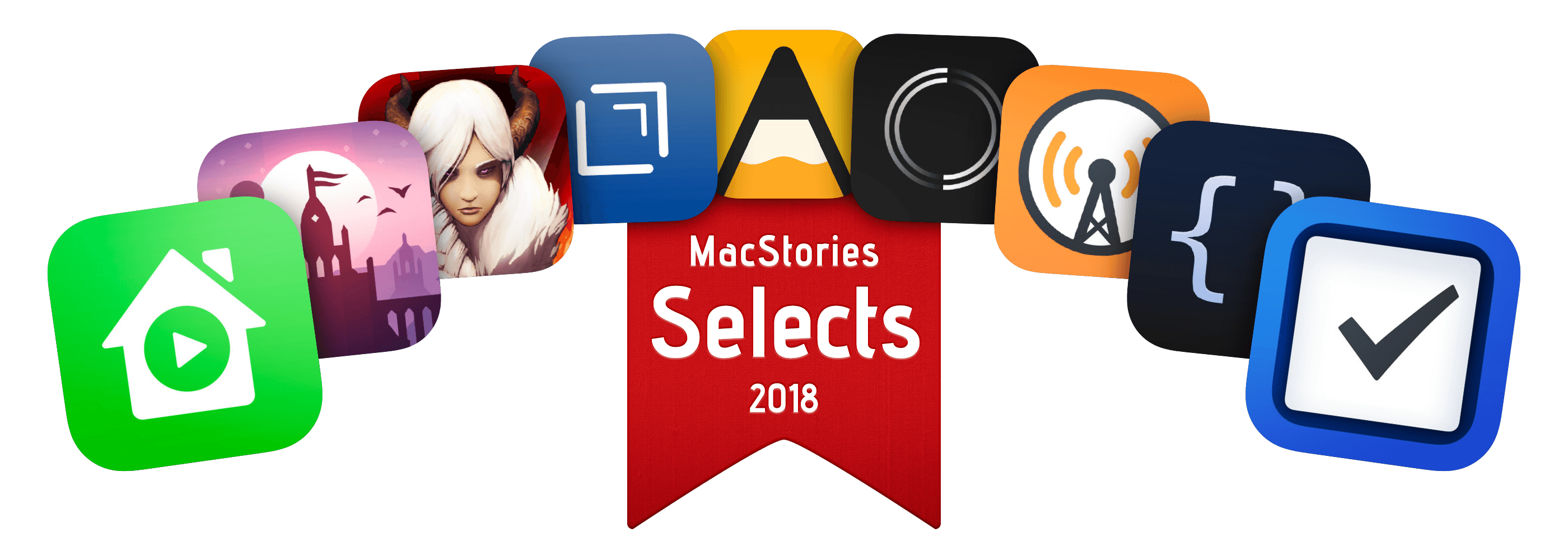
Below, you’ll find a collection of the 60 apps I consider my must-haves on the iPhone and iPad, organized in nine categories; whenever possible, I included links to original reviews and past coverage on MacStories. What you will not find is the usual list of awards for best new app and best app update, which we’ve relaunched as a team effort under the MacStories Selects name this year. Instead, at the end of the story you’ll find my App of the Year, which is also joining MacStories Selects as an award that recognizes an overall outstanding iOS app that had a profound impact on my workflow over the past year, regardless of its release date.
Let’s dig in.
Read more