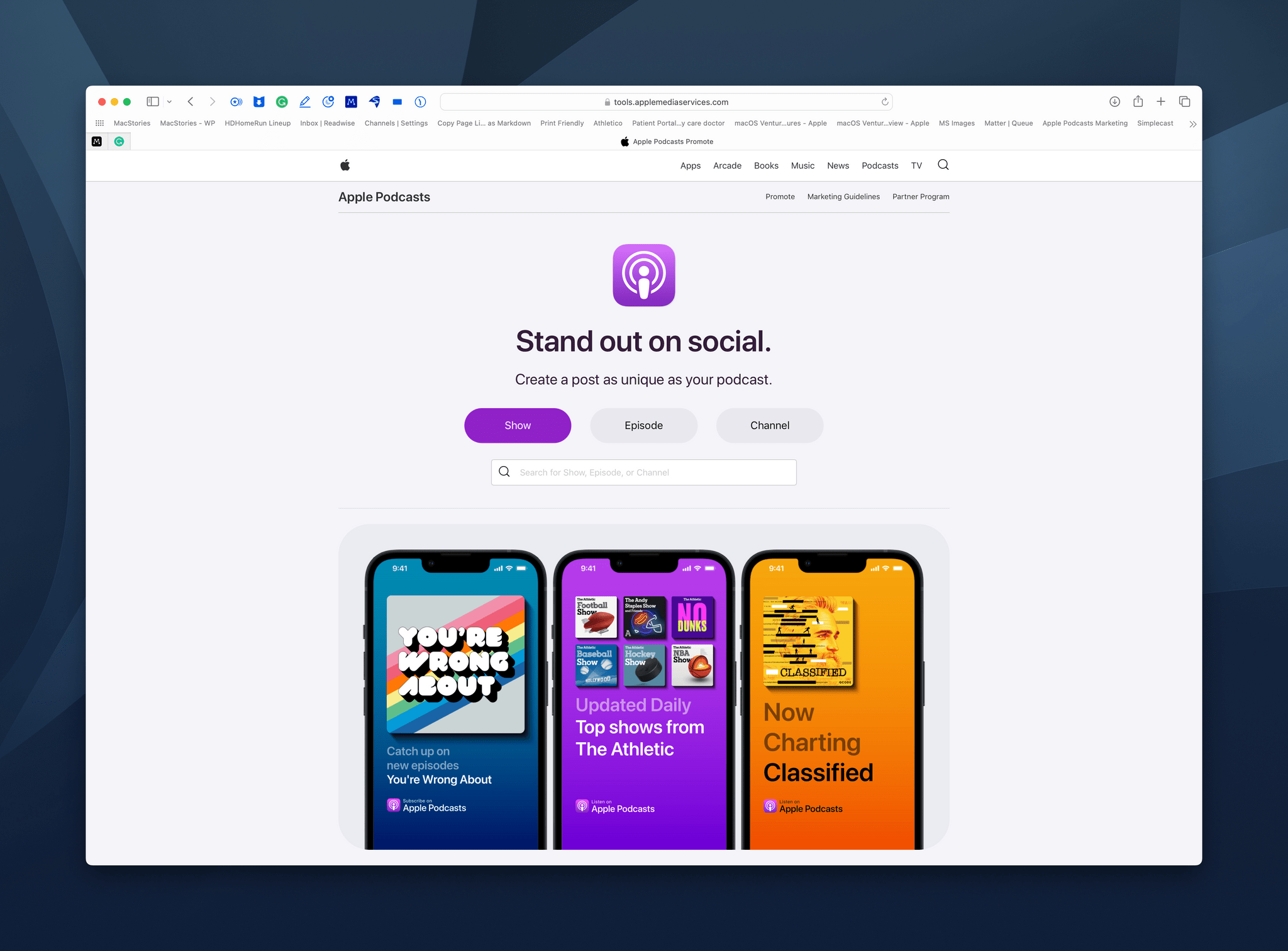
Apple has released a free web app that lets podcasters create artwork and links to promote their shows on Apple Podcasts. The app offers several customization options that should appeal to a wide variety of creators who want to market their shows on Apple’s service. Still, there are a couple of limitations worth keeping in mind.
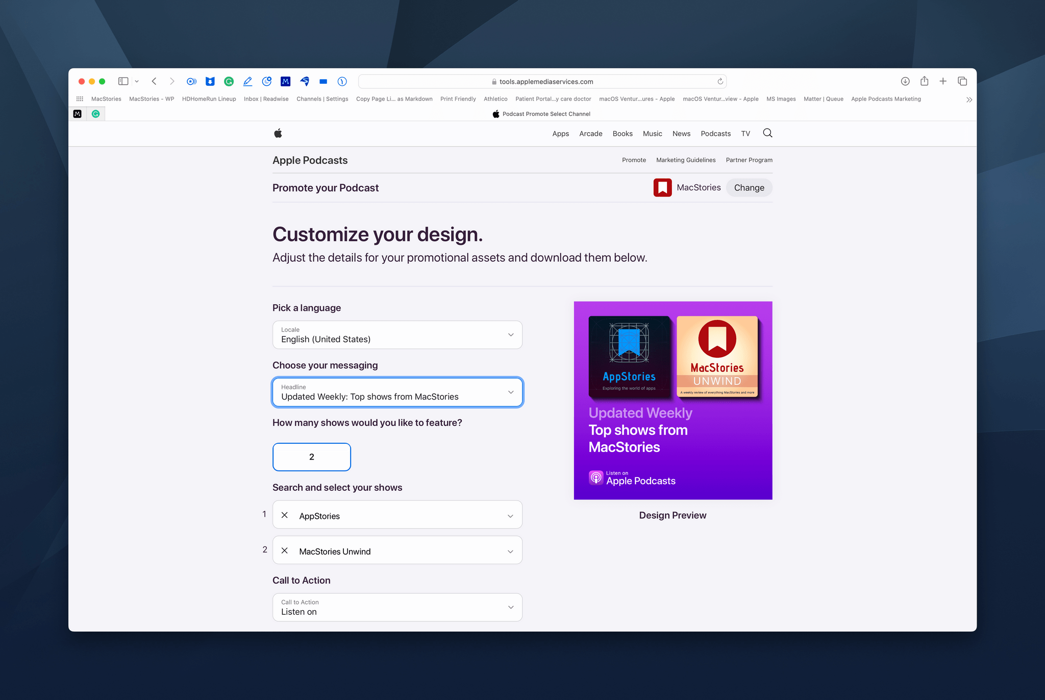
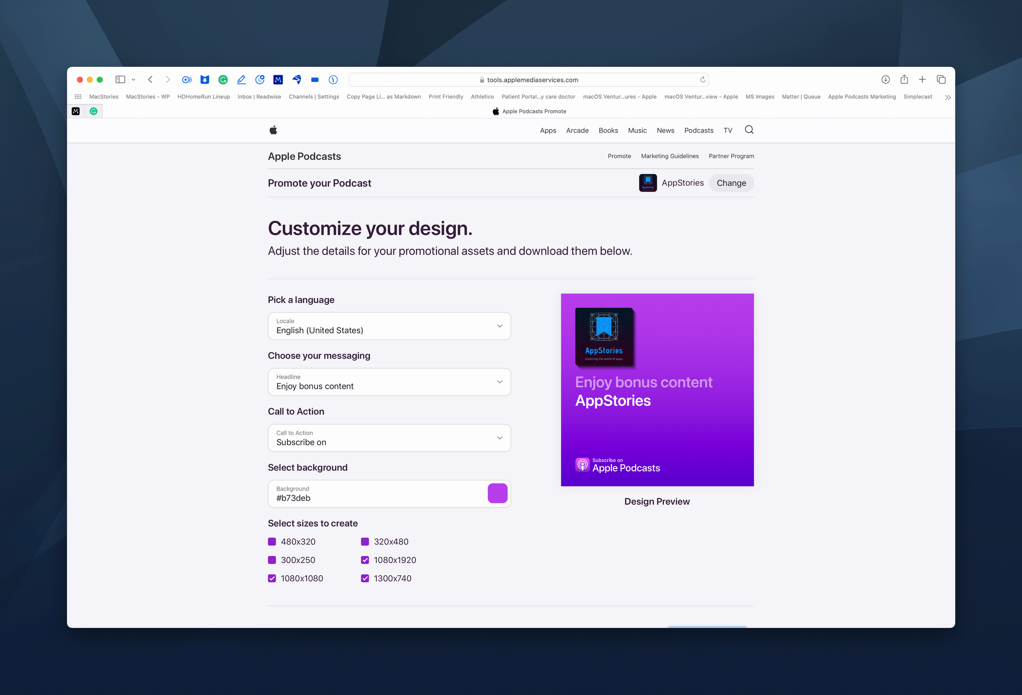
At its core, Apple’s tool makes it easy to generate promotional artwork in several predefined sizes along with links that can be posted to social media to promote a show, an episode, or an Apple Podcasts channel. Six size choices cover the standard artwork specifications for most social networking services. By default, the artwork is generated with a purple gradient that matches the Podcasts’ app color scheme, but you can change it to whatever you like.
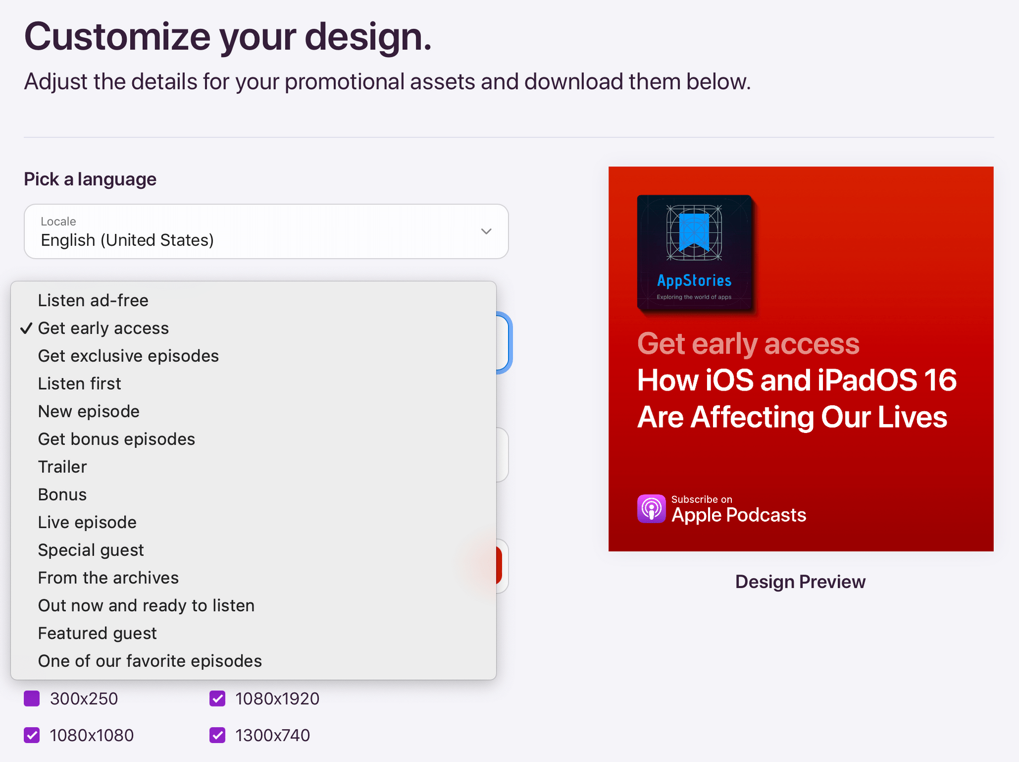
There are several messaging options tailored to whether a show is free or offers a subscription version.
The tool also provides several predefined messages that are applied to the artwork, the number of which depends on whether a show is free, paid, or free with a paid option. Shows that rank among Apple Podcasts’ Top Shows have the option of promoting their rankings too. However, there is no option to craft your own marketing message for the artwork, which is a little disappointing but not surprising.
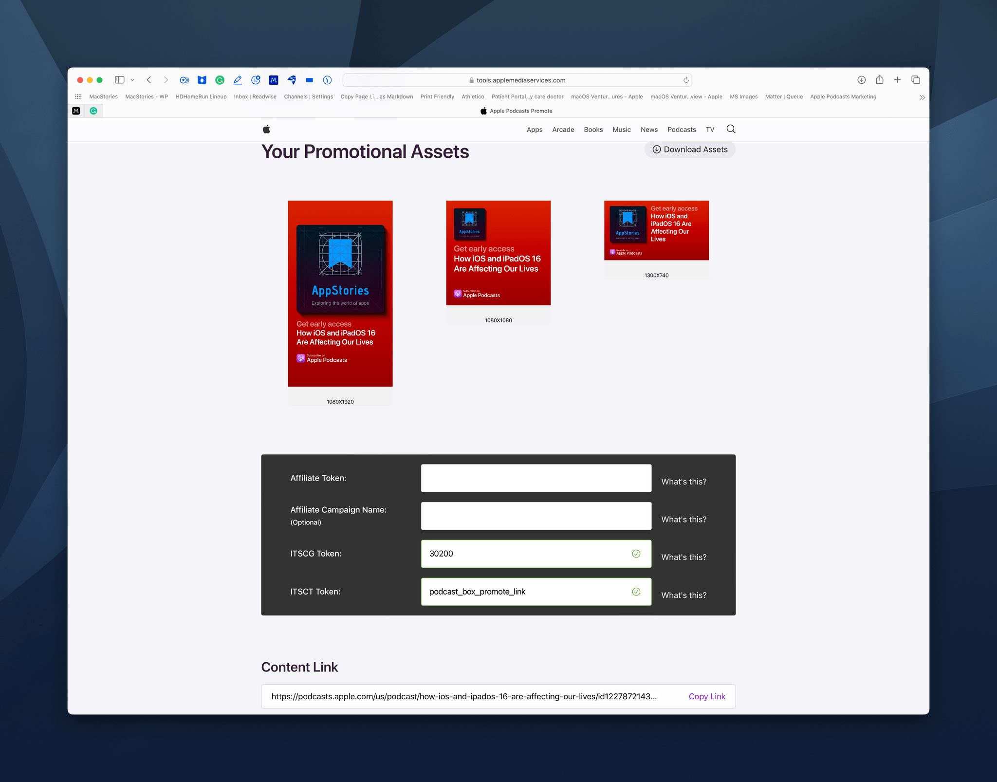
Promotional art comes in multiple sizes for different social networks, and URLs can include affiliate parameters.
The app generates full and shortened URLs, too, with the option to include affiliate parameters if you participate in Apple’s affiliate linking program for services.
Apple’s new marketing tool for social channels works well and generates good-looking artwork with minimal effort, making it a nice option for anyone with limited time and resources. However, it’s worth keeping in mind that the tool is limited to Apple Podcasts. The messaging options are limited too. You’ll need a different solution if you’d rather promote your podcast’s own website, another podcast directory, or use a marketing message not offered by Apple. Still, because such a large percentage of many shows’ audiences listen using Apple Podcasts, the company’s new tool is an excellent way to reach those listeners and potentially grow that segment of your audience.


](https://cdn.macstories.net/banneras-1629219199428.png)