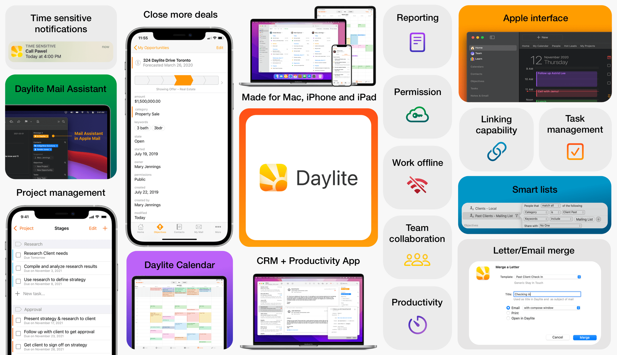
This Week's Sponsor:

Turbulence Forecast

Know before you go. Get detailed turbulence forecasts for your exact route, now available 5 days in advance.


Widgetsmith Is Coming for Your iOS 16 Lock Screen Too

It’s been two years since Widgetsmith took the App Store by storm. The app, which was created by long-time indie developer David Smith, lets users create custom Home Screen widgets. Then, shortly after the app’s release, it went viral when TikTokers discovered it and dropped Dave and his app squarely in the center of the Home Screen aesthetic phenomenon.

Two years later, it’s fair to say that few people know widgets like Dave knows widgets. He’s spent the past two years refining Widgetsmith. Also, Widgetsmith is just one of many apps Dave has released over the years, many of which included some of the best Apple Watch apps available. That unique combination of experience uniquely positioned Dave to take advantage of iOS 16’s Lock Screen widgets.

If you’ve used Widgetsmith to create Home Screen widgets, you’ll hit the ground running with Lock Screen widgets. There’s a new segmented control near the top of the iPhone app’s Widgets tab that toggles between Home Screen and Lock Screen widget creation. The Lock Screen view is divided between the inline text widgets that fit above the time on the Lock Screen and circular and rectangular widgets that sit below the time.

It's true, read the Messages section of his iOS 16 review.

It’s true, read the Messages section of his iOS 16 review.

When you tap to add an inline text widget, Widgetsmith opens its editor, which offers 11 categories of widgets, each which has its own set of options. The inline text widget can be used display whatever text you want that fits. Other options include multiple time, date, weather, calendar, fitness, and reminder widgets.

Setting up a circular widget.

Setting up a circular widget.

The circular widget offers six categories: photo, time, weather, step counting, reminders, and astronomy, each with multiple styles and available themes. Photos, which is also available to use with rectangular widgets, is interesting. It allows you to add a photo to the widget itself. Of course, the photo is rendered as a monochrome image when added to a widget, which can make images that aren’t high-contrast hard to see, but there’s also an option to isolate people from their backgrounds, which can help. The photo widget isn’t for me, but I can imagine situations where someone might want to add one. The rectangular widget category includes even more categories from which to choose. Between the overlap with other widget types, plus the Battery and Tides widgets, there are a total of 13 widget types that can be added to a rectangular widget and themed.

One of the best parts of Widgetsmith is browsing through its extensive catalog of widget types and then tweaking your favorites to make them fit with your own style. There are so many possibilities that I’d wager that the app has something to offer for everyone. If you want to dive deep in iOS 16 Lock Screen customization, Widgetsmith is a great place to start.

Widgetsmith is a free update on the App Store. The app offers a time-limited free trial after which it requires a $1.99/month or $19.99/year subscription.


LockFlow: A Simple Way to Add Shortcuts to the iOS 16 Lock Screen

A shortcut isn’t worth building if invoking it is more trouble than doing the same thing another way. Fortunately, that’s rarely the case because shortcuts can be triggered in so many ways. Still, you can never have too many options because more options mean more contexts where running the shortcut saves time. That’s why I was glad to see a brand new app called LockFlow released alongside the iOS 16 release. The app makes it incredibly simple to add shortcut widgets to your iPhone Lock Screen.

There are a couple of ways to set up your shortcuts to work with LockFlow. The first option is to use a special helper shortcut that’s bundled with the app. When you run it, the shortcut prompts you to pick the shortcuts for which you’d like to make Lock Screen widgets. The shortcuts you pick will then be listed in the LockFlow app for turning into widgets.

One word of warning, though. If you have hundreds of shortcuts, the scrolling performance of the helper shortcut isn’t great. However, because Lock Screen widget space is limited, I expect that most people won’t need to use the helper shortcut often. You also have the option of adding shortcuts by hand inside LockFlow, but you need to be careful to enter the exact name of the shortcut for the widget to work.

Adding a shortcut to LockFlow can be accomplished in the app or with a helper shortcut.

Adding a shortcut to LockFlow can be accomplished in the app or with a helper shortcut.

When you’re finished adding shortcuts to LockFlow, tap on one to give it an icon and test it if you’d like. That’s it. There’s nothing else to do other than head to your Lock Screen and add one of your new widgets.

When you add a LockFlow widget to your Lock Screen, it will be a generic circle with the word Edit in the middle. Tap it and pick the shortcut you want the widget to launch, which will replace the generic graphic with the icon you picked in LockFlow. Now, whenever you tap that widget, it will run your shortcut. My only quibble with this part of the app is that I think the widget’s iconography should be a little bigger than it is.

There are a lot of interesting use cases for LockFlow. You can use the widget as an app launcher with a single-action shortcut using the Open App action. Other options include controlling HomeKit scenes, switching Focus modes, starting a favorite playlist, and a lot more.

Personally, I’ve been using LockFlow with a shortcut that I adapted from one Federico made for Club MacStories members that appends text to a dedicated section of a Markdown note in Obsidian. I’ve also used it to shuffle a playlist of every song I’ve ever marked as ‘Loved’ in Apple Music. Both are the kind of actions I want to get to as quickly as possible with little effort, which is precisely where LockFlow excels.

LockFlow is available on the App Store as a free download.


watchOS 9: The MacStories Review

As we enter the ninth iteration of watchOS, I must admit that I sometimes find myself looking back wistfully on the computer watch that the Apple Watch once was. My inner tech nerd misses the wild, blind shots at digital connection and interface design which we were gifted by an Apple that had not yet figured out what the mass market wanted from this device.

In many ways, the early days of the Apple Watch feel like echoes from a bygone era of Apple; an era in which it was more willing to throw things at the wall just to see what stuck. This is, after all, the company which brought us the buttonless iPod shuffle, the hockey puck mouse, brushed metal, the tape-recorder Podcast app, and so much more. We tend to call it Apple’s sense of “whimsy”, and early watchOS had plenty of it.

Time Traveling in watchOS 2.

Time Traveling in watchOS 2.

In watchOS 2, Apple shipped a feature called Time Travel where you could spin the Digital Crown to “travel backwards and forwards in time”. Complications would move alongside the watch hands to reflect their past or predicted future values. Time Travel was demoted to a setting in watchOS 3, and quietly removed entirely some time later.

There was also the concept of Glances beginning all the way back in watchOS 1. Glances were single-page app interfaces accessible by swiping up from the watch face, then swiping side-to-side to switch between them. Third-party apps could create these, and the watch supported up to 20 of them. Glances were also canned in watchOS 3. They were replaced by the Dock, which never quite managed to capture the same energy.

For years, Apple seemed particularly interested in the potential of the Apple Watch to be a core hub for personal communication. Until watchOS 3, the hardware side button on the device was dedicated to opening the Friends interface. When interacting with your friends, you could send giant animated emojis — perhaps a very early precursor to the Memoji that we have today. And of course, no one could forget Digital Touch. Who among us did not feel more connected to our loved ones when tapping out pings and drawing shapes on their wrists1?

The Friends interface in watchOS 2.

The Friends interface in watchOS 2.

What leaves me feeling so conflicted is that, ultimately, all of the above features were pretty bad. No one used the Friends interface, Time Travel wasn’t particularly useful, third-party Glances were kneecapped by their lack of interactivity, and communicating from an Apple Watch has always just been way more work than pulling out your iPhone. Apple was right to kill all of these features in their time, but I still can’t stop missing the days when my Apple Watch was searching for more variety in purpose than it exists with today.

Read more


  1. I imagine Digital Touch is unfazed by my mockery; likely too busy feeling satisfied that it is the only one of the features described above which has (somehow) endured into modern iterations of watchOS. ↩︎

CARROT Weather 5.8: A Beautiful New iPad Layout, Lots of Lock Screen Widgets, and More

If you use CARROT Weather and have an iPad, stop. Go update CARROT, dig into its Layout settings, and pick the Multi-Column Layout Style before you read any further. I’ll wait.

It’s good, right? Even if you don’t customize it at all, CARROT’s new three-column layout will excite your inner weather geek. The layout is a natural extension of the card-like interface of CARROT’s iOS app, expanded to multiple columns. It’s a terrific update that makes much better use of the iPad’s bigger screen.

Picking Multi-Column from CARROT Weather's Layout settings.

Picking Multi-Column from CARROT Weather’s Layout settings.

The app’s signature card-like customization scheme is the perfect fit with the iPad, allowing users to pick and choose the data that’s most important to them, adjusting each component to fit nicely onscreen. In narrower Split View configurations, CARROT Weather falls back to the single-column, Plain style layout.

CARROT Weather's columns are completely customizable.

CARROT Weather’s columns are completely customizable.

The update also adds another 10 sections of weather data that can be displayed in a variety of ways, including as line and bar charts. With the existing sections, which we’ve covered before, there are more than enough data points and display choices to fill three-columns to your personal tastes.

Apple itself has headed in a similar direction, designing the new Weather app for iPadOS and macOS as a grid of tiles that offer more details when tapped. However, I prefer CARROT Weather because it lets me choose what to display and where. CARROT also lets me save multiple layouts, which opens up the option to customize layouts for each season or for different activities.

Examples of CARROT Weather's rectangular Lock Screen widgets.

Examples of CARROT Weather’s rectangular Lock Screen widgets.

A few of CARROT Weather's circular Lock Screen widgets.

A few of CARROT Weather’s circular Lock Screen widgets.

In addition to the new iPad design and new sections available in the iPhone and iPad versions of the app, CARROT Weather now comes with a whopping 20 Lock Screen widgets for the iPhone. Four of those widgets, Snark, Custom Conditions, Hourly Forecast, and Daily Forecast, are the larger rectangular variety. The remainder of the widgets are circular ones that offer a long list of data points like the current conditions, the current temperature along with the forecast high and low, the change of precipitation, wind speed, UV Index, Air Quality, and more. Whatever is most important to you, there’s bound to be a widget for it in CARROT Weather.

Finally, CARROT Weather has added another weather data provider: Apple’s own WeatherKit service. All weather data providers seem to be strong in some parts of the world and weaker in others, including WeatherKit, but it’s good to have another choice, especially since Dark Sky will no longer offer forecasts beginning next year.

I’ve been spending a lot of time pairing Lock Screens with Focus modes, and CARROT’s weather widgets have been a staple when I head out for a long walk or bike ride. Along with the redesign of the iPad app, version 5.8 is another excellent update from CARROT that I encourage everyone to check out.

CARROT Weather 5.8 is available for download now on the App Store. Some of the app’s features require a subscription, the details of which you can learn about on the App Store.


Last Week, on Club MacStories: An Apple Event Town Hall, the Best Keynote Moments, a Markdown Library Shortcut, and iOS 16 Details

Because Club MacStories now encompasses more than just newsletters, we’ve created a guide to the past week’s happenings along with a look at what’s coming up next:

An Apple Event Town Hall

After last week’s Apple event, we held a special live Club MacStories+ Town Hall in the Club MacStories+ Discord community. Federico, Alex, and I covered the iPhones, Apple Watches, and the new AirPods Pro announced by Apple last week.

If you missed the live event, the audio of the Town Hall is available as a podcast from the Club podcasts page.

MacStories Weekly: Issue 335

Up Next

Every year when Federico publishes his iOS review, we share special perks with Club MacStories members. This year is no different. Here’s what’s already available and what is coming later this week with a special Saturday edition of MacStories Weekly:

Available now:

Available this Saturday:

  • A special issue of MacStories Weekly including:
    • A “Making Of” story from Federico about this year’s review writing and production process
    • Two advanced shortcuts that take advantage of Shortcuts features that debuted with iOS 16
    • A featured story from Michael Steeber about the animation and artwork he designed for Federico’s review

Learn more, and join Club MacStories at plus.club.


iOS 16: The MacStories Review

AppStories+ Deeper into the world of apps

AppStories Episode 295 - iOS 16: The MacStories Review

0:00
42:18

AppStories+ Deeper into the world of apps

This week, Federico and John dig into Federico’s iOS 16 review, discussing the all-new Lock Screen, wallpaper creation, Focus modes and filters, App Shortcuts, and some of the smaller changes you might have missed.

This episode is sponsored by:

  • Pillow – Sleeping better, made simple.
  • Memberful – Monetize your passion with membership.

iOS 16: The MacStories Review

We deliver AppStories+ to subscribers with bonus content, ad-free, and at a high bitrate early every week.

To learn more about the benefits included with an AppStories+ subscription, visit our Plans page, or read the AppStories+ FAQ.


Follow us on Twitter

Follow us on Instagram


iOS 16 Review Extras: eBooks, Shortcuts, Making Of, and an Obsidian Plugin

Today, Federico published his iOS 16 review. As in past years, we’re releasing a wide variety of perks exclusively for Club MacStories members throughout the week, including an eBook version of the review, an eBook compilation of our 2022 OS Preview Series, two advanced shortcuts, two behind-the-scenes making of the review stories, and an update to one of our Club-exclusive Obsidian plugin.

What’s more, because Apple won’t be releasing iPadOS 16 until later this fall, we’ll have more perks for Club members when it’s released too.

Read more


iOS 16: The MacStories Review

Customization is back, and Apple’s having fun again.

When is the last time your iPhone truly surprised you?

The answer to this question is a fascinating Rorschach test that can say a lot about a person’s relationship with Apple’s mobile platform. Some might say it was over a decade ago, when they feasted their eyes upon the Retina display for the first time in 2010. Some might say it happened when the iPhones got bigger – and sales skyrocketed – with the iPhone 6 lineup in 2014. Others might argue that it happened with Face ID on the iPhone X, or the first time they tried Portrait or Night mode, or perhaps when they first took an ultra-wide shot.

My point is: if you ask someone about the last time an iPhone truly surprised them, chances are they’ll reply with a hardware feature. That’s not a shocker: Apple prides itself upon the tight integration they’ve been able to achieve between the iPhone’s hardware and iOS; they’ve successfully managed to turn their design philosophy into a selling point of their entire ecosystem.

People buy iPhones because they know they’re going to work well for a long time, and, usually, because the model they’re getting has a cool new gimmick they want to try. For this reason, it’s not absurd to postulate that, by and large, the iPhone’s software serves to enable hardware sales and subscriptions. I do not mean this pejoratively: I like Apple’s approach, otherwise I wouldn’t be writing annual reviews about their operating systems. But I also recognize that on the iPhone (the situation is the exact opposite on iPad) the software now largely takes the backseat compared to hardware and services.

Which is why whenever the iPhone’s software truly surprises me, I get excited.

Software-related surprises are more rarefied on iOS these days, but the kind of people who are reading this story can point to a few examples in our recent history. Apple buying Workflow, turning it into a system app, and outright claiming that Shortcuts is the future of automation was a surprise. The extent to which Apple integrated dark mode in iOS 13 was a surprise.1 The arrival of two iPad features – Picture in Picture and inter-app drag and drop – on iPhone felt like a surprise. But, of course, no modern feature comes close to the surprise that we all witnessed with iOS 14 two years ago: a renewed focus on user personalization with custom Home Screen widgets and the ability to create multiple Home Screens.2

That’s why, following last year’s welcome (if perhaps a tad uninspired) quality-of-life update that was iOS 15, I’m excited about a new version of iOS again.

iOS 16, launching today for a variety of iPhone models dating back to the iPhone 8, marks Apple’s triumphant return to user personalization, with a twist: while in 2020 customization might have felt like a happy consequence of Apple’s engineering, this time the company has intentionally marketed iOS 16 as an update that will make an iPhone feel truly your own. As we explored in June and July, the first thing you see on your iPhone – the Lock Screen – is fundamentally changing in iOS 16. With the ability to create multiple Lock Screens, choose from a diverse collection of wallpaper sets, and customize each one with widgets, you’ll now have endless possibilities for the screen you always see when you pick up your iPhone.

Sure, there’s an argument to be made for Lock Screen widgets also being developed in service of new hardware, but I don’t think that takes away from the breadth of this feature and how Apple created a whole narrative around wallpapers, widgets, photos, and Focus modes this year. As you’ll see, the customizable Lock Screen will be the main character of this review: I’ve had a lot of fun exploring different permutations of my Lock Screen this summer, and I’ve been able to test dozens of widgets from third-party developers, which I’ll also showcase in this story.

In keeping with my theory that modern iOS updates always need to have a little bit of something for everyone, there’s a ton of other (some bigger, some smaller) features I’ll be covering in this review.3 Messages, one of my most used apps on iPhone, has received a substantial update with the ability to edit and un-send messages, making it, in some ways, even superior to WhatsApp for me now. Mail – of all apps – has gotten a major upgrade with modern features such as scheduled send and, almost unbelievably, a revamped search that actually works. Reminders has officially turned into a serious task manager with even more filters for smart lists and the ability to create and share templates with others.

The new Lock Screen takes center stage this year and everything else pales in comparison to the massive update it received, but, overall, I find iOS 16 a more fun and useful update than iOS 15.

So, as with every September: let’s dive in.

Read more


  1. Then again, wasn't that in service of OLED displays? ↩︎
  2. Perhaps the iPhone 14 Pro's Dynamic Island will be another major surprise for iPhone users. Fascinatingly, it's going to be a unique blend of hardware and software that shows how Apple has been playing the long game with their design strategy for the past few years, which is now paying off. However, the iPhone 14 Pro is not out yet and I haven't tested the Dynamic Island, so that's beyond the scope of this review. ↩︎
  3. That's in addition to the apps and features we've already covered in our annual OS Summer Series on MacStories↩︎

Unlock Your Sales Potential with the New Daylite Opportunities Board [Sponsor]

For small businesses, acquiring new business often means juggling multiple priorities at the same time, as each deal has its own time frame and different client requirements. That’s why you need a tool that will help better manage your sales pipeline, so you’re making the most of every sales opportunity that comes your way.

Meet the Daylite Opportunities Board

The Daylite Opportunities Board lets you visually track your deals’ progress at every stage and helps you prioritize sales opportunities. This powerful feature gives you a holistic view of your sales pipelines, allowing you to track where each Opportunity is in the process, so you and your team can focus on the most valuable ones. The drag-and-drop functionality allows you to move opportunities from one stage to the next, and you can easily classify deals as “won” or “lost” by dragging them to the respective status categories. Learn more about how this powerful Daylite feature has become a game-changer for Apple-savvy small businesses

About Daylite

Daylite is an award-winning CRM and productivity business app that empowers small businesses to get more done throughout the full customer lifecycle. Daylite is a native app built exclusively for Mac, iPhone, and iPad. From meeting prospects and taking control of your sales to managing the moving pieces on projects, all the way through to winning more repeat business, it’s all done in Daylite. 

And now, with the Daylite Opportunities Board, you can finally better manage your sales process and unlock your sales potential. 

Are you ready to close more deals with Daylite? Start your free trial here.

Our thanks to Daylite for sponsoring MacStories this week.