 Monthly Log: December 2020
WinterFest 2020: The Winter Festival Of Artisanal Software [Sponsor]
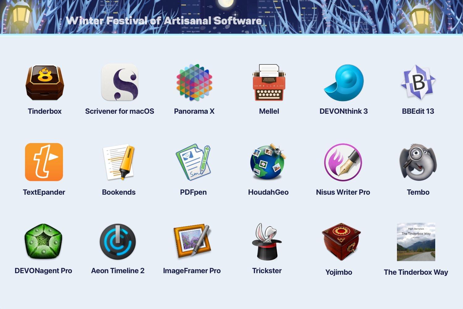
The 2020 Artisanal Software Festival is a fantastic collection of carefully-crafted apps for writing, research, thinking, and more at terrific prices. As in past years, software artisans from around the globe come together to offer fair discounts direct to you from the workshop door.
The 18 apps and book span a wide spectrum that will assist you with everyday knowledge work. There are apps to plan your next big project, conduct research, organize your research, edit images, manage email, write, and more:
- Tinderbox – Visualize and organize ideas and plans
- Scrivener for macOS – Your complete writing studio
- Panorama X – Collect, organize, and understand your data
- Mellel – A real word processor
- DEVONthink 3 – Manage documents the smart way
- BBEdit 13 – Power tool for text
- TextExpander – Recall your best words. Instantly, repeatedly
- Bookends – The reference manager you’ve been looking for
- PDFpen – Powerful PDF editing
- HoudahGeo – Photo geotagging
- Nisus Writer Pro – The powerful word processor for the Mac
- Tembo – Friendly file search assistant
- DEVONagent Pro – Your smart (re)search assistant
- Aeon Timeline 2 – The timeline tool for creative thinking
- ImageFramer – Add creative borders and frame to photos
- Trickster – Your recently used files, at your fingertips
- Yojimbo – Your effortless, reliable information organizer for macOS
- The Tinderbox Way – Definitive eBook on artisanal software
No gimmicks, no bundles, no gotchas – just saving of hundreds of dollars on these fine tools for a limited time. Visit the WinterFest website now for links to amazing deals each of these fantastic apps and to learn more or use the coupon code WINTERFEST2020 at checkout.
Our thanks to WinterFest 2020 for its support of MacStories this week.
AppStories, Episode 199 – Workflows Revisited: Task Management→
Scenecuts Adds Effortless Access to HomeKit Scenes in Your Mac’s Menu Bar
Scenecuts is a new utility app for controlling HomeKit devices from your Mac’s menu bar. The free, open source app, by Seattle developer Nick Hayward can control HomeKit scenes from the menu bar app’s drop-down menu, customizable per-scene menu bar icons, or the keyboard. It’s a terrific trio of options that makes controlling your smart devices immediate by freeing them from the confines of the Home app.
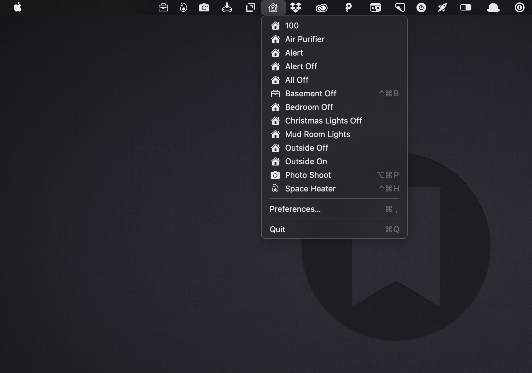
In its default configuration, Scenecuts adds its icon to your menu bar, and clicking on it reveals a drop-down menu of all the HomeKit scenes you’ve created in Apple’s Home app for controlling your smart devices. However, the app’s real power lies in its preferences, where you can edit Scenecuts’ drop-down menu, add individual scenes to your menu bar, and assign them to global keyboard shortcuts.
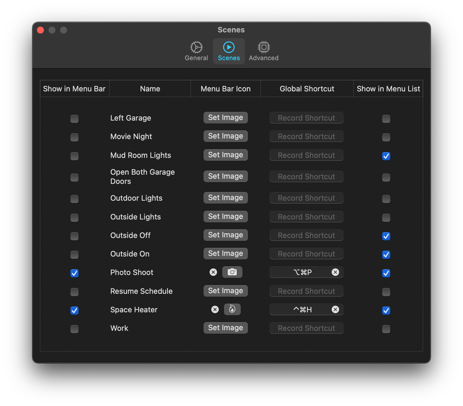
The HomeKit scenes you want to control with a particular Mac may vary. For instance, you may only care about the lights in the room where your desktop Mac sits, but want to control any of the lights in your home with a laptop that you carry with you. Scenecuts recognizes this by providing checkboxes next to every scene in its preferences. By default, all of your scenes are available in Scenecuts’ drop-down menu, but each of them can be turned off by unchecking its checkbox, which is a nice way to tidy up a long list of scenes. I turned off a bunch of scenes to make it easier to quickly locate the ones I use most often.
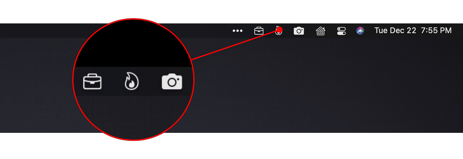
Another series of checkboxes, which are unchecked by default, controls whether scenes are shown as individual menu bar items. The feature is a lot like the ability to drag items out of Control Center to the menu bar. You can also add an icon for any of the scenes you add to the menu bar using Apple’s SF Symbols. I immediately added separate menu bar items for the space heater in my office and the settings for my overhead lights that I use for product photography because those are two scenes I find myself wanting to trigger from my desk regularly. The use of SF Symbols is an excellent way to pick something that is meaningful and memorable for triggering scenes.
The third way to use Scenecuts to trigger scenes is by using global keyboard shortcuts. Keyboard shortcuts are optional but extremely handy when you’re working with the keyboard instead of a trackpad or mouse. I appreciate, too, that Scenecuts displays the keyboard shortcuts you’ve assigned in its drop-down menu. The visibility provides a little reminder that has helped me memorize the shortcuts faster than I might otherwise have.
I’ve leveled my fair share of criticisms against the Home app, especially on the iPhone, but it’s grown on me when using my Mac. There’s more screen real estate than on the iPhone, which means its tile UI is less of an issue. Still, for quickly toggling my space heater or switching off a set of lights, opening a full-blown Mac app is overkill. By surfacing individual scenes in the menu bar, Scenecuts is the perfect complement to Apple’s Home app.
Scenecuts also highlights the anemic state of Control Center on the Mac. As I explained in my Big Sur review, I like the concept of Control Center on the Mac a lot, but it’s disappointing that so much of the functionality found in iOS is unavailable. Until Apple expands Control Center to incorporate scene support, Scenecuts is an excellent solution.
Jason Snell on the iPhone 12 Mini and Pro Max→
After a few months of use, Jason Snell has written a great article on the iPhone 12 line’s two outliers. Despite waiting for the shortfalls of a small phone to become apparent, the other shoe never dropped for him on the iPhone 12 Mini. Small phone aficionados won’t be disappointed by Apple’s long awaited return to devices in that size class. Similarly, for those willing to accept the enormous size, the iPhone 12 Pro Max is unafraid to deliver on the best an iPhone can be. As Snell describes, these products have rounded out the iPhone product line:
Apple’s one-size-fits-all approach to the iPhone worked for a very long time. But eventually the company realized that the iPhone needed to be more than a product—it needed to be a product line. And over the past few years, it’s been building out that product line—leading to late 2020 and its release of four distinctly different models in three distinct size classes.
The iPhone 12 and iPhone 12 Pro share a size, if not features. But bracketing them are the two outliers, each sharing a set of features with one of the 6.1-inch phones back at home base.
Don’t miss the full post over at Six Colors.
Fitness Totals Review: Effortlessly Surface Fitness Data and Track Your Progress
The Apple Watch and iPhone can collect a lot of fitness data. The trouble is, there’s so much information available that it can be a little overwhelming and difficult to sift through in Apple’s Health app. The situation has left an opening for third-party apps like Fitness Totals that use smart design and leverage new features like widgets to make sense of the piles of data and provide useful insights.
Fitness Totals benefits from its tight focus on applying a consistent approach to 16 fitness metrics using its app and companion widgets. The app compares fitness data over daily, weekly, monthly, and annual time periods, providing answers to questions like ‘Have I burned as many calories today as yesterday? and ‘Is my step count higher or lower this week than last?’ The data is available in the app, but its greatest strength is its widgets.
As much as I like Fitness Totals’ widgets, though, I want to start with the app. This is where you set up which metrics you want to track, and you can view even more data than is available in the widgets. Fitness Totals can track:
- Steps
- Walking and Running distance
- Walking workouts
- Running workouts
- Hiking workouts
- Cycling
- Wheelchair distance
- Wheelchair pushes
- Swimming strokes
- Swimming distance
- Downhill snow sports
- Resting calories burned
- Active calories burned
- Flights of stairs climbed
- Exercising minutes
- Standing minutes
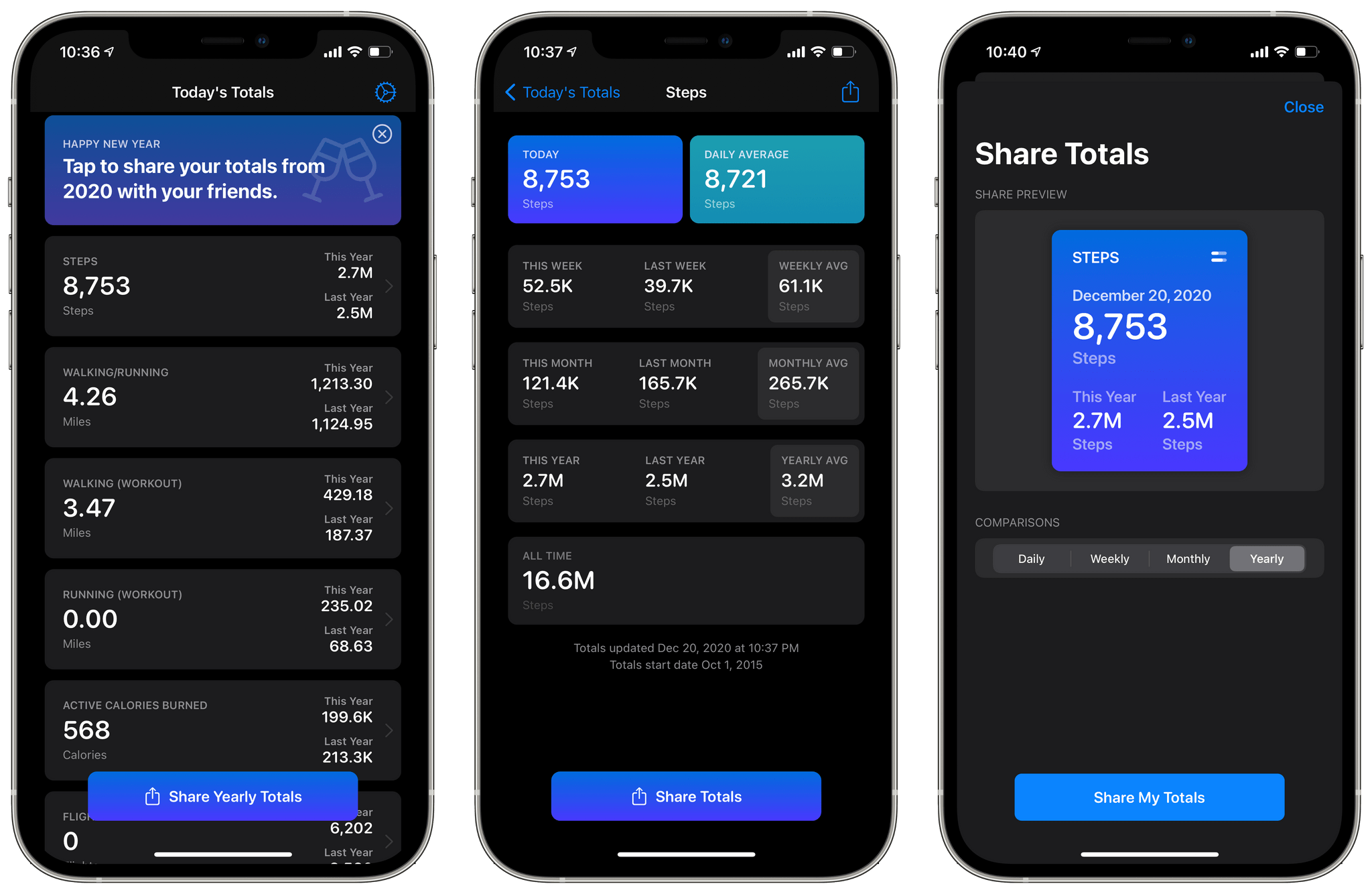
The app’s main view displays a series of cards for each category you’ve chosen to track. Each card lists your total for the day and the current year compared to last year. Tapping a card opens a detailed view with more statistics. For example, my step details included today’s total and my daily average along with totals for this week, month, and year compared to last week, month, and year, and the averages for each. Finally, there’s an all-time number totaling all the data recorded and a button for sharing a daily, weekly, monthly, or yearly summary with a colorful graphic.
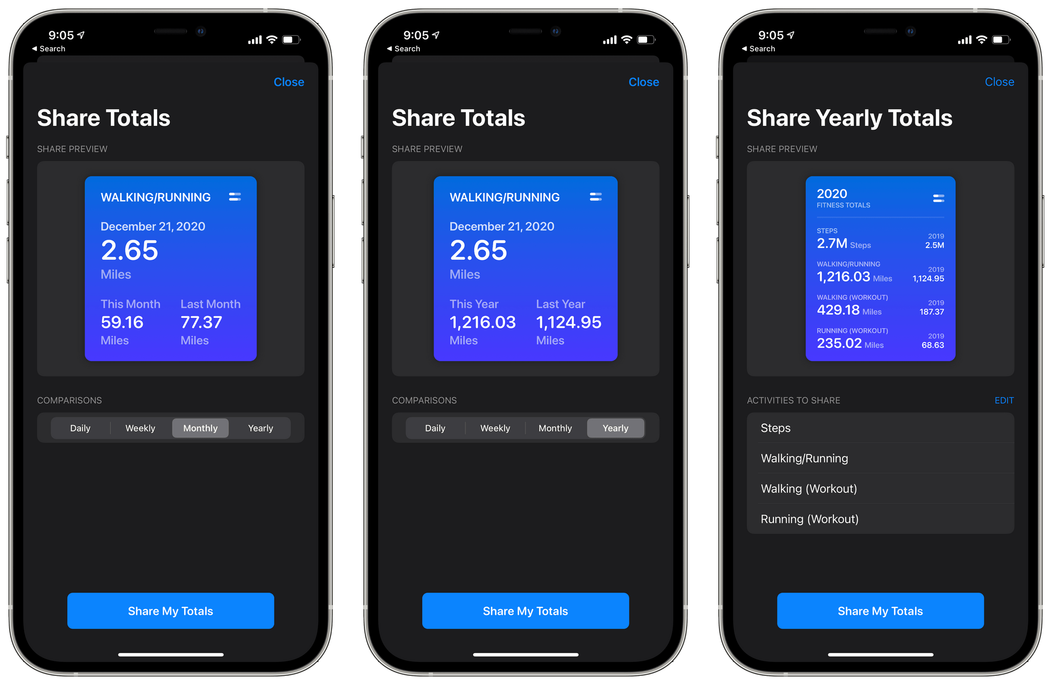
The main view of the app also has a share button that lets you compose a graphic showing your yearly totals for any of the metrics you’re tracking. Currently, there’s also a banner at the top of the app prompting users to share their yearly totals, which does the same thing as the share button at the bottom of the screen.
The app’s three sizes of widgets are similar to the graphics its share functionality creates. The primary difference between each widget size is how much data it can display. The small widget displays one pair of statistics: today compared to yesterday or this week, month, or year compared to last week, month, or year. The medium widget adds a second set of data points, and the large one allows for three points of comparison.
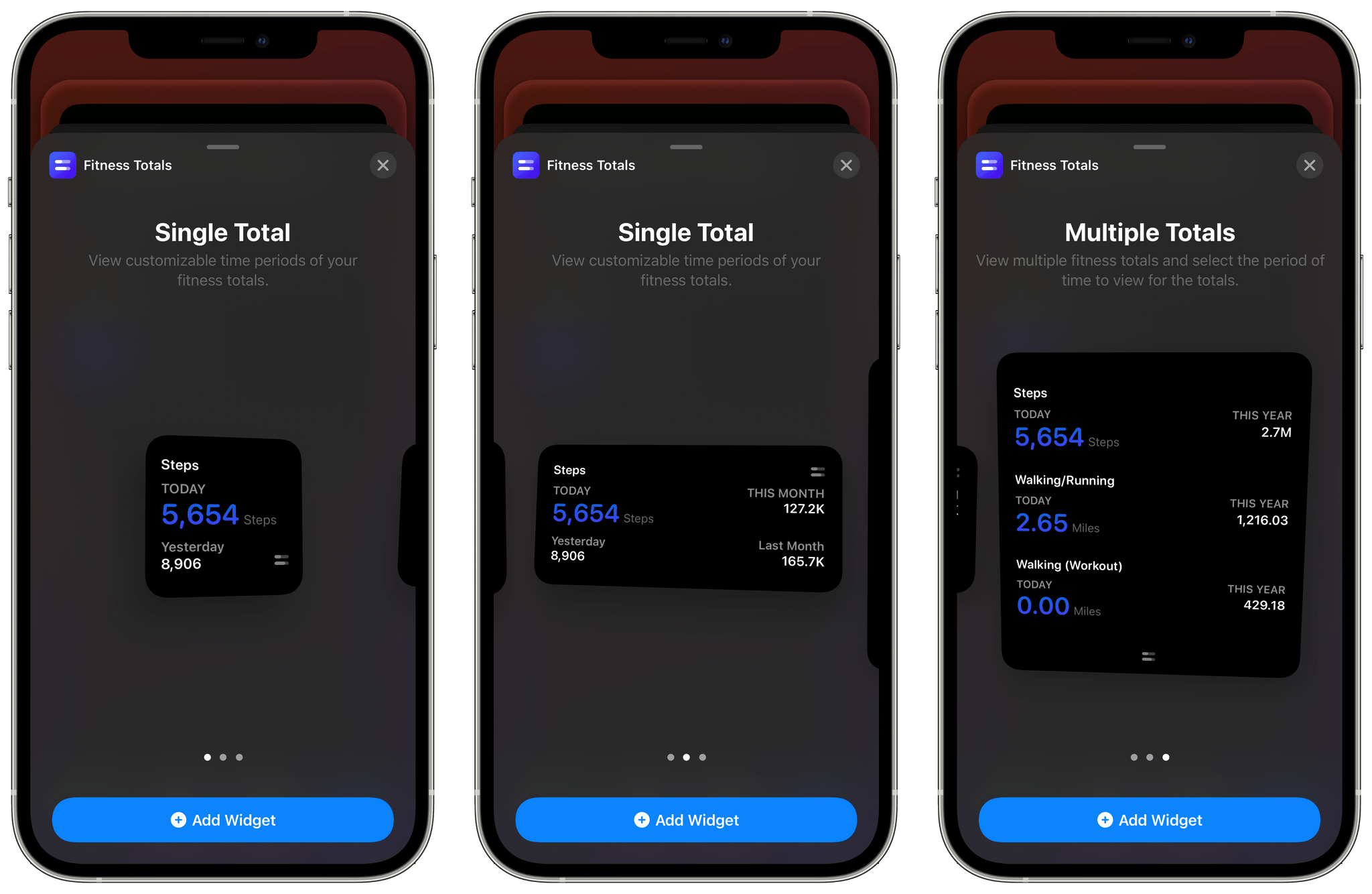
I’ve been using a medium widget to remind me of my step count for today, yesterday, and last week versus this week. The widget serves as a quick way to gauge how active I’ve been as the week progresses and is a nice addition to the health and fitness stack that I’ve created on a secondary Home Screen. I may add additional Fitness Totals widgets over time, but for now, the step count widget is doing a good job of reminding me to stay active.
The one thing I’d like to see added to Fitness Totals’ widgets is color and typeface customization options. The widgets are pure black, and some statistics are a dark purple that looks good but doesn’t offer much contrast against the black, which can make the numbers difficult to read. The black background can also be a bit stark against some wallpapers.
Even so, Fitness Totals fills a nice gap Apple has left wide open. Apple’s Health app has all the data Fitness Totals displays, but the company doesn’t offer a Health widget. Fitness Totals also benefits from its focus on just a handful of fitness metrics that can be turned on or off by users surfacing the data far better than the Health app. If you’re looking for a periodic Home Screen reminder to keep you on track with your fitness plans for 2021, Fitness Totals is an excellent choice.
Fitness Totals is available on the App Store for $2.99.
HealthView: Your Go-To Apple Health Dashboard App [Sponsor]
HealthView is a beautifully-designed iPhone and Apple Watch app that brings the health data those devices collect together in a highly-customizable, unified dashboard.
The iPhone and Apple Watch are capable of collecting lots of health data but making sense of it all and accessing it can be frustrating. Instead of poking around in the many sections of the Health app, give HealthView a try. The app provides a clean, concise view into your health data on both the iPhone and Apple Watch.
As good as HealthView looks, though, the app’s utility runs much deeper. HealthView is highly customizable, allowing you to tailor its dashboard to your specific needs and interests. You can set goals and track your progress, making it easier than ever to reach those goals. You can also view daily, weekly, monthly, and annual totals for metrics like steps, hydration, workout minutes, distance, mindful minutes, weight, heart rate, and a lot more.
If you want more detail, just tap into a category to focus on a single metric that reports all your stats alongside graphs that display the data over time. HealthView also offers a wealth of beautiful widgets, so you can get your most important stats from a quick glance at your iPhone’s Home Screen. No matter the your goals, HealthView can be customized to suit your needs.
So, download HealthView today to see why so many users rely on it for tracking their health and fitness.
Our thanks to HealthView for supporting MacStories this week.
MacStories Unwind: The 2020 Selects Awards, iOS 14.3, Fitness+, AirPods Max Power Modes, and ProRAW


Sponsored by: Agenda – Date-Focused Note Taking
This week on MacStories Unwind:
MacStories
- MacStories Selects 2020: Recognizing the Best Apps of the Year
- Apple Releases iOS and iPadOS 14.3 with Apple ProRAW, App Clip Codes, Fitness+ Support, and Direct App Launches from Shortcuts
- Fitness+ Review Roundup
- Apple Releases Cardio Fitness Notifications for Apple Watch
- Headland Review: Fight Your Way Through a World of Imagination
- AirPods Max Power Management Explained by Updated Apple Support Document
- Pro Photographer Austin Mann Explains ProRAW
- Developer Ben Sandofsky on ProRAW and Halide Mark II’s Implementation of the New Format
Club MacStories
- MacStories Weekly
- Wonder - a simple, elegant Wikipedia browser and research tool
- A collection of Home Screen customization tools
- Federico on how he’s using Timery and GoodTask widgets
- A big interview with Balint Orosz, founder and CEO of Craft
AppStories
Unwind
- Federico’s Pick:
- Ori and the Blind Forest on Xbox
- John’s Pick:
- evermore by Taylor Swift