Posts tagged with "iPhone"

Hands-On with the Kuxiu X40 Turbo Qi 2.2 3-in-1 Travel Charger

Wireless charging is great, but historically it’s been slow. That’s starting to change for the iPhone with Qi 2.2, the latest wireless charging standard that the iPhone 16 and 17 series phones support. With Qi 2.2, a compatible iPhone charges wirelessly at 25W. By comparison Qi 1 charged at 5–7.5W and Qi 2.0 and the original MagSafe charged at 15W.

So far, though, there have been precious few chargers, besides Apple’s MagSafe puck charger, that support Qi 2.2’s faster charging, which is why I was interested in trying the Kuxiu X40 Turbo, when Kuxiu offered to send me a review unit. As advertised, the compact 3-in-1 charger delivers the fastest wireless iPhone charging around, but that’s not its only selling point.

In addition to fast charging an iPhone 16 or 17 series phone at 25W, the X40 Turbo, which retails for around $80, charges AirPods and an Apple Watch at 5W. However, what I wasn’t expecting was just how small the X40 Turbo is when folded for travel. The entire package is about twice as thick as an iPhone 17 Pro Max and fits neatly into the palm of your hand. At the same time, though, the X40 Turbo feels sturdy. It’s made of metal with soft-touch pads to avoid scratching your devices or tabletop. Here’s a closer look at what Kuxiu sent me:

When it’s time to charge your iPhone, AirPods, and Apple Watch, the X40 Turbo unfolds into a z-shaped configuration from which the Watch pad flips down horizontally. So far, I’ve used the X40 Turbo on my nightstand and at my desk, where it takes up minimal space. I also plan to take the X40 Turbo on my next trip because it takes so little room in my bag.

Kuxiu isn’t the first company to make a charger in this form factor, but the X40 Turbo is one of the best built that I’ve tried, and as one of the first Qi 2.2 models, it’s notable, and a great upgrade to your charging setup.

The Kuxiu X40 Turbo is available directly from Kuxiu and Amazon.


Jess Weatherbed Breaks Down Why Apple’s Crossbody Strap is a Great Idea

Source: Apple.

Source: Apple.

In the run-up to yesterday’s Apple Event, there were increasingly loud rumblings that Apple would introduce a crossbody strap or lanyard that could be attached to new iPhone cases.

What followed was a noticeable amount of confusion from those in the tech sphere as to why Apple was entering this market. Now that the Crossbody Strap has been released, Jess Weatherbed at The Verge has a great explainer on why crossbody straps are an increasingly popular trend and why Apple’s take on them is so good. (Spoiler: it’s magnets. It’s always magnets.)

This trend seems to be more popular in Europe and Asia, but it’s picking up steam in the United States, too. I personally see them all the time in London, both as fashion accessories and practical ways for people to carry their most important device. In fact, as a quick experiment, I counted almost 20 of them on my five-minute walk back from this morning’s school drop-off.

The Apple Crossbody Strap is available to order now and is only compatible with Apple’s cases for iPhone 17, Air, 17 Pro, and 17 Pro Max. For more on all the accessories Apple released this week, check out Niléane’s overview.


You can follow all of our September 2025 Apple event coverage through our September 2025 Apple event hub or subscribe to the dedicated September 2025 Apple event RSS feed.

Permalink


Apple Announces iPhone 17, 17 Pro, and 17 Pro Max

Earlier today, Apple revealed the iPhone 17, 17 Pro, and 17 Pro Max. There are a lot of details to dig into, so let’s dive in.

iPhone 17

Source: Apple.

Source: Apple.

The new iPhone 17 is both colorful and a significant upgrade. There are a total of five colors – Lavender, Mist Blue, Black, White, and Sage – all of which look great.

As for the upgrades to the hardware, the most significant to my mind is that the iPhone 17 is finally getting ProMotion and a 6.3-inch Always-On display that can refresh adaptively between 1 and 120 Hz. The front screen is protected by Ceramic Shield 2, which Apple says is three times more scratch-resistant than before, has a peak brightness of 3000 nits, and includes an improved seven-layer anti-reflective coating. From the specs, it appears that this is the same screen found in the iPhone Air, only slightly smaller.

Read more


Apple’s September 2025 Event: All the Small Things (Bento Box Version)

Several things are ubiquitous with Apple Events. Tim Cook’s “Good Morning!”, Craig Federighi being, well, Craig Federighi, and the keynote bento boxes. Offering up a summary to each keynote section, these bento box slides provide a great way to recap a new product.

So, after today’s bumper announcements, let’s take a look at today’s bento box slides.

iPhone 17

iPhone Air

iPhone 17 Pro

Read more


Apple Announces September 9 Awe Dropping Event

Today, Apple announced that it will host an event entitled “Awe Dropping” on September 9, 2025, at 10:00 AM Pacific Time. The company is expected to announce the iPhone 17 line, including the new iPhone 17 Air, alongside new Apple Watches and potentially AirPods Pro.

The event will be streamed live globally on Apple’s Events page as well as on YouTube and in the Apple TV app. Some members of the media were invited to watch the event in person at the Steve Jobs Theater at Apple Park.

The MacStories team will be covering all the details of the event, so stay tuned and get ready for September 9.


Tot 2.0: A Thoughtful Extension of an Already Elegant Note-Taking App

Late yesterday, The Iconfactory released 2.0 updates to Tot for macOS, Tot Pocket for iOS and iPadOS, and Tot Mini for watchOS. The apps, which The Iconfactory describes as tiny text companions, include a handful of big new features that span all three versions, along with other updates and fixes that are unique to each platform.

What hasn’t changed is Tot’s incredible design and reliable performance across all platforms. The app showcases some of The Iconfactory’s best app design work, which Federico described in his review of version 1.0:

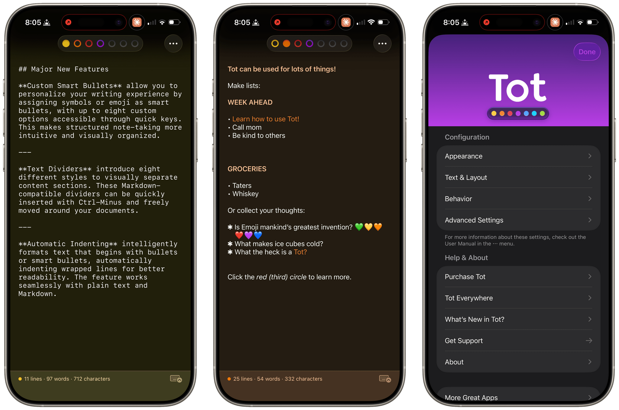
Tot’s colored dots serve the dual purpose of being spatial navigation tool and context indicators. You can navigate across documents in the app with a quick swipe, and in doing so on modern iPhones you’ll feel a delightful haptic tap; alternatively, you can tap the dots to switch documents. As I mentioned above, each dot carries a color, which becomes the background color of the selected document (vibrancy is also used to let the color shine through the software keyboard – a nice touch). The palette chosen by The Iconfactory for Tot’s seven documents is some of the finest selection of colors I’ve seen in a modern iOS app: it looks great in light mode, and it looks amazing in dark mode thanks to its combination of high contrast and translucency.

The combination of that elegant design with reliable sync across multiple OSes and thoughtful Shortcuts integration has understandably made the Tot family of apps integral to a lot of MacStories readers’ workflows. However, if you haven’t tried any of the Tot apps before, it’s worth checking out Federico’s review of version 1.0 for the fundamentals because they haven’t changed, and I’ll be focusing on what’s new.

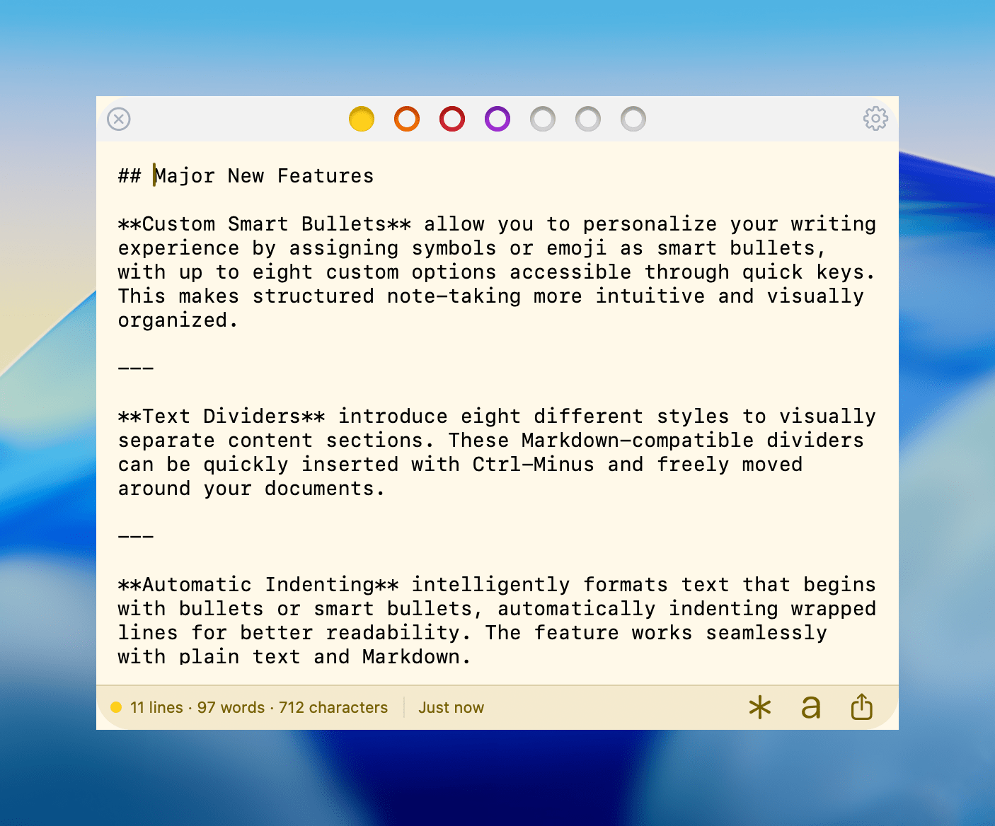
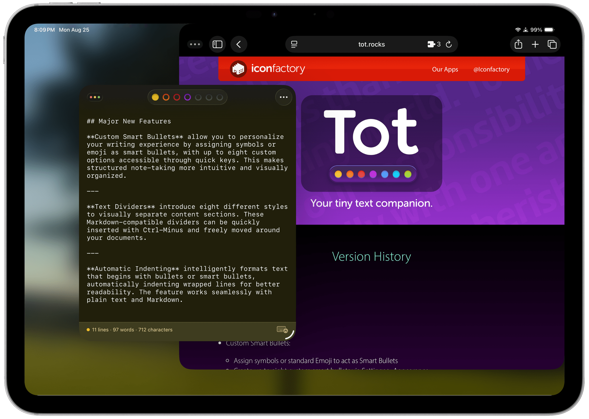
My favorite 2.0 feature is that Tot now supports automatic indenting. If you indent a line using the Tab key, the next line will begin at the same indentation level when you hit Return. That makes creating hierarchical lists a lot faster than before. My only quibble with the feature is that if you’re making a bulleted list, to indent a line, you can’t indent using just the Tab key if the cursor appears anywhere in your line of text. However, you can use ⌘ + ] and ⌘ + ] to do the same thing. Regardless of how indenting is invoked, it’s an excellent addition to Tot that I was glad to see included in the update.

Tot allows you to define pairs of smart bullets.

Tot allows you to define pairs of smart bullets.

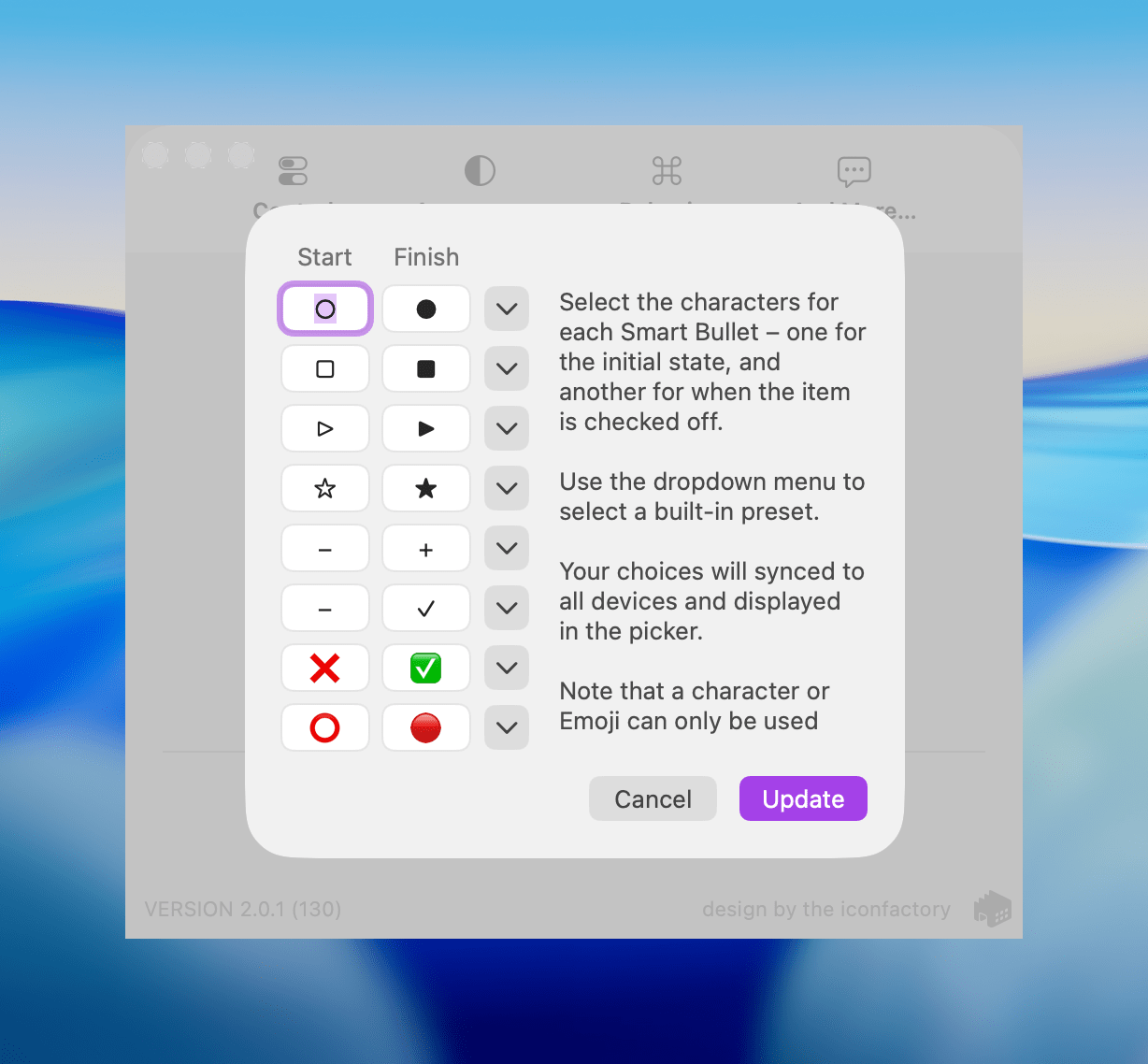
Speaking of bullets, Tot 2.0 also supports customizable smart bullets. From the app’s settings, you can choose from different pairs of symbols and emoji, like empty and filled circles or empty and filled stars. To toggle between the symbols in each pair, all you need to do is click or tap on them. If the eight default pairs aren’t to your taste, there are a bunch of alternatives you can use instead, such as the snowflake and flame emoji. It’s a clever twist on standard checkboxes and radio buttons that I’ve enjoyed because it adds some character and color to the app.

Tot adds eight new text dividers, too. From the classic three dashes used in Markdown to asterisks and more, there’s a nice variety of options. Plus, you can easily insert a divider with the keyboard shortcut Control + Minus.

The Iconfactory has made other platform-specific changes, too:

  • Settings have been redesigned in the Mac version and include new options, such as floating the Tot window over other windows.
  • The iOS and iPadOS versions include a menu button that offers access to the app’s settings along with a couple of bulk operations like saving, sharing, and exporting notes.
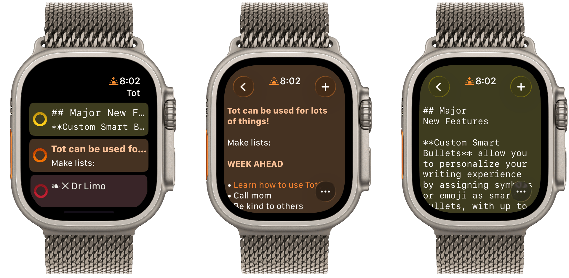
  • The watch app’s design has been refreshed with simplified controls and colorful backgrounds.

It’s great to see the Tot apps reach version 2.0. The three tentpole features – automatic indenting, custom smart bullets, and text dividers – are all meaningful improvements that don’t compromise the apps’ simplicity. Those features, along with several quality of life improvements and other bug fixes that you can read about in Tot’s version history, add up to an excellent update that should serve users well for a long time.

Tot is available on the Mac App Store, and Tot Pocket is available on the iOS and iPadOS App Store. Each costs $19.99, though existing users can update to Tot Pocket at no extra cost. Tot Mini, the Apple Watch app, is available as a separate $1.99 purchase.


Ars Technica Takes CarPlay Ultra for a Spin

Michael Teo Van Runkle, writing for Ars Technica, spent eight days testing CarPlay Ultra in an Aston Martin DB12 Volante. Van Runkle walks readers through the setup process, covers the themes available, and describes the experience of monitoring and controlling the car’s systems using Apple’s next-generation version of CarPlay.

By and large, Van Runkle’s experience was positive:

Ultra’s biggest improvements over preceding CarPlay generations are in the center console infotainment integration. Being able to access climate controls, drive modes, and traction settings without leaving the intuitive suite of CarPlay makes life much easier. In fact, changing between drive modes and turning traction control off or down via Aston’s nifty adjustable system caused less latency and lagging in the displays in Ultra. And for climate, Ultra actually brings up a much better screen after spinning the physical rotaries on the center console than you get through Aston’s UI—plus, I found a way to make the ventilated seats blow stronger, which I never located through the innate UI despite purposefully searching for a similar menu page.

That said, it was not without glitches and hiccups along the way, some of which were difficult to pin on CarPlay Ultra versus Aston Martin’s systems.

Precious few auto makers have signed on to offer CarPlay Ultra, but Kia and Porsche have said they will, too, which is a start. I remember when CarPlay debuted in 2014 with a similarly small lineup composed mostly of luxury brands like Ferrari and Mercedes-Benz. So, it’s not surprising Ultra is debuting in a car that starts at $265,000. It took years before the original CarPlay trickled down to ordinary, everyday cars. But they did, and now, with a few notable exceptions, like Tesla, Rivian, and GM EVs, you can find CarPlay in most makes and models.

I hope CarPlay Ultra follows a similar trajectory. It looks great, and I’d love to have it in my next car, which I can confidently predict now will not be an Aston Martin.

Permalink